Brand Accessibility is not just a task; it's a way to grow. When experiences are easy for all to use, you reach more people. This increases happiness and helps you stand out.
By making your brand easy for everyone to access, you tap into needs others miss. This gives you an edge in various areas.
About 1 in 6 people globally have a disability, says the World Health Organization. Many also face temporary issues: screen glare, loud places, slow internet, or an injury. Making your design accessible helps everyone. This includes those using mobile phones, the elderly, people who speak different languages, and new clients.
The reason to do this is clear. Simple words, good contrast, and easy-to-follow layouts help keep visitors. They also make more people buy from you and keep coming back. Companies like Microsoft, Apple, and BBC are trusted because they focus on making their digital experiences accessible. This way, they show respect and build strong brand trust.
Include accessibility in your brand from the start. Think about how you speak, your visual designs, and how people interact with your products. Make accessibility a basic part of your designs, guides, and marketing. This approach saves money, requires fewer changes later, boosts your search engine ranking, and earns loyal fans.
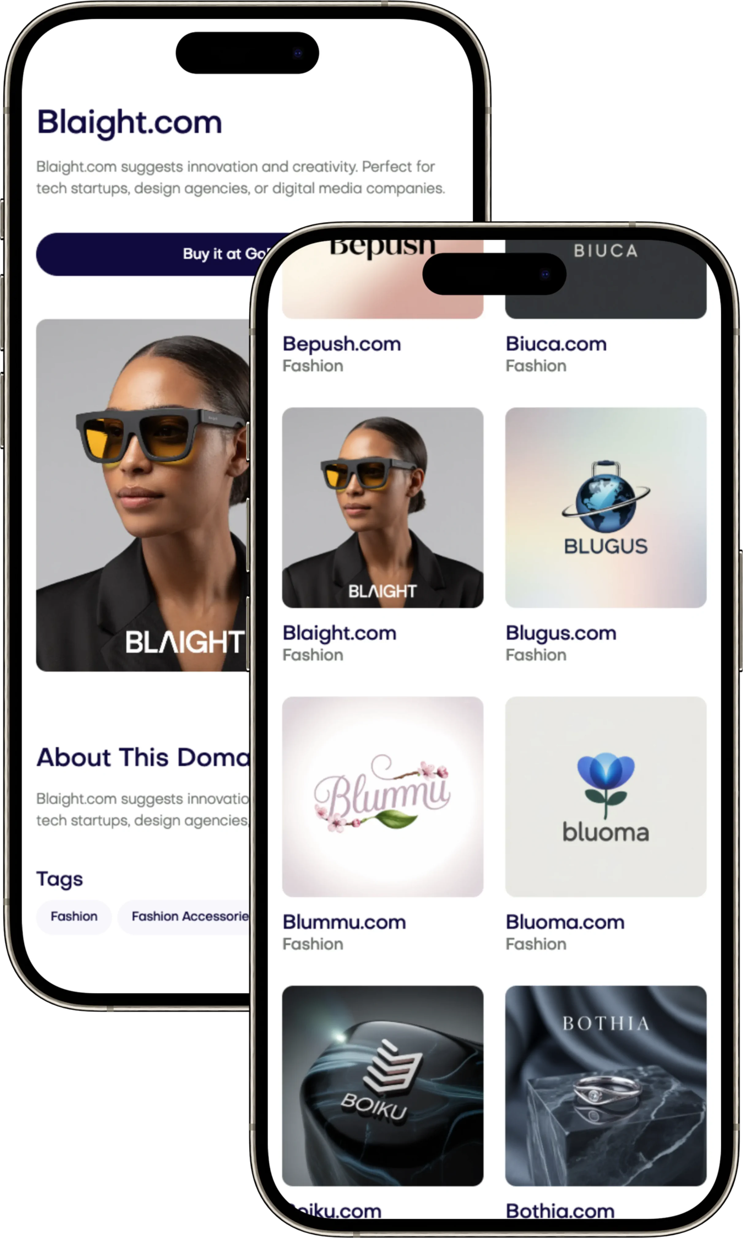
Want your brand to be clear and trusted? Pick a name that stands out and supports inclusive branding. Great domain names can be found at Brandtune.com.
What Inclusive Branding Really Means for Modern Audiences
Inclusive branding makes your brand easy to understand and use for everyone. It combines useful access with feelings that connect. This creates a brand that everyone finds welcoming and useful.
It includes many things: how things look, websites and apps, what's on the packaging, store layouts, videos, and how you talk to customers. It's about more than just following a list. It's making sure your brand fits into everyone's life in a useful way. Everything your brand does should be easy to understand and use.
People today want things to be simple and quick. They like clear directions, easy-to-read words, pretty pictures, and straightforward talk. Making your marketing thoughtful helps everyone understand and use your brand better.
By doing this, more people can enjoy what you offer. It even helps those trying something new, people who aren't used to the internet, and those with slow internet. Everyone feels more welcome, and they come back for more.
Look at Microsoft, Airbnb, and GOV.UK. Microsoft offers tools for everyone to create. Airbnb makes its platform easier for more people to use. GOV.UK writes in simple English so more people can understand. These examples show that being inclusive is good for everyone.
To start, check how easy and clear each part of your brand is to use. Match your actions to your values, like making text easy to read and websites easy to navigate. This way, your brand becomes truly welcoming and useful for everyone.
Brand Accessibility as a Driver of Trust and Loyalty
Your brand wins when it's easy for everyone to use. Making things easy builds trust from the start. And it shows your team values time and can meet diverse needs.
How accessibility signals respect and empathy
Easy words, clear layouts, and tech help show you care. Captions and simple forms mean no one struggles. This is caring design. It helps everyone, no matter where they are or what challenges they face.
Leaders like Microsoft show designing for one helps many. This makes people happy and builds trust in your brand.
Reducing friction across the customer journey
Using alt text and captions makes your content reach more people. It makes things smoother right from the start.
Clear product pages and easy navigation help during shopping. This makes buying something less of a hassle. An easy experience lets people shop with confidence.
At checkout, clear labels and error messages prevent frustration. Good support means quick fixes and happier customers. This helps keep your customers loyal.
Turning accessibility into long-term brand equity
Make accessibility a core part of your standards. Being reliable earns trust and helps your brand grow over time.
Being inclusive makes people want to recommend your brand. Lowering costs and fewer problems mean you can focus on new ideas. And keep making things easy for your customers.
Brand Accessibility
Brand accessibility changes good design into something everyone can use. It gives a clear meaning of accessibility. It asks if people can see, understand, move around, and interact with various forms like text and video.
By matching identity and messages with design and service, you make an inclusive experience. This works well everywhere.
Defining accessibility in the context of brand experience
Think about the whole trip: your website, app, packaging, events, and help. Accessibility links these aspects into a whole system. It keeps your brand's promise consistent.
This comes across in the words you use, how screens talk, and how controls work. This brings reliable help that fits your brand's voice smoothly.
Core principles: perceivable, operable, understandable, robust
Follow the WCAG rules like a guiding star. Make your content perceivable. Add text for pictures, strong contrasts, captions, and clear labels. Make sure users can operate it easily.
Offer keyboard navigation and clear control guidelines. Don't trap users. Make everything understandable. Use simple language and familiar patterns. Give specific error messages that are helpful.
Build sturdy experiences. Support tech like VoiceOver and NVDA. Make sure your code works well even when technology changes. Strive for experiences that work well for everyone, anywhere.
Aligning accessibility with brand voice and visual identity
Being clear is a choice in style. Keep your brand voice strong with short sentences and clear headlines. Match this with visual choices that are accessible.
Choose colors carefully and use text that's easy to read. Control how things move and display media wisely. Include options to pause and reduce motion. Provide texts for hearing.
Make standard rules for decisions. This helps teams keep quality consistent. It's how making inclusive experiences becomes a regular habit, not a quick fix.
Designing Accessible Visual Identities Across Touchpoints
Your visual identity should shine everywhere: websites, apps, products, and print materials. Create it with clear guidelines. Then, grow it with design tokens. This keeps teams in sync and moving quickly. Everything looks consistent, high-end, and easy to interact with.
Color contrast and palette choices that remain on-brand
Begin with easy-to-read color contrasts: aim for 4.5:1 for regular text and 3:1 for bigger text. Pick a brand palette that includes primary, secondary, and accent colors. Add accessible colors for various uses like backgrounds and errors.
Support colors with other clues. Add icons, patterns, and special lines to help those with trouble seeing colors. Check your colors on mobile and dark mode to ensure they look good everywhere.
Typography for readability without sacrificing style
Pick fonts that are easy to read and stylish. Steer clear of very tight fonts for your main text. Use a good line height between 1.4 and 1.6. This makes reading faster and less tiring.
Ensure text sizes work well on small screens and allow zooming without messing up the layout. Use design tokens for spacing, boldness, and backup fonts. This keeps your text consistent on all platforms.
Iconography and imagery that communicate inclusively
Choose icons that everyone can understand, maintaining consistent style and size. Always use clear labels with icons. Make sure your designs are easy to recognize at a quick glance.
Pick images that show people of different ages, abilities, and cultures without
Brand Accessibility is not just a task; it's a way to grow. When experiences are easy for all to use, you reach more people. This increases happiness and helps you stand out.
By making your brand easy for everyone to access, you tap into needs others miss. This gives you an edge in various areas.
About 1 in 6 people globally have a disability, says the World Health Organization. Many also face temporary issues: screen glare, loud places, slow internet, or an injury. Making your design accessible helps everyone. This includes those using mobile phones, the elderly, people who speak different languages, and new clients.
The reason to do this is clear. Simple words, good contrast, and easy-to-follow layouts help keep visitors. They also make more people buy from you and keep coming back. Companies like Microsoft, Apple, and BBC are trusted because they focus on making their digital experiences accessible. This way, they show respect and build strong brand trust.
Include accessibility in your brand from the start. Think about how you speak, your visual designs, and how people interact with your products. Make accessibility a basic part of your designs, guides, and marketing. This approach saves money, requires fewer changes later, boosts your search engine ranking, and earns loyal fans.
Want your brand to be clear and trusted? Pick a name that stands out and supports inclusive branding. Great domain names can be found at Brandtune.com.
What Inclusive Branding Really Means for Modern Audiences
Inclusive branding makes your brand easy to understand and use for everyone. It combines useful access with feelings that connect. This creates a brand that everyone finds welcoming and useful.
It includes many things: how things look, websites and apps, what's on the packaging, store layouts, videos, and how you talk to customers. It's about more than just following a list. It's making sure your brand fits into everyone's life in a useful way. Everything your brand does should be easy to understand and use.
People today want things to be simple and quick. They like clear directions, easy-to-read words, pretty pictures, and straightforward talk. Making your marketing thoughtful helps everyone understand and use your brand better.
By doing this, more people can enjoy what you offer. It even helps those trying something new, people who aren't used to the internet, and those with slow internet. Everyone feels more welcome, and they come back for more.
Look at Microsoft, Airbnb, and GOV.UK. Microsoft offers tools for everyone to create. Airbnb makes its platform easier for more people to use. GOV.UK writes in simple English so more people can understand. These examples show that being inclusive is good for everyone.
To start, check how easy and clear each part of your brand is to use. Match your actions to your values, like making text easy to read and websites easy to navigate. This way, your brand becomes truly welcoming and useful for everyone.
Brand Accessibility as a Driver of Trust and Loyalty
Your brand wins when it's easy for everyone to use. Making things easy builds trust from the start. And it shows your team values time and can meet diverse needs.
How accessibility signals respect and empathy
Easy words, clear layouts, and tech help show you care. Captions and simple forms mean no one struggles. This is caring design. It helps everyone, no matter where they are or what challenges they face.
Leaders like Microsoft show designing for one helps many. This makes people happy and builds trust in your brand.
Reducing friction across the customer journey
Using alt text and captions makes your content reach more people. It makes things smoother right from the start.
Clear product pages and easy navigation help during shopping. This makes buying something less of a hassle. An easy experience lets people shop with confidence.
At checkout, clear labels and error messages prevent frustration. Good support means quick fixes and happier customers. This helps keep your customers loyal.
Turning accessibility into long-term brand equity
Make accessibility a core part of your standards. Being reliable earns trust and helps your brand grow over time.
Being inclusive makes people want to recommend your brand. Lowering costs and fewer problems mean you can focus on new ideas. And keep making things easy for your customers.
Brand Accessibility
Brand accessibility changes good design into something everyone can use. It gives a clear meaning of accessibility. It asks if people can see, understand, move around, and interact with various forms like text and video.
By matching identity and messages with design and service, you make an inclusive experience. This works well everywhere.
Defining accessibility in the context of brand experience
Think about the whole trip: your website, app, packaging, events, and help. Accessibility links these aspects into a whole system. It keeps your brand's promise consistent.
This comes across in the words you use, how screens talk, and how controls work. This brings reliable help that fits your brand's voice smoothly.
Core principles: perceivable, operable, understandable, robust
Follow the WCAG rules like a guiding star. Make your content perceivable. Add text for pictures, strong contrasts, captions, and clear labels. Make sure users can operate it easily.
Offer keyboard navigation and clear control guidelines. Don't trap users. Make everything understandable. Use simple language and familiar patterns. Give specific error messages that are helpful.
Build sturdy experiences. Support tech like VoiceOver and NVDA. Make sure your code works well even when technology changes. Strive for experiences that work well for everyone, anywhere.
Aligning accessibility with brand voice and visual identity
Being clear is a choice in style. Keep your brand voice strong with short sentences and clear headlines. Match this with visual choices that are accessible.
Choose colors carefully and use text that's easy to read. Control how things move and display media wisely. Include options to pause and reduce motion. Provide texts for hearing.
Make standard rules for decisions. This helps teams keep quality consistent. It's how making inclusive experiences becomes a regular habit, not a quick fix.
Designing Accessible Visual Identities Across Touchpoints
Your visual identity should shine everywhere: websites, apps, products, and print materials. Create it with clear guidelines. Then, grow it with design tokens. This keeps teams in sync and moving quickly. Everything looks consistent, high-end, and easy to interact with.
Color contrast and palette choices that remain on-brand
Begin with easy-to-read color contrasts: aim for 4.5:1 for regular text and 3:1 for bigger text. Pick a brand palette that includes primary, secondary, and accent colors. Add accessible colors for various uses like backgrounds and errors.
Support colors with other clues. Add icons, patterns, and special lines to help those with trouble seeing colors. Check your colors on mobile and dark mode to ensure they look good everywhere.
Typography for readability without sacrificing style
Pick fonts that are easy to read and stylish. Steer clear of very tight fonts for your main text. Use a good line height between 1.4 and 1.6. This makes reading faster and less tiring.
Ensure text sizes work well on small screens and allow zooming without messing up the layout. Use design tokens for spacing, boldness, and backup fonts. This keeps your text consistent on all platforms.
Iconography and imagery that communicate inclusively
Choose icons that everyone can understand, maintaining consistent style and size. Always use clear labels with icons. Make sure your designs are easy to recognize at a quick glance.
Pick images that show people of different ages, abilities, and cultures without
Start Building Your Brand with Brandtune
Browse All Domains