Your business moves faster when ideas feel clear. Moodboards make your brand's strategy shine through visuals before design kicks off. They mix color, typography, pictures, textures, and references to set the right tone.
This process reduces guessing and unites teams creatively.
Think of a moodboard as your guide. It changes core ideas—like purpose and target audience—into simple visuals. This helps make better creative decisions and cuts down on redoing work.
It also means less arguing over details and quicker progress.
The benefits of moodboards are clear in the results. They ensure your brand looks the same everywhere, from online to packaging. This makes your brand stand out and be remembered easily.
To fine-tune your brand's vibe, start with moodboards. Check if the board reflects what you know about your audience and goals. A good match? Then planning gets smoother and approval is quicker.
If there’s a mismatch, tweak the moodboard, not your whole strategy. It's how moodboards link big-picture strategy with actual production.
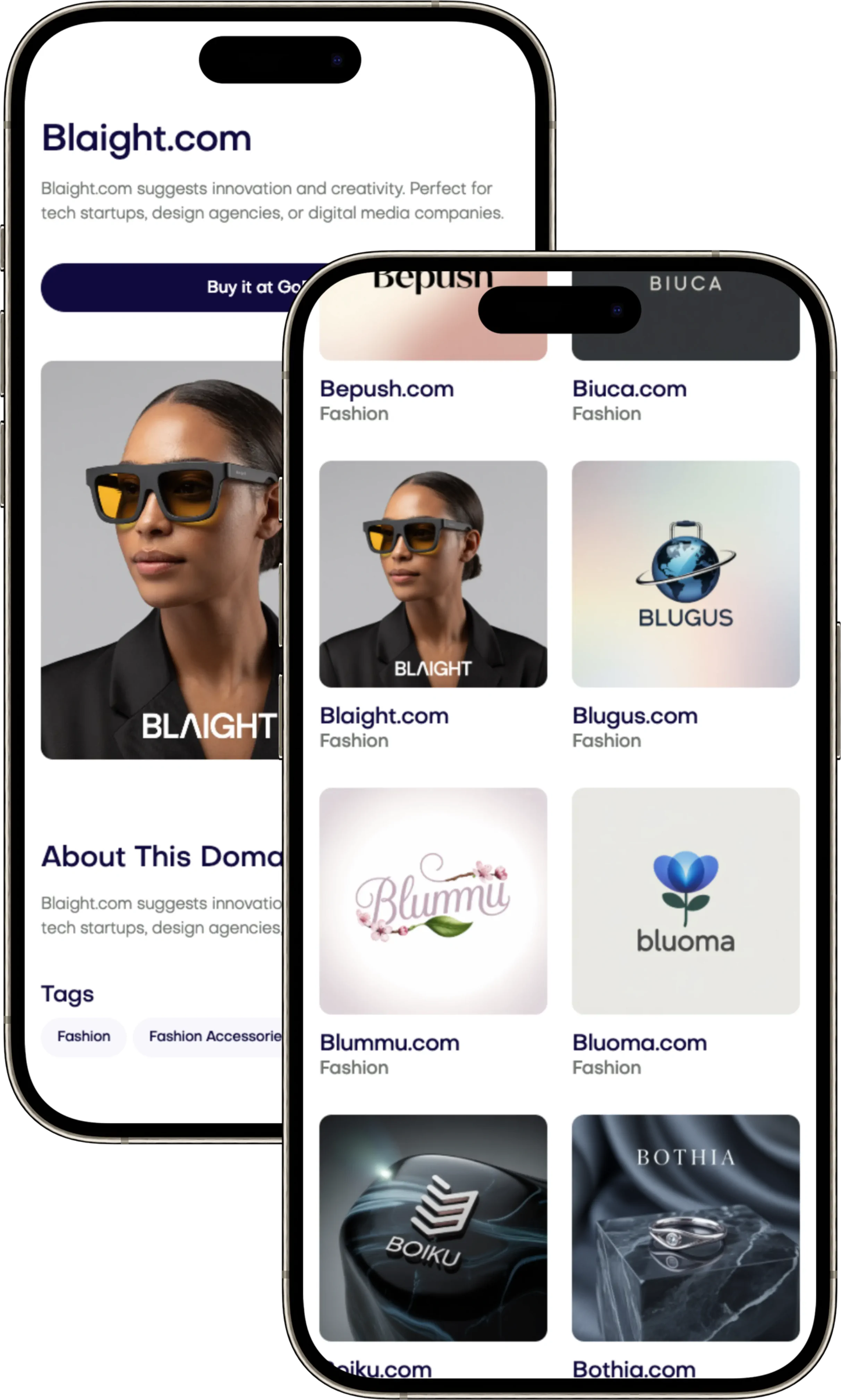
Want to bring your vision to life and move faster in creative development? Find top domain names at Brandtune.com.
What Is a Moodboard and Why It Matters for Creative Direction
Your business needs fast, sure choices. A moodboard shows everyone the same picture of what's planned. It helps your team agree on creative ideas quickly. It sets the scene for your brand and makes designing faster. You don't get stuck on final designs too soon.
Defining the moodboard in a branding context
Think of a moodboard as a visual summary. It shows your strategy's look and feel in one place. It has pictures, colors, fonts, textures, and more. It helps decide how the brand feels before deciding on its look.
It tests if visual ideas work. You can mix main and new ideas. Say what's a must and what's just a wish. This keeps everyone on the same page.
How visual synthesis accelerates alignment
Putting brand ideas on one picture makes things simpler. People decide faster and give clearer opinions. Everyone agrees using real examples, not just words.
This makes agreeing on creative ideas quicker and cuts down on changes needed. You move forward faster with a better visual plan. This leads to easier concept making.
The role of inspiration vs. execution
A moodboard starts the creative journey. It's not the end design. It helps choose looks and moods without too many cooks in the kitchen. From here, you make detailed guides and design elements.
Use moodboards to start thinking in workshops. They help set the scene and tone early on. This leads to clearer designs that can be tested and tried out.
Brand Moodboards
Your brand's moodboard makes strategy visual. It pairs identity with colors, fonts, and pictures. This sets the voice and keeps messages the same across all places.
Core components: color, typography, texture, imagery, and tone
Colors decide the main and backup shades and how to mix them. We make sure text is easy to read everywhere.
Fonts pair up for headlines, subheads, and text. A modern sans font means we're tech-savvy; a classic serif shows tradition. We detail weights, sizes, and spaces for consistency.
Textures and shapes bring in patterns, grains, and icons to set the mood. We keep designs simple so they work everywhere.
For pictures, we guide on light, setup, and focus. Or, for drawings, we talk about lines and colors. We also cover how to crop and what backgrounds to use.
Tone shares bits of text and slogans. We say if we sound bold, friendly, fun, or serious, and when to turn it up or down.
Translating brand strategy into visual cues
Bold traits need strong colors and clear headlines; Practical goes with simple layouts and easy icons; Sophisticated uses elegant fonts and space. Every choice matches our goals and what our audience likes.
We look at brands like Nike and Airbnb for ideas. Nike uses dynamic pictures and strong fonts for energy. Airbnb uses gentle colors and real-life photos for warmth. These are just starting points to keep our brand unique.
Ensuring consistency across channels and touchpoints
We describe how to adapt elements for online, social media, print, and more. We list what to do and what to avoid to keep our look the same everywhere.
A stress test panel helps. It shows how things look tiny, huge, and in dark mode. This makes sure colors, fonts, and photos still work.
End with a checklist: check color mix, font pairs, voice, and photo rules at every key point. Once all boxes are checked, the moodboard is ready to guide creation every day.
How Moodboards Speed Up Stakeholder Alignment
Moodboards help teams make quick, clear decisions. They make aligning stakeholder views a visual and quick task. This cuts down meeting times, gets approvals faster, and keeps the project moving smoothly.
Reducing subjective debates with objective visual references
Use visuals instead of vague words. Tag styles like Minimalist or Expressive and explain their goals. Link these to known brands, like Apple’s simplicity or Nike’s dynamism.
This approach makes feedback more about goals than personal taste. Teams can then agree on a direction and proceed without delay.
Creating a shared vocabulary for creative teams
Explain design terms like contrast and brand voice on your board. A clear guide helps keep feedback on track. It demonstrates the difference in text weight and how images fit the tone.
This common language gets stakeholders to agree faster. It focuses discussions on results, not just opinions.
Using boards to secure buy-in earlier
Show a few moodboards that all align with your strategy but differ slightly. Have a workshop to pick favorites in colors, fonts, and images. Record these choices and finalize the chosen moodboard.
This leads to quicker agreement, fewer changes, and less back-and-forth. Making decisive choices early on avoids costly late changes.
Tip for leaders: start with a brief summary that explains the moodboard’s goal. Then, show the elements. This focuses the discussion on business goals, guided by visual examples.
From Inspiration to Execution: Turning Boards into Brand Systems
Your moodboard sets the tone; now turn it into tools for your team. Build a design system that changes intuition into rules and parts you can reuse. Make the language easy so anyone can use it every day.
Bridging the gap between mood and guidelines
Turn chosen boards into brand guidelines: color codes, type scales, and more. Add why it’s important and simple examples of what to do and not do. Then, make a library of buttons, cards, and layouts that feel right and are easy to use.
Keep everything in one place for easy access. Store tokens for colors, type, and spacing to keep designs consistent everywhere.
Mapping elements to deliverables: web, social, packaging
First, decide what each part of the website needs. This includes button looks, forms, and how to use pictures. For social media, decide on the look of posts, stories, and thumbnails. Use tools like Canva, Figma, or Adobe Express to make these.
For packaging, note down the materials, shapes, and special touches like foils. Make sure everything matches the component library so it looks the same from start to finish.
Version control and iteration cycles
Keep track of each version with clear labels: Start with v1.0 for moodboard, then update as you go. Save old versions separately to avoid confusion. This makes every change clear and easy to reverse if needed.
Test the system in a few campaigns first. Watch how people respond, and see if they remember your brand better. Update your system based on what works, then share everything with your team and partners for an easy start.
Choosing the Right Visual Elements for Impact
Your moodboard is key for shaping brand
Your business moves faster when ideas feel clear. Moodboards make your brand's strategy shine through visuals before design kicks off. They mix color, typography, pictures, textures, and references to set the right tone.
This process reduces guessing and unites teams creatively.
Think of a moodboard as your guide. It changes core ideas—like purpose and target audience—into simple visuals. This helps make better creative decisions and cuts down on redoing work.
It also means less arguing over details and quicker progress.
The benefits of moodboards are clear in the results. They ensure your brand looks the same everywhere, from online to packaging. This makes your brand stand out and be remembered easily.
To fine-tune your brand's vibe, start with moodboards. Check if the board reflects what you know about your audience and goals. A good match? Then planning gets smoother and approval is quicker.
If there’s a mismatch, tweak the moodboard, not your whole strategy. It's how moodboards link big-picture strategy with actual production.
Want to bring your vision to life and move faster in creative development? Find top domain names at Brandtune.com.
What Is a Moodboard and Why It Matters for Creative Direction
Your business needs fast, sure choices. A moodboard shows everyone the same picture of what's planned. It helps your team agree on creative ideas quickly. It sets the scene for your brand and makes designing faster. You don't get stuck on final designs too soon.
Defining the moodboard in a branding context
Think of a moodboard as a visual summary. It shows your strategy's look and feel in one place. It has pictures, colors, fonts, textures, and more. It helps decide how the brand feels before deciding on its look.
It tests if visual ideas work. You can mix main and new ideas. Say what's a must and what's just a wish. This keeps everyone on the same page.
How visual synthesis accelerates alignment
Putting brand ideas on one picture makes things simpler. People decide faster and give clearer opinions. Everyone agrees using real examples, not just words.
This makes agreeing on creative ideas quicker and cuts down on changes needed. You move forward faster with a better visual plan. This leads to easier concept making.
The role of inspiration vs. execution
A moodboard starts the creative journey. It's not the end design. It helps choose looks and moods without too many cooks in the kitchen. From here, you make detailed guides and design elements.
Use moodboards to start thinking in workshops. They help set the scene and tone early on. This leads to clearer designs that can be tested and tried out.
Brand Moodboards
Your brand's moodboard makes strategy visual. It pairs identity with colors, fonts, and pictures. This sets the voice and keeps messages the same across all places.
Core components: color, typography, texture, imagery, and tone
Colors decide the main and backup shades and how to mix them. We make sure text is easy to read everywhere.
Fonts pair up for headlines, subheads, and text. A modern sans font means we're tech-savvy; a classic serif shows tradition. We detail weights, sizes, and spaces for consistency.
Textures and shapes bring in patterns, grains, and icons to set the mood. We keep designs simple so they work everywhere.
For pictures, we guide on light, setup, and focus. Or, for drawings, we talk about lines and colors. We also cover how to crop and what backgrounds to use.
Tone shares bits of text and slogans. We say if we sound bold, friendly, fun, or serious, and when to turn it up or down.
Translating brand strategy into visual cues
Bold traits need strong colors and clear headlines; Practical goes with simple layouts and easy icons; Sophisticated uses elegant fonts and space. Every choice matches our goals and what our audience likes.
We look at brands like Nike and Airbnb for ideas. Nike uses dynamic pictures and strong fonts for energy. Airbnb uses gentle colors and real-life photos for warmth. These are just starting points to keep our brand unique.
Ensuring consistency across channels and touchpoints
We describe how to adapt elements for online, social media, print, and more. We list what to do and what to avoid to keep our look the same everywhere.
A stress test panel helps. It shows how things look tiny, huge, and in dark mode. This makes sure colors, fonts, and photos still work.
End with a checklist: check color mix, font pairs, voice, and photo rules at every key point. Once all boxes are checked, the moodboard is ready to guide creation every day.
How Moodboards Speed Up Stakeholder Alignment
Moodboards help teams make quick, clear decisions. They make aligning stakeholder views a visual and quick task. This cuts down meeting times, gets approvals faster, and keeps the project moving smoothly.
Reducing subjective debates with objective visual references
Use visuals instead of vague words. Tag styles like Minimalist or Expressive and explain their goals. Link these to known brands, like Apple’s simplicity or Nike’s dynamism.
This approach makes feedback more about goals than personal taste. Teams can then agree on a direction and proceed without delay.
Creating a shared vocabulary for creative teams
Explain design terms like contrast and brand voice on your board. A clear guide helps keep feedback on track. It demonstrates the difference in text weight and how images fit the tone.
This common language gets stakeholders to agree faster. It focuses discussions on results, not just opinions.
Using boards to secure buy-in earlier
Show a few moodboards that all align with your strategy but differ slightly. Have a workshop to pick favorites in colors, fonts, and images. Record these choices and finalize the chosen moodboard.
This leads to quicker agreement, fewer changes, and less back-and-forth. Making decisive choices early on avoids costly late changes.
Tip for leaders: start with a brief summary that explains the moodboard’s goal. Then, show the elements. This focuses the discussion on business goals, guided by visual examples.
From Inspiration to Execution: Turning Boards into Brand Systems
Your moodboard sets the tone; now turn it into tools for your team. Build a design system that changes intuition into rules and parts you can reuse. Make the language easy so anyone can use it every day.
Bridging the gap between mood and guidelines
Turn chosen boards into brand guidelines: color codes, type scales, and more. Add why it’s important and simple examples of what to do and not do. Then, make a library of buttons, cards, and layouts that feel right and are easy to use.
Keep everything in one place for easy access. Store tokens for colors, type, and spacing to keep designs consistent everywhere.
Mapping elements to deliverables: web, social, packaging
First, decide what each part of the website needs. This includes button looks, forms, and how to use pictures. For social media, decide on the look of posts, stories, and thumbnails. Use tools like Canva, Figma, or Adobe Express to make these.
For packaging, note down the materials, shapes, and special touches like foils. Make sure everything matches the component library so it looks the same from start to finish.
Version control and iteration cycles
Keep track of each version with clear labels: Start with v1.0 for moodboard, then update as you go. Save old versions separately to avoid confusion. This makes every change clear and easy to reverse if needed.
Test the system in a few campaigns first. Watch how people respond, and see if they remember your brand better. Update your system based on what works, then share everything with your team and partners for an easy start.
Choosing the Right Visual Elements for Impact
Your moodboard is key for shaping brand
Start Building Your Brand with Brandtune
Browse All Domains