Case 02 / 03 · Consumer audio · Studio concept
Budlio
An audio brand built to be noticed in a crowded street.
Brand
A range of wireless earbuds and headphones with a companion app, launched with an out-of-home campaign.
Challenge
A short, friendly name and a look that holds up on a phone screen and on a station billboard.
Idea
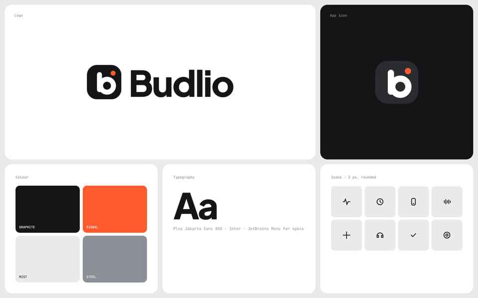
Sound that fits your day. Graphite, one signal orange, and a rounded b that still reads at app-icon size.
Plus Jakarta Sans for headlines, Inter for text, JetBrains Mono for specs, and a set of 2 px rounded icons.
Why this route
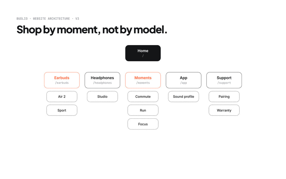
- Set asideA site organised by model
A list of model numbers says what the product is, not when you would use it.
- ChosenShop by moment: commute, run and focus beside the product lines
People find the right headphones by their day. The rounded b, graphite and one signal orange hold up at app-icon size and on a station billboard.
Identity.
The identity board: logo, app icon, four colours, type and icons.
Store.
A store organised by moment, not by model: commute, run and focus sit beside the product lines, and the home page carries one headline and one orange button.
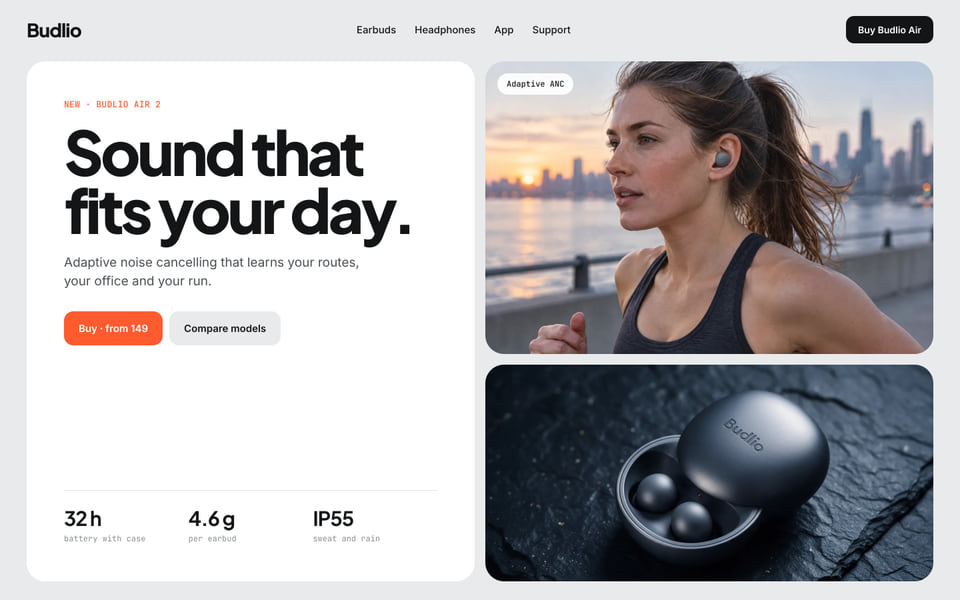
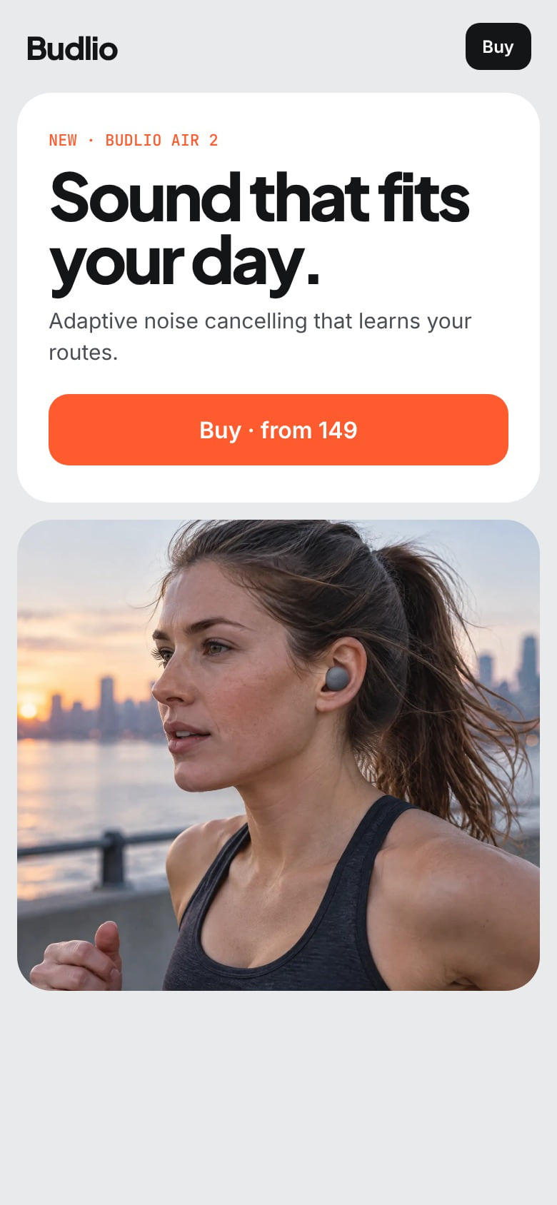
The home page on desktop and phone: one headline, one orange button.
Applications.
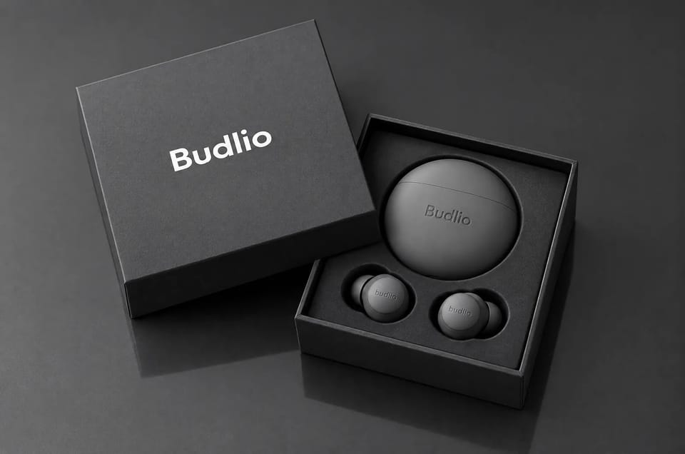
The identity on the pieces people hold, see and unpack.
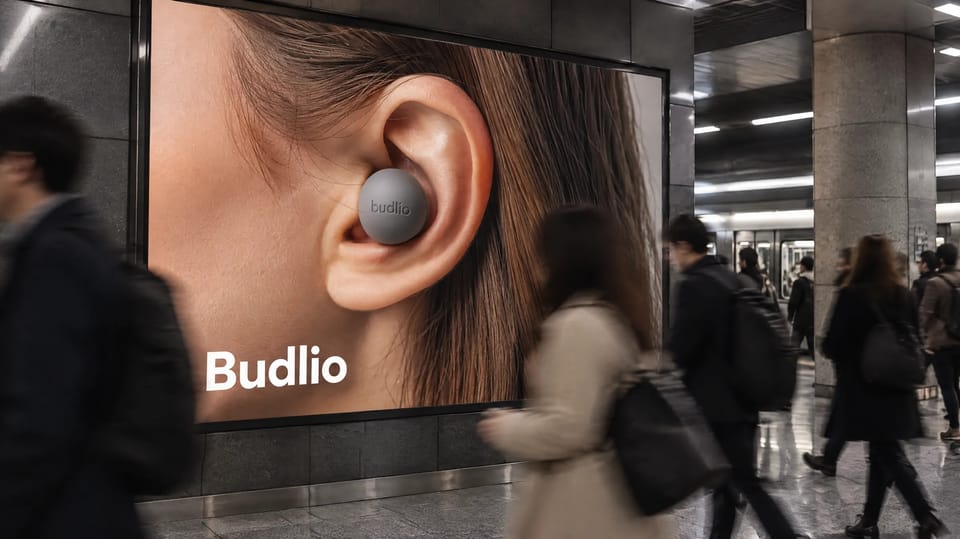
Designed applications
- Name and wordmark
- App icon
- Colour, type and icons
- Site architecture
- Out-of-home campaign
- Packaging
Credits Strategy, naming, identity and art direction by the Brandtune studio.
Your identity and your website, designed as one project.
Scope and schedule in writing before design starts.
- 01You tell us about the project in a short request.
- 02A short call to agree what the project needs.
- 03A proposal with scope and schedule in writing.