Brand Identity Design: Build a Cohesive Visual System
Elevate your company's presence with expert Brand Identity Design services. Create a seamless visual identity and find your unique domain at Brandtune.com.

Your business needs more than just a logo. It needs a complete Brand Identity Design. This combines your brand's strategy, looks, and how it's shown everywhere. A cohesive system makes your brand stand out, builds trust, and encourages people to buy from you. It also cuts down on extra design work and speeds up how quickly things get made.
A well-thought-out design system lowers the money you spend to get new customers and makes your brand look better. It makes creating content easier and lets you launch campaigns faster. Your brand becomes more consistent, which helps launch new products. It provides clear instructions for your team and partners.
Here's what needs to be done: figure out your brand's position and message. Then, turn these into a visual identity that can grow. Set up clear brand guidelines. Finally, make sure everything is applied properly. The result? A dynamic system that works across all channels, rather than just a single design.
You'll end up with a bunch of useful tools. These include a clear brand position, key messages, a set of logos, colors, fonts, and layouts. Also, you'll get icons, a style for illustrations, advice on photos, how to use motion, standards for making things easy to access, and an updated guide to your brand. This leads to quicker launches, a united look and feel, consistent user experiences, and a stronger brand.
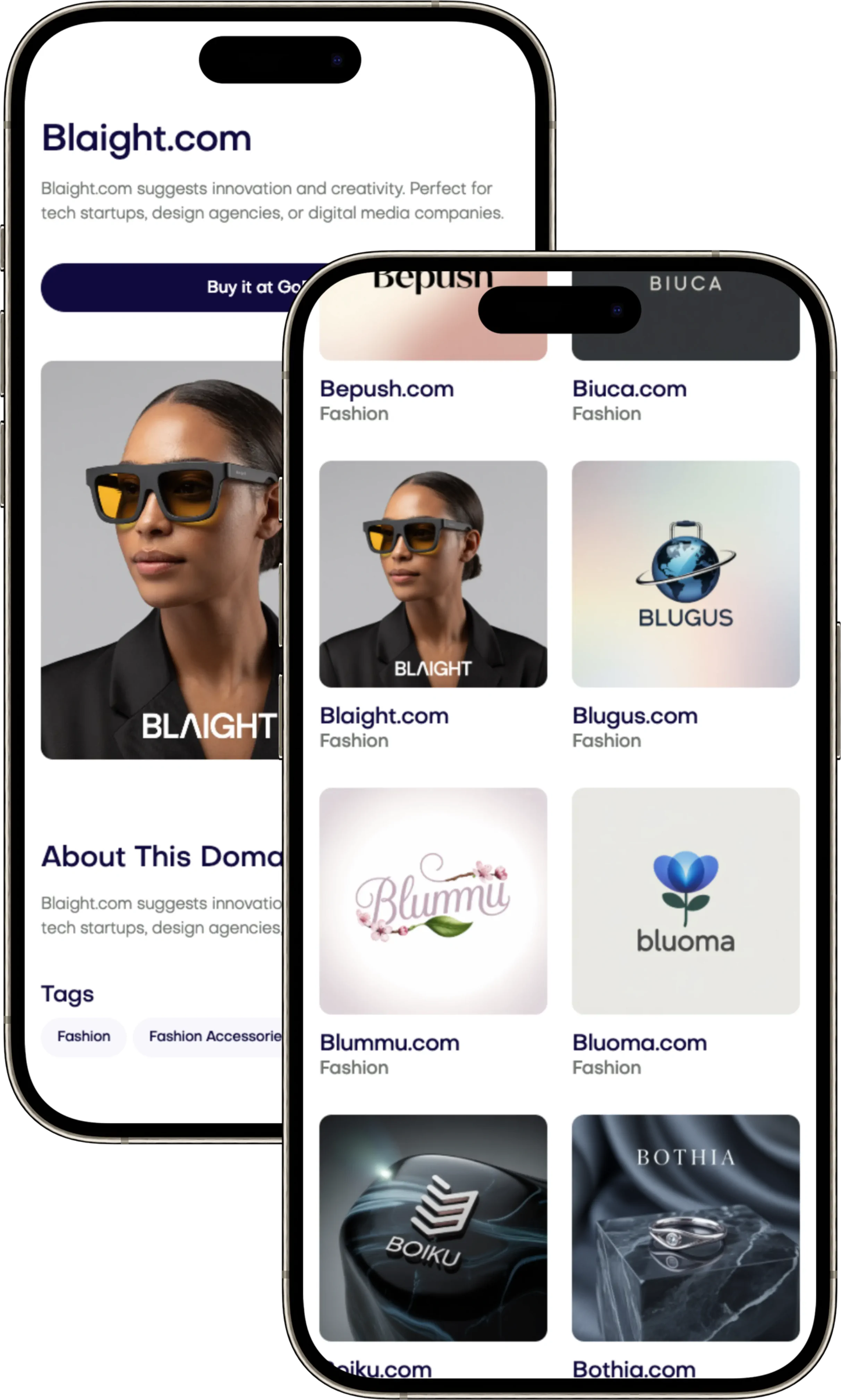
Take the lead and choose a unique, memorable online space for your brand. You can find great domain names at Brandtune.com.
What Is a Cohesive Visual System and Why It Matters
When every impression looks and feels the same, your business grows faster. Having a cohesive visual system makes your brand appear as one whole entity, not just separate parts. This unity encourages consistent experience, stronger brand awareness, and recognition at every touchpoint.
Defining a visual system across touchpoints
A visual system sets the rules for how your brand appears across different platforms. It includes your website, app, social media, packaging, retail spaces, emails, presentation decks, and ads. This ensures your brand looks the same everywhere.
The core parts of a visual system are logo variations, color schemes, font styles, and layout grids. There are also rules for pictures, icons, and how elements move. All these elements work together so your brand can be flexible but still recognizable, from small details to large ads.
Key elements that create consistency and recognition
Clear organization, consistent color use, and predictable layouts make your brand easy to recognize. Visual clues like a specific color, font, or graphic style help people remember your brand. For example, Tiffany's blue color, Airbnb's font, or Spotify's special graphic effects.
Keeping a balance of repetition and new elements makes your brand feel familiar yet exciting. Stable and unique patterns help your brand stand out, making it more memorable without being boring.
How cohesion improves user trust and conversion
A cohesive design helps people understand your brand better, making them more confident in using it. Easy-to-recognize designs help users navigate and complete tasks like signing up or buying. This makes your website or app more user-friendly.
When your brand looks consistent, it can help increase clicks, keep people on your site longer, and help them remember your brand. A trusted and familiar design increases confidence and leads to better performance across all platforms.
Brand Identity Design
Your brand identity succeeds when strategy comes first. Before drawing, understand your positioning, value, and customer needs. Identify your unique spot and competition to know what you'll own in people's minds. Use insights to create your brand promise, personality, and evidence. This approach guides naming, key messages, and a detailed brief, making decisions faster.
The role of strategy before aesthetics
Create a statement that identifies your audience, the problems you solve, and the benefits you deliver. Check if it fits the market and stands out from competitors. List evidence like case studies, reviews, or product successes to support your promise. Agree on how to measure success, so you can make creative decisions together.
Translating positioning into visual language
Transform your statement into visuals that show your intent quickly. Pick colors that reflect your brand's values. Choose fonts that fit your brand’s voice: friendly, modern, or authoritative. Design a logo that fits yet differentiates in your category. Prepare a mood board with your team’s approval before starting production.
Test your designs on key platforms like websites, apps, presentations, and packages. Make sure your brand can be recognized and works well everywhere. Check every detail, like spacing and icons, to stay consistent across all uses.
Aligning identity with audience expectations
Test your designs with your audience to see if they’re clear, credible, and unique. Aim for a mix of the familiar and the new to stand out. Adjust your designs for different settings like online shopping, B2B, and social media to stay true to your brand.
Monitor how well your designs perform by tracking clicks, engagement, and conversion help. Update your visuals and messaging as needed based on feedback. Being consistent earns trust, and staying relevant keeps it.
Core Building Blocks: Logo, Color, Typography, and Layout
Your brand shines when all parts work together. You should build a solid logo system and choose colors carefully. Also, decide on the types of fonts to use and create a consistent layout grid. These elements make your brand look the same on apps, websites, print, and packaging.
Logo marks and wordmarks that scale and adapt
Make a set that includes main logos and ones for small spaces. Use a symbol and a clear name that looks good even when very small. Check that it's easy to see on both light and dark backgrounds, set space around it, and make sure to have it ready in all digital forms. This helps your logo look great everywhere.
Color systems with primaries, neutrals, and accents
Decide what colors stand for: main ones show your brand, neutral ones for balance, and bright ones for action. Use different colors for success, warnings, errors, and helpful info. Turn these into digital color codes and keep track of how much you use them. This keeps your colors consistent everywhere without being too much.
Typographic hierarchies for clarity and tone
Choose a main font set that offers different styles. Create a flexible system for using big and small text clearly. Set rules for how text looks and provide backup options to keep your website fast and sounding right.
Grids and spacing to unify layouts
Start with a basic grid and use even spacing to make everything look orderly. Decide on the size of spaces, columns, and how it all changes on different devices. Make notes on how to arrange content and use these guidelines for everything your team makes. This keeps your designs consistent across what you create.
Designing a Flexible Visual Language for Omnichannel Use
Your business needs a visual system that works in many places. This includes the web, mobile apps, social media, ads, and print. It's important to think about omnichannel branding from the beginning. This makes sure that every interaction feels planned and connected. A good design system has parts that work well on different platforms and look clear everywhere.
Modular components for digital and print
Create a library with reusable parts like hero blocks, feature grids, and more. Include different styles for light and dark themes, and choose layouts that focus on pictures or text. Make sure to set spacing and size rules to save time and keep quality high.
For printed materials, use the same parts. Pick paper details that go with your colors. Have ready-made designs for things like brochures so teams can work quickly. By linking digital and print details, everything matches perfectly.
Responsive behaviors for different screen sizes
Explain how components change from desktop to mobile. Choose text sizes, picture adjustments, and button sizes that work well on all devices. Also, outline how logos, menus, and content should adapt to keep designs readable and neat.
Give clear examples of what to do and what not to do. This helps avoid mistakes. Show how to handle changes in size and interactions. This makes sure designs work predictably on different platforms.
Iconography and illustration styles that extend the system
Make a standard for icons with consistent size and shape. Choose visuals that match your brand and avoid clutter. Create an illustration style that uses the same colors and details for clarity.
Share files that can be edited, names for layers, and settings for saving. Connect icons and illustrations to your design parts. This makes your branding work smoothly across different channels without extra effort. It keeps your visuals adaptable and ready to grow.
Crafting a Memorable Verbal-Visual Connection
Make what people read match what they see to help them remember. Start with a unique brand voice. Tie your key messages to visual signs. Use headlines that highlight benefits with pictures showing results.
Keep the same tone across ads, product pages, and help topics. This builds trust.
Develop a verbal identity that shapes your word, rhythm, and size choices. Craft a short tagline that conveys meaning quickly. Sequence attention with copy and design: start from the headline, to the subhead, then picture, and lastly, the call to action.
Use stories to showcase value with action words that show change and results.
Create brand assets that are easy to use everywhere. Make a headline formula for ads. Set patterns for short copy in forms, hints, and error messages. Short lines are easier to read and keep your team on track.
Test these lines with your designs to see if they stand out well.
Make a content plan everyone can use quickly. Set rules for headlines, action words, and user experience writing that consider reading levels. Keep records of examples for web, emails, products, and ads.
Prepare for different languages by setting limits on line and character counts. This makes sure words fit well in designs without losing meaning.
Creating a Style Guide That Teams Actually Use
Your business needs a style guide that's easy and quick to use. It should be clear and help teams quickly find what they need. Think of it as a live tool that helps everyone in design, marketing, and product work better together.
Structure of a practical brand guideline
Start with the basics: strategy, voice, and principles. Next, put in core assets like logos, colors, and fonts. Include patterns, icons, illustrations, and design tokens. End with how to use them on the web, social media, in print, and products. Don't forget rules for approvals and updates.
Make sure everything is easy to find and use. Have short pages and clear signs to guide people. Keep your asset library close so people can use it without having to go elsewhere.
Usage rules, do’s and don’ts, and edge cases
Be clear on how to use things: logo size, where to place them, and what backgrounds work. Show what works and what doesn't for colors, fonts, and photo cropping. Use examples that make choices clear.
Think about special situations like working with other brands, ads in small spaces, or designs for outdoors. Include how things should adapt from phones to big screens. Show how to make things move or respond.
Asset management and version control
Have one place where everyone can get what they need. Provide everything: logos, color codes, fonts, templates, and more. Keep a log of changes so everyone knows what's new and why.
Set up a system for handling requests and making decisions. Use forms to keep track of new needs, who approves them, and what's decided. With a well-organized library and clear rules, your brand will be strong and consistent everywhere.
Imagery Systems: Photography, Motion, and Graphics
Your imagery helps others recognize you quickly. Think of it as a product. Explain the way photos change across campaigns. Show how movement grabs attention. And how graphics connect everything. Write down your choices so your team can make visuals that grow with your business.
Art direction for consistent photo libraries
Begin with a clear style for photos. Choose subjects that show real uses: people, tools, places your market recognizes. Set rules for how you compose your photos. Think about using thirds, leaving space for text, and keeping horizons level. Use lighting that's soft, has consistent colors, and makes skin look natural.
Talk about depth, who you include, and the setting. Give examples of what to do and what not to do, from start to finish, and how to tag everything. Using programs like Adobe Lightroom or Capture One. These rules help create a photo library even big companies would admire for its detail.
Motion principles for video and micro-interactions
Use motion to explain things, not just to add flair. Pick how things move and stop: softly for transitions, quickly for reveals. Choose how long hovers, taps, and changes last. Plan how everything should start and stop with a reason.
Make rules for videos that work on platforms like TikTok, Instagram, YouTube, and LinkedIn. Keep to the right sizes and how to save files. In apps, link small animations to actions—like loading or success—so users understand what's happening and why.
Graphic devices, textures, and patterns
Design a graphic system that shows off your brand’s personality. Make rules for how to use frames, shapes, dots, color changes, and lines. This helps keep designs clean, not cluttered. Use grid logic to make patterns that fit print, online, and packaging.
Put together vector files in SVG and AI with clear names and colors. Add guides on using textures with text, grounding data with shapes, and telling stories with patterns. This helps keep your visuals the same from websites to booths at events.
Accessibility and Inclusivity in Visual Design
Make sure inclusivity is a key part of the product. Always set clear rules for accessibility. This includes having strong color differences for text, buttons, and icons. Use fonts that are easy to read and big enough.
Make sure keyboard users can navigate easily. Their motion through the site should feel smooth.
Design so everyone can understand, no matter the context. Use colors and icons or words together. This avoids confusion. Write alt text that explains what's important.
Provide captions for videos. When showing charts, offer written summaries. Make sure controls are easy to see and use.
Include accessibility from the start of your design process. Check your work regularly. Publish details about how things should work. Test with different devices and pay attention to how people interact with your design.
Consider dark mode important. Ensure it has the right colors and text sizes for dim light conditions.
Give your team tools they'll use every day. This includes patterns for focus styles and tips for keyboard use. Offer examples of good alt text. Keep a simple guide that grows with your projects.
Measurement: Evaluating Brand Consistency and Impact
Your brand grows when you use data to make creative choices. Always set clear goals and check your progress. Make sure every design decision helps your business succeed.
Defining KPIs for brand recognition and recall
Start by setting brand KPIs that match your market goals. Keep track of both aided and unaided recall, logo spotting, uniqueness scores, and your search share. See how your visuals lift your brand during campaigns.
Create a score for how consistent your design is across the web, apps, social media, and stores. Connect how people engage with your brand's colors, fonts, and movement. Look for changes in how well people remember your brand after big events or seasonal efforts.
Auditing touchpoints for visual compliance
Every quarter, check how your brand looks on your site, in your product, emails, social media, sales materials, packaging, and at events. Score how well you use your logo, colors, font order, image style, and if things are easy to access. Use checklists to keep your design on track.
Focus on the most important fixes first. Tackle big problems like colors that don't fit your brand or missing descriptions for images. Write down every change and update your main design files to avoid old mistakes.
Testing and iterating based on user feedback
Improve your designs by testing with users and comparing options. Try different colors, font sizes, and pictures to make your message clearer and faster to get. Make sure your ads and landing pages look and feel the same to keep visitors from leaving.
Keep making your system better with what you learn. Refresh your design pieces and check if you're doing better at getting recognized and remembered.
Implementation Roadmap and Governance
Start by launching your main assets on key channels. Next, bring templates and elements to other areas. Use a clear plan to swap old materials with new ones. Set end dates for old items and monitor their replacement.
Keep the team focused with quick goals. Make sure everyone knows the limits to prevent changes in plans.
Set up a system that combines quick actions with thorough checks. Form a brand team with leaders in marketing, product, and design. This team will decide on key roles and rules. They will also set a process for approving new ideas after testing them.
This setup helps keep your brand consistent while allowing creativity.
Help everyone use the system the right way through training. Offer workshops, videos, and guides fit for each role. Set up a place for questions and quick help. Provide easy-to-use templates and a library of assets.
Include quality checks in your creative steps. Check colors, fonts, and accessibility before finalizing. This helps maintain high standards effortlessly.
Regularly update everyone on new methods and improvements. Make sure these updates match with your product and marketing plans. This keeps everyone aligned. Keep your core brand strong online. Then, grow your brand with confidence. Visit Brandtune.com for ideas on premium brand domains.
Your business needs more than just a logo. It needs a complete Brand Identity Design. This combines your brand's strategy, looks, and how it's shown everywhere. A cohesive system makes your brand stand out, builds trust, and encourages people to buy from you. It also cuts down on extra design work and speeds up how quickly things get made.
A well-thought-out design system lowers the money you spend to get new customers and makes your brand look better. It makes creating content easier and lets you launch campaigns faster. Your brand becomes more consistent, which helps launch new products. It provides clear instructions for your team and partners.
Here's what needs to be done: figure out your brand's position and message. Then, turn these into a visual identity that can grow. Set up clear brand guidelines. Finally, make sure everything is applied properly. The result? A dynamic system that works across all channels, rather than just a single design.
You'll end up with a bunch of useful tools. These include a clear brand position, key messages, a set of logos, colors, fonts, and layouts. Also, you'll get icons, a style for illustrations, advice on photos, how to use motion, standards for making things easy to access, and an updated guide to your brand. This leads to quicker launches, a united look and feel, consistent user experiences, and a stronger brand.
Take the lead and choose a unique, memorable online space for your brand. You can find great domain names at Brandtune.com.
What Is a Cohesive Visual System and Why It Matters
When every impression looks and feels the same, your business grows faster. Having a cohesive visual system makes your brand appear as one whole entity, not just separate parts. This unity encourages consistent experience, stronger brand awareness, and recognition at every touchpoint.
Defining a visual system across touchpoints
A visual system sets the rules for how your brand appears across different platforms. It includes your website, app, social media, packaging, retail spaces, emails, presentation decks, and ads. This ensures your brand looks the same everywhere.
The core parts of a visual system are logo variations, color schemes, font styles, and layout grids. There are also rules for pictures, icons, and how elements move. All these elements work together so your brand can be flexible but still recognizable, from small details to large ads.
Key elements that create consistency and recognition
Clear organization, consistent color use, and predictable layouts make your brand easy to recognize. Visual clues like a specific color, font, or graphic style help people remember your brand. For example, Tiffany's blue color, Airbnb's font, or Spotify's special graphic effects.
Keeping a balance of repetition and new elements makes your brand feel familiar yet exciting. Stable and unique patterns help your brand stand out, making it more memorable without being boring.
How cohesion improves user trust and conversion
A cohesive design helps people understand your brand better, making them more confident in using it. Easy-to-recognize designs help users navigate and complete tasks like signing up or buying. This makes your website or app more user-friendly.
When your brand looks consistent, it can help increase clicks, keep people on your site longer, and help them remember your brand. A trusted and familiar design increases confidence and leads to better performance across all platforms.
Brand Identity Design
Your brand identity succeeds when strategy comes first. Before drawing, understand your positioning, value, and customer needs. Identify your unique spot and competition to know what you'll own in people's minds. Use insights to create your brand promise, personality, and evidence. This approach guides naming, key messages, and a detailed brief, making decisions faster.
The role of strategy before aesthetics
Create a statement that identifies your audience, the problems you solve, and the benefits you deliver. Check if it fits the market and stands out from competitors. List evidence like case studies, reviews, or product successes to support your promise. Agree on how to measure success, so you can make creative decisions together.
Translating positioning into visual language
Transform your statement into visuals that show your intent quickly. Pick colors that reflect your brand's values. Choose fonts that fit your brand’s voice: friendly, modern, or authoritative. Design a logo that fits yet differentiates in your category. Prepare a mood board with your team’s approval before starting production.
Test your designs on key platforms like websites, apps, presentations, and packages. Make sure your brand can be recognized and works well everywhere. Check every detail, like spacing and icons, to stay consistent across all uses.
Aligning identity with audience expectations
Test your designs with your audience to see if they’re clear, credible, and unique. Aim for a mix of the familiar and the new to stand out. Adjust your designs for different settings like online shopping, B2B, and social media to stay true to your brand.
Monitor how well your designs perform by tracking clicks, engagement, and conversion help. Update your visuals and messaging as needed based on feedback. Being consistent earns trust, and staying relevant keeps it.
Core Building Blocks: Logo, Color, Typography, and Layout
Your brand shines when all parts work together. You should build a solid logo system and choose colors carefully. Also, decide on the types of fonts to use and create a consistent layout grid. These elements make your brand look the same on apps, websites, print, and packaging.
Logo marks and wordmarks that scale and adapt
Make a set that includes main logos and ones for small spaces. Use a symbol and a clear name that looks good even when very small. Check that it's easy to see on both light and dark backgrounds, set space around it, and make sure to have it ready in all digital forms. This helps your logo look great everywhere.
Color systems with primaries, neutrals, and accents
Decide what colors stand for: main ones show your brand, neutral ones for balance, and bright ones for action. Use different colors for success, warnings, errors, and helpful info. Turn these into digital color codes and keep track of how much you use them. This keeps your colors consistent everywhere without being too much.
Typographic hierarchies for clarity and tone
Choose a main font set that offers different styles. Create a flexible system for using big and small text clearly. Set rules for how text looks and provide backup options to keep your website fast and sounding right.
Grids and spacing to unify layouts
Start with a basic grid and use even spacing to make everything look orderly. Decide on the size of spaces, columns, and how it all changes on different devices. Make notes on how to arrange content and use these guidelines for everything your team makes. This keeps your designs consistent across what you create.
Designing a Flexible Visual Language for Omnichannel Use
Your business needs a visual system that works in many places. This includes the web, mobile apps, social media, ads, and print. It's important to think about omnichannel branding from the beginning. This makes sure that every interaction feels planned and connected. A good design system has parts that work well on different platforms and look clear everywhere.
Modular components for digital and print
Create a library with reusable parts like hero blocks, feature grids, and more. Include different styles for light and dark themes, and choose layouts that focus on pictures or text. Make sure to set spacing and size rules to save time and keep quality high.
For printed materials, use the same parts. Pick paper details that go with your colors. Have ready-made designs for things like brochures so teams can work quickly. By linking digital and print details, everything matches perfectly.
Responsive behaviors for different screen sizes
Explain how components change from desktop to mobile. Choose text sizes, picture adjustments, and button sizes that work well on all devices. Also, outline how logos, menus, and content should adapt to keep designs readable and neat.
Give clear examples of what to do and what not to do. This helps avoid mistakes. Show how to handle changes in size and interactions. This makes sure designs work predictably on different platforms.
Iconography and illustration styles that extend the system
Make a standard for icons with consistent size and shape. Choose visuals that match your brand and avoid clutter. Create an illustration style that uses the same colors and details for clarity.
Share files that can be edited, names for layers, and settings for saving. Connect icons and illustrations to your design parts. This makes your branding work smoothly across different channels without extra effort. It keeps your visuals adaptable and ready to grow.
Crafting a Memorable Verbal-Visual Connection
Make what people read match what they see to help them remember. Start with a unique brand voice. Tie your key messages to visual signs. Use headlines that highlight benefits with pictures showing results.
Keep the same tone across ads, product pages, and help topics. This builds trust.
Develop a verbal identity that shapes your word, rhythm, and size choices. Craft a short tagline that conveys meaning quickly. Sequence attention with copy and design: start from the headline, to the subhead, then picture, and lastly, the call to action.
Use stories to showcase value with action words that show change and results.
Create brand assets that are easy to use everywhere. Make a headline formula for ads. Set patterns for short copy in forms, hints, and error messages. Short lines are easier to read and keep your team on track.
Test these lines with your designs to see if they stand out well.
Make a content plan everyone can use quickly. Set rules for headlines, action words, and user experience writing that consider reading levels. Keep records of examples for web, emails, products, and ads.
Prepare for different languages by setting limits on line and character counts. This makes sure words fit well in designs without losing meaning.
Creating a Style Guide That Teams Actually Use
Your business needs a style guide that's easy and quick to use. It should be clear and help teams quickly find what they need. Think of it as a live tool that helps everyone in design, marketing, and product work better together.
Structure of a practical brand guideline
Start with the basics: strategy, voice, and principles. Next, put in core assets like logos, colors, and fonts. Include patterns, icons, illustrations, and design tokens. End with how to use them on the web, social media, in print, and products. Don't forget rules for approvals and updates.
Make sure everything is easy to find and use. Have short pages and clear signs to guide people. Keep your asset library close so people can use it without having to go elsewhere.
Usage rules, do’s and don’ts, and edge cases
Be clear on how to use things: logo size, where to place them, and what backgrounds work. Show what works and what doesn't for colors, fonts, and photo cropping. Use examples that make choices clear.
Think about special situations like working with other brands, ads in small spaces, or designs for outdoors. Include how things should adapt from phones to big screens. Show how to make things move or respond.
Asset management and version control
Have one place where everyone can get what they need. Provide everything: logos, color codes, fonts, templates, and more. Keep a log of changes so everyone knows what's new and why.
Set up a system for handling requests and making decisions. Use forms to keep track of new needs, who approves them, and what's decided. With a well-organized library and clear rules, your brand will be strong and consistent everywhere.
Imagery Systems: Photography, Motion, and Graphics
Your imagery helps others recognize you quickly. Think of it as a product. Explain the way photos change across campaigns. Show how movement grabs attention. And how graphics connect everything. Write down your choices so your team can make visuals that grow with your business.
Art direction for consistent photo libraries
Begin with a clear style for photos. Choose subjects that show real uses: people, tools, places your market recognizes. Set rules for how you compose your photos. Think about using thirds, leaving space for text, and keeping horizons level. Use lighting that's soft, has consistent colors, and makes skin look natural.
Talk about depth, who you include, and the setting. Give examples of what to do and what not to do, from start to finish, and how to tag everything. Using programs like Adobe Lightroom or Capture One. These rules help create a photo library even big companies would admire for its detail.
Motion principles for video and micro-interactions
Use motion to explain things, not just to add flair. Pick how things move and stop: softly for transitions, quickly for reveals. Choose how long hovers, taps, and changes last. Plan how everything should start and stop with a reason.
Make rules for videos that work on platforms like TikTok, Instagram, YouTube, and LinkedIn. Keep to the right sizes and how to save files. In apps, link small animations to actions—like loading or success—so users understand what's happening and why.
Graphic devices, textures, and patterns
Design a graphic system that shows off your brand’s personality. Make rules for how to use frames, shapes, dots, color changes, and lines. This helps keep designs clean, not cluttered. Use grid logic to make patterns that fit print, online, and packaging.
Put together vector files in SVG and AI with clear names and colors. Add guides on using textures with text, grounding data with shapes, and telling stories with patterns. This helps keep your visuals the same from websites to booths at events.
Accessibility and Inclusivity in Visual Design
Make sure inclusivity is a key part of the product. Always set clear rules for accessibility. This includes having strong color differences for text, buttons, and icons. Use fonts that are easy to read and big enough.
Make sure keyboard users can navigate easily. Their motion through the site should feel smooth.
Design so everyone can understand, no matter the context. Use colors and icons or words together. This avoids confusion. Write alt text that explains what's important.
Provide captions for videos. When showing charts, offer written summaries. Make sure controls are easy to see and use.
Include accessibility from the start of your design process. Check your work regularly. Publish details about how things should work. Test with different devices and pay attention to how people interact with your design.
Consider dark mode important. Ensure it has the right colors and text sizes for dim light conditions.
Give your team tools they'll use every day. This includes patterns for focus styles and tips for keyboard use. Offer examples of good alt text. Keep a simple guide that grows with your projects.
Measurement: Evaluating Brand Consistency and Impact
Your brand grows when you use data to make creative choices. Always set clear goals and check your progress. Make sure every design decision helps your business succeed.
Defining KPIs for brand recognition and recall
Start by setting brand KPIs that match your market goals. Keep track of both aided and unaided recall, logo spotting, uniqueness scores, and your search share. See how your visuals lift your brand during campaigns.
Create a score for how consistent your design is across the web, apps, social media, and stores. Connect how people engage with your brand's colors, fonts, and movement. Look for changes in how well people remember your brand after big events or seasonal efforts.
Auditing touchpoints for visual compliance
Every quarter, check how your brand looks on your site, in your product, emails, social media, sales materials, packaging, and at events. Score how well you use your logo, colors, font order, image style, and if things are easy to access. Use checklists to keep your design on track.
Focus on the most important fixes first. Tackle big problems like colors that don't fit your brand or missing descriptions for images. Write down every change and update your main design files to avoid old mistakes.
Testing and iterating based on user feedback
Improve your designs by testing with users and comparing options. Try different colors, font sizes, and pictures to make your message clearer and faster to get. Make sure your ads and landing pages look and feel the same to keep visitors from leaving.
Keep making your system better with what you learn. Refresh your design pieces and check if you're doing better at getting recognized and remembered.
Implementation Roadmap and Governance
Start by launching your main assets on key channels. Next, bring templates and elements to other areas. Use a clear plan to swap old materials with new ones. Set end dates for old items and monitor their replacement.
Keep the team focused with quick goals. Make sure everyone knows the limits to prevent changes in plans.
Set up a system that combines quick actions with thorough checks. Form a brand team with leaders in marketing, product, and design. This team will decide on key roles and rules. They will also set a process for approving new ideas after testing them.
This setup helps keep your brand consistent while allowing creativity.
Help everyone use the system the right way through training. Offer workshops, videos, and guides fit for each role. Set up a place for questions and quick help. Provide easy-to-use templates and a library of assets.
Include quality checks in your creative steps. Check colors, fonts, and accessibility before finalizing. This helps maintain high standards effortlessly.
Regularly update everyone on new methods and improvements. Make sure these updates match with your product and marketing plans. This keeps everyone aligned. Keep your core brand strong online. Then, grow your brand with confidence. Visit Brandtune.com for ideas on premium brand domains.
Tags
Start Building Your Brand with Brandtune
Browse All Domains