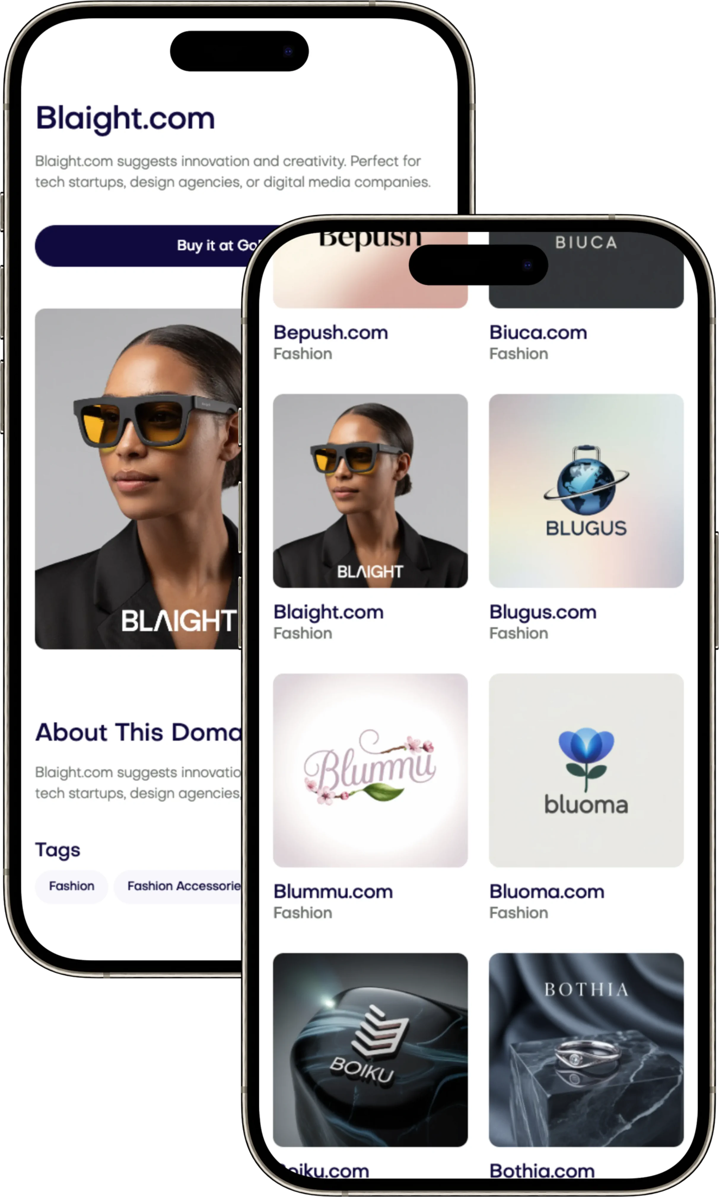
Iconic Brands: M·A·C - Makeup Art Cosmetics, Boldly Short
Explore the legacy of the MAC Brand Name, its impact on beauty culture, and why it stands out in the cosmetics world. Find your domain at Brandtune.com.

M·A·C (Make-up Art Cosmetics) proves a simple name can mean a lot. It was started in Toronto in 1984 by two friends. They built MAC into a trusted brand in the makeup world. This strong name is now known everywhere for its quality and style.
The MAC Brand Name is great because it's short and easy to remember. The name M·A·C is bold and feels fresh. The dot in the middle makes it stand out. This look works everywhere - on products, in stores, and online.
Try this for your business. Keep your brand name short, and make sure it sounds good. Pick a special style for writing it and choose your colors carefully. A good name tells a story, is easy to remember, and fits well with partners.
First, see if your name is short and clear. Can it work on something small or big? If yes, it will help people find you and talk about you. When it's time, find a great domain name at Brandtune.com.
The origin story that shaped a global beauty identity
The MAC founders worked under studio lights, creating makeup that had to shine on camera. They tested their formulas in real-world settings. This early effort earned their brand trust from both everyday users and makeup professionals.
Makeup artists as founders and the power of insider credibility
In 1984, in Toronto, Frank Toskan and Frank Angelo started a pro makeup brand. Toskan, a makeup artist, knew what worked best under lights. Angelo had the skills to grow their vision. They showed the world their quality before telling anyone about it.
They made products that stayed true in any light. This proven dependability showed their expertise. An ad couldn't do that as well.
From counter culture to couture: early adoption by pros and press
Pros and press loved their makeup kits. Their products appeared in magazine photoshoots. This visibility raised demand.
Trained artists at counters helped spread the word. This cycle made the brand more trusted and known.
How brand purpose informed naming, tone, and visual style
The name-Make-up Art Cosmetics-shows who it's for: artists and bold spirits. The brand's style is confident and clean. The look is simple, with a clear focus.
They also offer a wide range of colors and support cultural projects. Starting as MAC did can help any business stand out.
Minimalist naming: why short, punchy names stick in memory
Short names are easy to remember. They don’t need much effort to read, speak, or share. They help your brand stick in minds quickly and lastingly.
Cognitive fluency: ease of reading leads to recall
Cognitive fluency loves short names. M·A·C shows how three letters make it easy to recognize quickly. Simple shapes turn into memorable names since our brains like easy patterns.
Phonetics and rhythm: the crisp cadence of M·A·C
A strong phonetic strategy uses letters as sound cues. “MAC” hits sharply, with a distinct sound. This rhythm helps everyone remember the name easily in conversations or online.
Visual brevity across packaging and social feeds
Less letters means bigger, clearer text. On products or in ads, the short name is easy to see. In busy online feeds, simple designs help short names stand out better.
For your business, choose names with 3–6 letters. Make sure they are easy to remember, say, and hear. Check if they’re clear on apps, online, and on packaging. This makes your brand memorable.
Visual identity: the dot separator and typographic confidence
Your brand stands out when its design and function match. Strong fonts make your brand instantly recognizable. This makes products easier to read and helps grow your brand in many places. A simple visual sign, used carefully, makes your brand unique without being too much.
The centered dot as a distinctive typographic cue
The centered dot separates and unites letters in a special way. It helps move the eye, clear up space, and make your brand stand out online. Use this sign in headlines, on products, and online to keep your font game strong everywhere.
Pick a clear sign-separator, joiner, or a special shape-and use it wisely. You'll get fast recognition, smooth reading, and clearer product names in stores.
Black-and-white palette and professional aura
Black-and-white shows you mean business. It highlights colorful products and seasonal themes without extra fuss. Strong contrasts make photos, videos, and store setups pop. They also make products easier to read in different lights.
Stick to simple colors: mainly black-and-white, with a little color. This keeps your brand's look clear and lets textures and finishes add extra detail without mixing up your font style.
Scalability from lipstick bullets to billboards
A logo that works big or small keeps its sharpness. Clean lines and enough space between letters keep it clear at any size. This one design fits tiny icons, signs behind the stage, and big outdoor ads.
Try it on different materials and screens. If it looks good small and large, your brand stays known and trusted everywhere. This builds lasting brand appeal through fonts and design.
MAC Brand Name
The MAC Brand Name stands for “Make-up Art Cosmetics,” shortened to M·A·C. It shows skill, use, and industry roots quickly. The MAC meaning is clear: artistry first, cosmetics built for performance.
The MAC name is short, bold, and simple to say. It works well on packaging, in articles, and online. Its sound is easy worldwide, and the dot makes it pop. These features keep the name clear on tiny products and big signs.
Years of professional use and fashion shows have enriched MAC's image. Now, the name stands for more than makeup; it signals diversity and creativity for all. This message is understood around the globe.
Here's a tip for any business: pick a meaningful acronym. Create a visual style that enhances these letters. Whether it's for a beauty brand or any naming strategy, remember: make it readable, memorable, and easy to spread.
Acronym power: meaning density in three letters
Acronyms create rich meaning in small spaces. M·A·C embodies this: three letters signify expertise, category, and trust. Using acronyms, businesses gain a memorable and broad-reaching name. It's perfect for online, packaging, and global markets.
Compressing a brand’s promise into initials
M·A·C stands for "Make-up Art Cosmetics," offering a clear, potent message. It tells customers what you offer and your excellence. Acronyms ease communication and help consistency across all platforms.
Signaling expertise through expanded meaning
Unfolding M·A·C reveals its depth: "Make-up Art Cosmetics" suggests high standards. It appeals to shoppers seeking expert products. Choose initials that convey your brand's authority and suit your acronym strategy.
How acronyms travel across cultures and languages
Short acronyms adapt well internationally. They're simple, memorable, and work well in various languages thanks to clear visuals. They're great for teaching and remain recognizable from online to outdoors.
Pronounceability and global resonance
A name's fast catch can make a big difference. Think about how it sounds when said out loud. A name like MAC hits strong with just one beat. This simplicity helps people remember it all around the world. Picking easy-to-say names for your business is smart. They fit snugly into everyday chats.
Simple syllable structure for multilingual markets
A single syllable can bridge the gap from hearing to remembering. It fights off accent changes and keeps your message clear. This works great for training and selling across the globe. Choose names that hold true in any language.
Audio branding in videos, tutorials, and retail counters
Short names shine in videos and social media. They stand out, even with background noise. When testing names, try saying them loud or soft. Make sure voice searches pick it up easily.
Nicknames, hashtags, and the social vernacular
Compact names fit well in social media. For instance, #MACCosmetics groups together all related posts. Keep your online tags consistent. Watch related words to stay on topic. This strategy helps people find you and keeps your name clear.
Brand storytelling embedded in the name
The name M·A·C means pro craft for all. It mixes studio quality with fun at home. This is storytelling that's clear, bold, and culturally smart.
From “studio” roots to everyday artistry
Make-up Art Cosmetics feels pro yet friendly. It's about being an expert without being exclusive. Companies can use this approach. They make expert goals feel simple for everyone.
Its short name works well online and on products. It turns expert methods into something we do every day. This supports a beauty brand for all, making polished looks easy.
Professional credibility meeting pop culture
M·A·C won over artists and then got famous with stars like Rihanna and brands like Balmain. Each team-up keeps the brand fresh without changing its name.
Keep your main name but add through partnerships. Let your allies add new layers while your brand remains solid and known.
How the name cues inclusivity and bold self-expression
The simple, neutral name invites everyone. With lots of color choices, it supports a beauty brand for all. It says: Your face, your rules.
Pick names that back self-showing and community pride. A name that fits many identities makes your brand's story richer and more relevant with each launch and partnership.
Packaging and retail: name-led design consistency
Your name should guide the design. On small items like lipsticks and brushes, keep the logo clear. Use the same size and spot for your logo to look the same on everything. This makes items easy to spot and they look strong on shelves.
Use these rules in stores too. Use simple colors and big signs to show your brand clearly. For beauty items, the same materials and clear signs make your logo stand out everywhere.
Having a simple logo helps a lot. It means fewer mistakes on packages and less work for changes. Easy rules for printing help lower risks when making items in different places.
Make a design plan. Set guidelines for where logos go to make them easy to read. Share these rules with your team. This keeps your look the same everywhere and makes items pop on shelves.
Search and discoverability: how the name fuels SEO
A short, distinct name makes it easy for users to find what they're looking for. Clear signs in typography and packaging help people recognize a brand in search results and stores. This boosts the brand's online presence on different platforms.
Branded search volume and navigational queries
When folks search for things like “M·A·C lipstick” or “M·A·C Studio Fix,” they show they're looking for something specific. These searches lead to official sites, store locators, and trusted shops. They increase clicks and make the brand's search page look better with images and product details.
Co-occurrence with product categories and shades
Connecting the brand with types of products-like lipstick, mascara, foundation-and colors makes it easier to find. Using these related keywords in titles, descriptions, and pictures helps search engines. It makes it simpler for people to find both popular items and specific colors.
Avoiding ambiguity while encouraging brand-serp dominance
Unique visual symbols, consistent images, and reliable listings prevent mix-ups with other terms. Using structured product info and clear content areas boosts the brand's SEO. It keeps the brand's search page accurate for specific searches and general brand-related searches through all seasons.
Collaboration-ready: a name that pairs well with partners
M·A·C shows a crisp name helps in co-branding. The compact mark fits well with “M·A·C x” lockups. It ensures visuals stay aligned and adds flair from partners. Use this approach to grow your brand smoothly.
Limited editions and artist tie-ins
Fans look forward to limited edition team-ups. Examples include “M·A·C x Keith Haring” or “M·A·C x Selena.” Artist partnerships add story and the core logo builds trust. This naming makes it easy for shoppers to remember and share.
A simple formula works best: one main name, one symbol, one release. This keeps your offers clear, reduces mess, and makes them seem more valuable.
Co-branding symmetry across typography and visuals
The dot, bold name, and simple colors blend easily with partners like Disney or Mariah Carey. This design supports seasonal art and special packaging. It keeps the look consistent everywhere.
Set up your brand similarly: establish guidelines for layouts. Keep your main colors the same; change smaller details to match the theme.
Expanding reach without diluting core identity
Smart co-branding keeps the main logo same. M·A·C uses colors and designs to tell each new story. Each partnership widens the brand's appeal without losing its identity.
For your brand, always use your main logo, set rules for naming team-ups, and manage how things look together. This will help you reach more people without losing your brand's special meaning.
Community and culture: the name as a badge of identity
M·A·C stands as a symbol within its community. People wear it to show they belong to a world of creativity. Whether it's in professional settings or on social media, the logo means art, performance, and welcoming vibes. This symbol is recognized everywhere, from drag shows to glamorous movie premieres.
It's easy to share the brand because its name is short. People can quickly tag it in their beauty tutorials or product reveals. This fast sharing boosts the discovery of new creators. With every post, friends approve and admire each other's style decisions.
Teaching customers turns them into devoted fans. M·A·C offers expert classes and supports important causes. This involvement makes people want to keep coming back and to bring friends along.
To use this strategy in your business, make a name that's easy to tag. Create specific hashtags for different events and share expert advice. Give small funds to creators and praise the best content from your community. This will make your brand's symbol a part of people's identities. Then, fans will spread your mark everywhere, increasing your brand's impact and loyalty among various creative groups.
Lessons for founders: naming takeaways inspired by M·A·C
Your name is more than just a word. Think of it as a product you can improve. Test it and see how it fits in the real world. Have a clear method so your team can grow confidently.
Keep it short, strong, and story-rich
Pick a short name that means something. Make sure it's easy to understand and sounds good. Also, be sure it works well in slogans and different products. Share its backstory to add more meaning everywhere it appears.
Start using founder tips early on. Try out memory tests and check how it sounds. Make sure it fits different areas you might enter. Have a consistent story across all your materials.
Design a distinctive typographic signature
Make a symbol that stands out easily. It could be a special dot, a unique connection between letters, or a different line thickness. This makes your brand memorable through design, not just looks.
Decide on design rules early: how far letters are spaced, color contrast, and size limits. Use this style in everything from packaging to websites. This keeps your brand easy to recognize.
Plan for omnichannel readability and recall
Make sure your name works small on phones and big on signs. Check it looks right on screens and in print. Also, ensure it's clear in videos and ads. Brands need to be consistent to be remembered well.
Create a useful checklist: test how it sounds, make sure it works worldwide, and check packaging. Look at how easy it is to remember before you launch. Improve your method as you learn more.
Always have your guide ready: tips for daily choices, big decision advice, and design guidelines for growing. This careful planning adds value to your brand.
Take the next step: explore brandable domains that fit your vision
Your name should grab attention. Choose a domain that's short and easy to remember. It should match your vibe and be easy to say. Go for domains that are clear and stick in the mind. They should work well everywhere, like on phones and online.
Make sure it sounds good and checks out on all devices. Say it out loud and see if it's catchy. Do a quick search to see if it's not taken. Pick a name that's easy to remember and avoid complicated words. Say no to hyphens and numbers if you can.
Start by looking at what you already have. Make a list of names you like, then test them with friends. Make sure your social media names match your domain. This helps keep your brand together. Create a landing page to draw people in early.
Don't wait around, grab your perfect domain now. You can find great ones at Brandtune.com. Do a domain search and pick the best one. Let your domain name tell your story everywhere.
Tags
Start Building Your Brand with Brandtune
Browse All Domains