Brand Style Guide: Keep Design Consistent
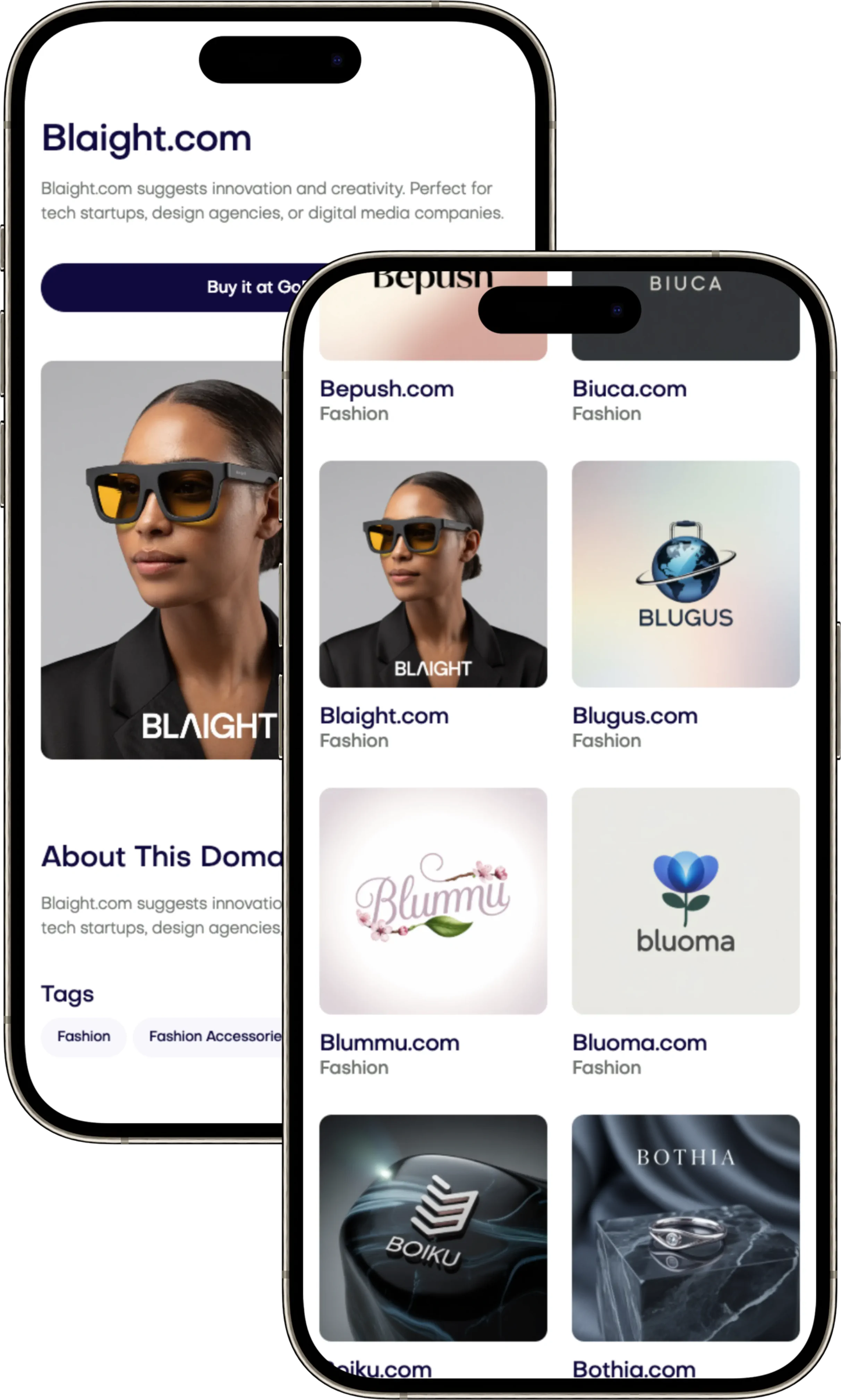
Craft a cohesive visual identity with a Brand Style Guide. Ensure consistency across all platforms and check out Brandtune.com for your domain needs.

When every part of your business matches, it grows quicker. A brand style guide ensures your look and message are consistent. It tells you how to use brand elements and keeps designs tight and memorable.
Being consistent makes your brand more recognizable and trusted. Studies show well-aligned brands earn more and keep customers loyal. A detailed brand book puts these insights to work. It guides how to use logos, colors, words, and more to stay on track.
Having a plan speeds up making things. Clear rules and templates mean less redoing, faster projects, and saved money. It keeps everyone on the same page, makes quick decisions possible, and scales your creative vision.
Your guide should talk about looks, words, and how to use certain tools. It helps everyone work together better and supports design with patterns that are ready to go. Start building now for a unique spot on the web-find great domain names at Brandtune.com.
Why Consistency Matters in Visual Identity
Your audience scans fast. A clear visual identity helps everyone know what you're about. Using similar colors, fonts, and layouts makes your brand easy to recognize. This helps your business grow without extra work from your team.
How consistent design builds recognition and trust
Seeing something over and over makes it memorable. Colors and shapes remind people of your brand. Like how Coca-Cola uses red and fancy writing or Spotify uses green with a circle design.
When you keep your look the same, people trust you more. Small details show that your business is dependable.
Reducing cognitive load with unified visuals
Having a consistent look makes things easier to understand. Using one grid style, similar colors, and the same kind of parts make information clearer. Research by Jakob Nielsen found that familiar designs help people use content better.
Repeat spacing, clear setups, and matching icons keep designs helpful. This makes even tricky information easy to get.
Aligning look-and-feel with brand positioning
Everything you show should match your brand's promise. Match your fonts, spaces, and colors to your brand's core message. For a luxury feel, use elegant fonts, lots of space, and a simple color scheme. Tech brands might use bold contrasts, flexible layouts, and dynamic elements.
Know who you're talking to and what you offer, then match your designs to these elements. This keeps your brand's visual identity sharp and strengthens trust with every interaction.
Brand Style Guide
Turn your vision into action with your style guide. Make it work everywhere: for all teams and over time. A guide with clear rules and good brand management lets everyone speak in one voice.
Core components every brand book should include
Begin with the basics: your mission, values, and what makes you different. Also, define your brand's character. This makes decisions easier and quicker.
Your logo needs rules for how to use it right. Include all versions and how not to use them. Choose colors that look good in print and on screens, with details like HEX and RGB values.
Show which fonts to use, how to arrange them, and what fonts are backups. Describe how photos, drawings, and icons should look. This keeps your visuals consistent.
Explain how your brand should sound and the mood for different situations. Talk about making content easy to use and understand. Show how to use design elements like buttons and templates.
Mapping guidelines to real-world use cases
Help your team by showing how the rules apply to projects like ads and websites. Look at big brands for examples of consistent branding.
Show what works and what doesn't with clear examples. This helps even non-designers use your brand right. Keep everything linked to your guide to avoid confusion.
Ownership, access, and governance of your guide
Choose someone to keep your brand guide up-to-date. Store it online as a always-updated resource with everything your team needs.
Control updates and track changes. Set rules for who can use the guide and how. This keeps your brand looking its best without slowing down work.
Logo Usage and Clear Space Best Practices
Your logo works hardest when it follows simple rules. Use these guidelines to boost your mark's impact across various platforms. Strong standards help your business grow without confusion. Consistency in proportions, spacing, and backgrounds builds trust.
Primary, secondary, and lockup variations
Start with a master logo in two formats: horizontal and stacked. Add an icon-only version for small spaces and a wordmark for text-focused designs. Use the full logo, wordmark, and icon smartly across different places. A monospaced version fits well in code UI or tight spots.
Create documented pairings of your logo with a tagline or product name. Make clear rules for their layout, size, and spacing. This ensures their relationship stays fixed. Detail how to place these elements in various layouts across all platforms.
Minimum sizes, padding, and background control
Define a small size limit for your logo to stay clear. Use pixels for digital and millimeters for print. A clear unit, like x-height, should determine space around your logo. Keep this area free from text or other elements.
Control your logo’s background to keep it visible. Use design solutions for busy images. These strategies help your logo stand out clearly.
Color-on-color and imagery placement rules
Offer color options: full color, single color, and reversed for dark areas. Avoid gradients that aren't in your guidelines. Don't alter the logo in ways that reduce its clarity.
Design safe areas to ensure logos align well on all materials. Avoid placing logos on highly textured or busy images. Use outlines or boxes when necessary to keep logos clear. This approach helps maintain your brand's identity.
Color Systems That Scale Across Channels
Your brand's color palette needs to work across all mediums. It should scale from screens to print, and to product UI easily. Be sure to keep specs like HEX, RGB, and CMYK consistent. This helps marketing, product, and print teams stay aligned.
Building a palette: primary, secondary, and neutrals
Start with defining one to three main colors for your brand. These are your primaries. Add secondary colors for visuals like charts and alerts, and neutrals for background and text. Record each color's HEX, RGB, CMYK, and Pantone for consistency across all materials.
Set usage ratios for a balanced look. The 60/30/10 rule is a good guide. Use primary colors for important buttons and highlights. Secondary colors can manage visuals like charts. Neutrals are great for surfaces and text. Examples from big names show how it’s done in real life.
Accessible contrast ratios for readability
Make sure your colors are easy for everyone to see from the start. Aim for a contrast ratio of 4.5:1 for text. For bigger text and important UI elements, 3:1 is okay. Define what combinations work and what don’t to avoid mistakes.
Consider different user interactions like hovering or clicking. They need clear, visible changes. For layers over images, use a minimum opacity or a backup color. This keeps text and buttons easy to see.
Color tokens for design systems and code handoff
Create meaningful design tokens like color-primary or text-muted. These should reflect your brand's values. Have versions for different themes and states to make things easier.
Prepare your design for both Figma and Sketch, and then make them match with CSS, Android XML, and iOS assets. Start with HEX, RGB, CMYK formats so engineering can easily adapt. This approach turns your color system into a smooth process from design to coding.
Typography for Readability and Brand Personality
Your brand's typography should show who you are before you even speak. Pick a main typeface that fits your brand's vibe: Inter for friendly talks, Poppins for a sleek look, or Merriweather for a sense of authority. Add a different font for special touches or longer reads. Have a plan for all your texts – headlines, main text, captions, and the small stuff – so everyone can work smoothly.
Start with a neat font order using sizes like 1.25 or 1.333. Make the text big enough to read, at least 16px, with space between lines about 1.4 to 1.6. The lines themselves shouldn't be too long or too short - aim for 45 to 75 characters. And don't forget to space things out to avoid a messy look and make reading easier.
When designing for websites, get your fonts ready from places like Google Fonts or by hosting them yourself. You'll also need backup options just in case. Remember to keep your site speedy: only load the font parts you need, use the right settings to prevent shifts on the page, and make fonts load quickly. And make sure your numbers and lists look sharp and tidy.
Think about users everywhere. Make sure your fonts work in different languages and have all the special bits needed. Check that your fonts are easy to read in various parts of your site, like menus and tables. Use your font plan everywhere – in titles, buttons, and forms – to help your brand grow strong and consistent.
Make everything clear: decide on font weights and styles, adjust spacing for ALL CAPS, and stick to your spacing plans. With definite guides for both web and print fonts, your team can create more quickly and keep everything readable, no matter where it shows up.
Imagery, Illustration, and Iconography Direction
Your brand's images tell a story everywhere they're seen. Keep everything in sync. Use photos, drawings, and icons from one asset library. Aim for pictures that show clarity, warmth, and purpose. This way, people get your message fast.
Photography style: subjects, framing, and mood
Show real people working, close-ups of products, and how products are used. Shoot from eye level or slightly above. Follow the rule of thirds and leave space for text and user interface designs.
Use natural light and soft contrasts. Keep things looking hopeful and genuine. Color grade softly but keep your brand's colors true. Retouch lightly to fix small issues but keep things looking natural.
Illustration guidelines: line weight and texture
Choose a unified style for illustrations. Use either simple vectors with light shadows or drawings with few fills. Set line weight at 2px to match icon strokes. Use your brand's main colors for consistent stories.
Add soft textures and depth wisely to highlight, not decorate. Use motion lightly for walkthroughs and getting started guides. Avoid overused ideas and go for clear action and outcomes. Keep original files well organized for updates.
Icon sets: grid, corner radius, and stroke rules
Make icons fit a 24px or 32px grid perfectly. Keep stroke weights, corner shapes, and joins consistent. Offer both outline and filled styles: outlines for general and low-key use, filled for active selections and important actions.
Save icons as SVG for products and PNG for guides. Name files clearly for easy searching and managing. Use clear, short descriptions for each icon to help everyone and support your brand's look across all assets and icon standards.
Voice, Tone, and Messaging Consistency
Your brand voice guides how your business talks on different platforms. It's important to have a consistent tone that adjusts but keeps its unique charm. Use a practical messaging framework and an editorial style guide. This helps keep teams on the same page and maintains high content quality everywhere from your website to customer support.
Defining voice pillars and tonal shifts
Choose four main pillars: clear, helpful, optimistic, expert. Then, map out how the tone shifts in different areas. For instance, marketing should be lively and brief; support, understanding and soothing; technical content, straightforward and simple; and wherever possible, use plain English instead of legal jargon.
Different situations call for different expressions of the same idea. For marketing: “Start faster with a guided setup.” For support: “I’m here to help you finish setup-let’s do it step by step.” Technical notes might say: “Run setup: select Settings > Start, then confirm.” And on social media: “New setup flow drops today-your faster start.” These keep your brand's voice consistent but change the tone as needed.
Editorial rules: grammar, casing, and punctuation
Start with AP style but with some specific changes. Use sentence case for UI elements and Title Case for headlines. Stick to American spelling, active sentences, and keep them short. When counting, write out numbers one to nine and use numerals for 10 and above. For dates, go with MMM DD, YYYY format. Time should be written like 3:30 PM. Stay away from complicated words and be inclusive and respectful in your language.
You should also set specific terms and words to avoid. Make rules for naming products and how to write them. Decide how to use hyphens and en dashes. And remember, using the Oxford comma adds clarity. Write all these rules down in an editorial style guide. This way, everybody will follow the same standards no matter what they're working on.
Microcopy guidelines for UI and product flows
When it comes to microcopy, start with verbs: “Create project,” “Save draft,” “Invite team.” Make sure keywords come first so people can find what they need quickly. Keep everything short and easy to scan. For buttons, don't go over 16 characters. Tooltips can be up to 120 characters, and notifications up to 140 characters.
For your pattern library, here's how to handle different messages. Errors should clearly explain what went wrong and how to fix it: “Payment failed. Update card to retry.” Confirmations should acknowledge actions and suggest next steps: “Profile saved. Add a photo next.” For empty states, give some context and suggest an action: “No reports yet. Generate your first report.” When onboarding, focus on one task per screen with clear progress indicators.
For accessibility, make sure links describe what they do, like “Download invoice PDF” and clearly state intent in aria-labels. Avoid using just color to convey information. Error messages should be easy to understand, specific, and linked directly to what they refer to. Keeping your messaging clear and consistent helps strengthen your brand voice everywhere in your product.
Templates and Components for Omnichannel Consistency
Get your business ready with brand templates. Make every interaction look consistent. Create master files for many needs like presentations and social posts. Set rules for text and images. Make sure teams can send stuff quickly and keep it on-brand.
Build a clear. easy-to-use library of design components. Use these pieces for key website elements. Document how they change like when clicked or filled out wrong. This keeps things working the same everywhere.
Start with omnichannel branding in mind. Connect design elements to all your platforms with examples. Share source files and ready-for-edit structures. This helps speed up approvals and cuts down on changes.
Keep all your assets organized in one place. Label them clearly. Automatically update your designs or DAM. Share guides for quick starts. Use marketing templates that match to keep your message clear and trackable.
Governance, Rollout, and Continuous Improvement
Create a clear set of rules for your brand. This lets your team know who makes decisions. Have someone in charge of this system, with experts for quality, language, and design help. Make sure there are steps for approving new stuff. Use a simple system to track changes so everyone knows what's new.
Introduce your style guide in a way that gets everyone on board. Start with training sessions and handy cheat sheets. Test the rules in a real project to see how they work. Have weekly times for questions and a quick help option. This helps turn rules into second nature.
Use data to make everything better. Check on things regularly and listen to what people say. Look at important numbers: how often assets are reused, how long things take to make, mistakes made, and how well people remember your brand. Focus on what needs improvement based on these clues. This way, rules are helpful, not just extra paperwork.
Always work on getting better. Review your materials every three months to keep up with new plans. Keep your guide updated and let everyone know about changes easily. This makes your brand stronger and helps you act with more confidence. When it's time for a change, look for great new names at Brandtune.com.
Tags
Start Building Your Brand with Brandtune
Browse All Domains