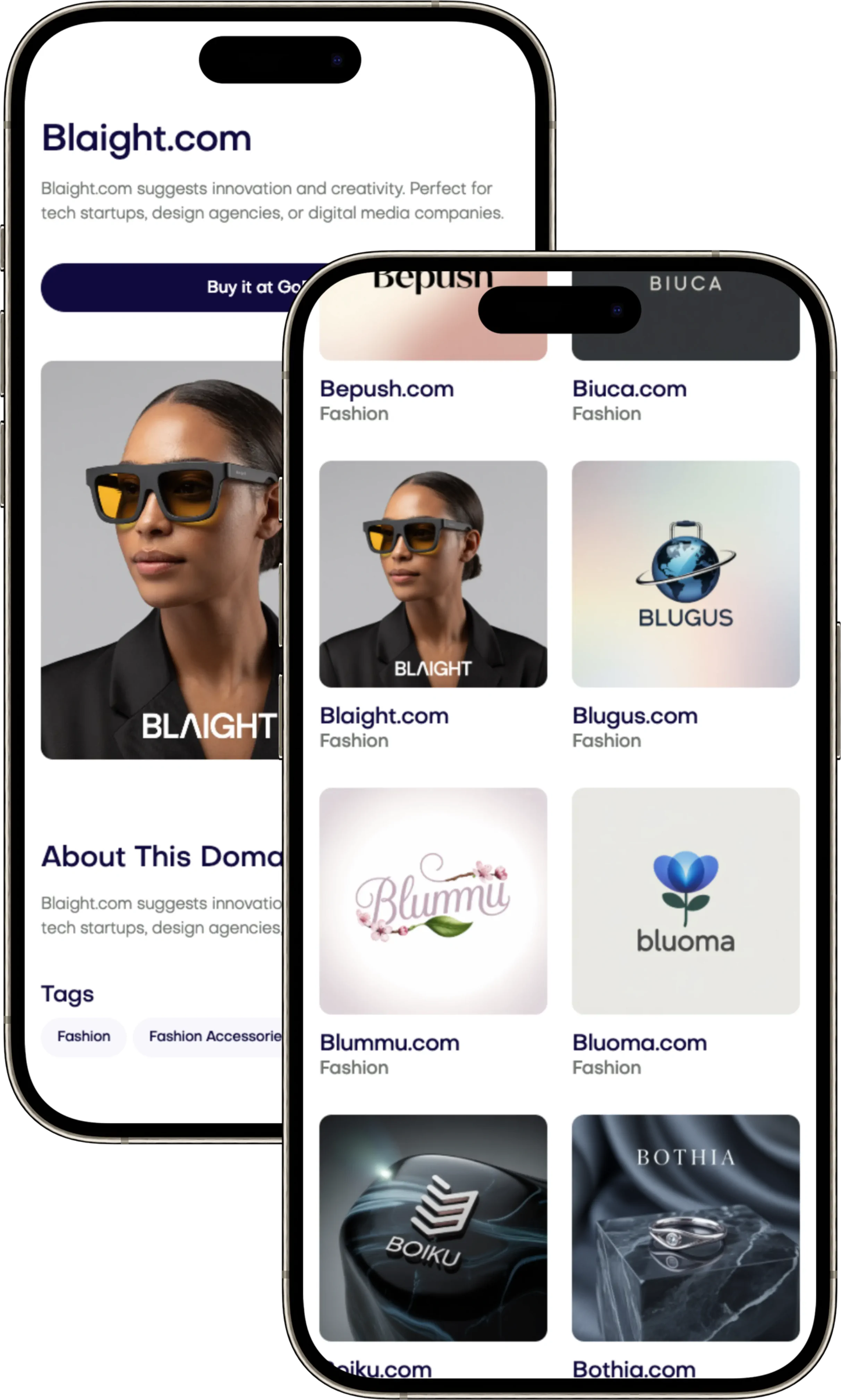
Branding for AI Companies: Humanize Advanced Technology
Elevate your app with our Apps Branding Principles guide, focusing on design strategies that boost growth and user loyalty. Find your domain on Brandtune.com.

Your app brand needs to attract users quickly and hold their attention. This guide links marketing strategy with action. It helps you match your product-led branding with design moves for growth and keeping users.
We focus on clarity, consistency, and continuity to grow brands. Clarity is about setting your mission, place in the market, and unique offer. Consistency ensures your app's look, sound, and feel are the same everywhere. Continuity helps users form habits and keeps them coming back.
Look at leaders like Duolingo and Spotify for inspiration. They show how good design leads to better user experiences. This includes everything from naming your app to messaging inside it. You'll see systems that work well on any platform.
You'll get a plan for your app's visual and motion identity. We also cover how to maintain your app's core quality as it grows. And how to pick a memorable name that matches your app's mission. You can find great names at Brandtune.com.
Building a Distinctive Brand Strategy for App Growth
Your brand grows when users grasp its clear purpose and see reliable results. Begin with a focused mindset. Address genuine needs. Demonstrate your product's reliability. Root every choice in what the user needs. Then, clearly display its value.
Defining a clear brand mission and promise
Formulate a concise brand mission statement. It should outline the change your app brings about. Combine it with a pledge that outlines expected outcomes and experiences. Employ Jobs-to-be-Done to pinpoint the main job, along with its emotional and social facets.
State a structured value proposition. It should include target users, the issue at hand, your distinct method, and the anticipated outcome. Make sure it's something you can test in the market. Highlight what's different with examples. Use one or two evidence points. Examples include Notion’s quick data capture, Figma’s precise teamwork tools, or Duolingo’s engaging streaks.
Positioning your app against alternatives in the market
Consider the real choices users face. These could be existing platforms, spreadsheets, email, or manual tasks. Position your app competitively with a perceptual map. This map would compare simplicity to power, or utilitarian value to enjoyment. Use category design to showcase how your app changes the game.
Show that your app fits well in the market with clear metrics and narratives. Illustrate how your solution lessens users' effort or boosts their confidence. Ensure the evidence is distinct and concrete, avoiding vague claims.
Aligning product roadmap with brand positioning
Pick a key North Star metric that mirrors your brand's promise. This could be the activation rate, week-four retention, or content creation levels. Link this metric to features that foster engagement and deliver value. If clarity is your goal, focus on clear starter content, thorough onboarding, and helpful advice. If you aim for power, develop complex settings and templates.
Create a one-page action plan. It should lay out the mission, promise, target audience segments, key challenges, positioning strategy, evidence points, and product initiatives. Regularly review this document as you decide what to focus on. Maintain your product's unique appeal by avoiding work that muddies your message. Make sure every update reaffirms your brand's commitment.
Visual Identity Systems That Scale Across Platforms
Your visual identity must look good big and as a tiny icon. Make sure your app's icon is easy to see at 48px on different backgrounds. Use simple shapes and a few colors for easy spotting, like Spotify's green circle or Duolingo's owl. Write down your branding rules so everyone tells the same story.
Logo systems and icons optimized for app stores
Build a logo system that adapts to different layouts like primary, horizontal, and stacked. Set rules for space, safe zones, and the smallest sizes for App Store and Google Play. Make perfect icons for iOS, Android, and the web. Include color and shape codes in your files to make sure corners look right.
Color, typography, and motion guidelines for consistency
Pick colors carefully and use codes like brand.primary to keep them consistent. Aim for color contrasts that are easy to read. Use a font system that makes head, subhead, and text clear. Make sure your fonts work everywhere you sell.
Make animations that help, not distract. They should move smoothly and quickly. Add a way to reduce motion and provide weight limits for animations. Give teams icons and illustrations to use right away to keep your brand unified.
Accessibility-first design choices that strengthen brand recall
Think about everyone from the start. Check that colors are easy to see. Use icons with words to help understand them. Make sure things are easy to click on and fit your brand. Fonts should be readable on small screens. Your logo should be recognizable anywhere.
Write down differences between iOS, Android, and web but keep core elements the same. Use codes to keep looks consistent. When everything matches in movement, contrast, and logo style, people learn and remember your product better.
Apps Branding Principles
Make sure your brand shows what your product does. Choose being clear over being clever. Good consistent branding is better than one-time wonders. Short names, clear defaults, and easy flows make branding useful every day.
Turn your story into actions. Use empty states for tips. Error messages should tell you what to do next. Success messages celebrate achievements. This shows your brand is reliable and easy to understand.
Have a mobile strategy that stands out but fits in. Use common iOS and Android gestures. Then, add your style with pictures, animations, and smart text. A fast, reliable, and smooth app builds trust.
Keep users coming back. Show them value right away. Celebrate their achievements. Offer new stuff and suggestions for them to check out. Combine keeping and growing users with smart alerts and updates that keep them engaged.
Make sure your app is easy for everyone to use. Use clear fonts, high contrast, and settings for less motion. Good branding means everyone can use your app easily, including clear focus, captions, and voice support.
Build a community. Ask for reviews, show what users say, and share easy-to-use templates. As you grow, keep quality high with rules: use design tokens, reusable parts, and team check-ins that follow your branding rules.
Track the right things and make changes. Look at where people stop using your app, try new texts, and improve app speed. Keeping your promises shows good consistent branding, and users notice it every time they use your app.
Designing Onboarding that Communicates Value Fast
Your onboarding must show value quickly. Start with a clear promise and main benefits. Use SSO and passwordless sign-in to reduce hassle and speed things up. Have one main action and a simple path. Offer a "Skip for now" option to keep things moving.
Crafting a first-run experience that reduces friction
Make the first-run UX simple by removing extra steps before setting up an account. Wait to ask for permissions until they're needed. Keep forms short and fill out more details later. Instead of long tours, use small hints triggered by what the user does.
Empty states can encourage taking the first important step, like making your first project. Start with templates or examples to show quick progress. Mark the first win with a special, light moment that doesn't stop the flow.
Messaging clarity and microcopy that drive activation
Write microcopy that's clear and focused on results: say what will happen and why it's important. Describe permissions with clear advantages, like better syncing or quicker sharing. Use short labels and strong verbs to boost activation.
Use simple language and suggest one main path. Keep highlighting the value to keep momentum up and reduce doubts.
Progressive disclosure to showcase core benefits
Reveal more features gradually, as they become relevant. Connect tips to current actions so learning is hands-on. Start with a clean interface, then add more options as the user gets more sure.
Check the onboarding process with funnel analytics: impressions, conversion at each step, and time between steps. Test different setups, wording, visuals, and where empty states are placed. Focus on activation rates and how fast users find value as signs of a good product match and onboarding.
Voice, Tone, and In-App Messaging for Retention
Your brand voice builds trust and keeps users coming back. Make sure your messages are short, useful, and friendly. Choose the right channel for your message: use push notifications for urgent info, in-app messages for help, and email for detailed guides. Send messages at just the right time by grouping users.
Establishing voice pillars that reflect your brand
Start with three main pillars: being clear, supportive, and knowledgeable. Being clear means telling users what's next and why it's important. Being supportive means celebrating their efforts and achievements. Being knowledgeable means giving strong, clear advice without using hard words.
For UI labels, use simple commands like “Save,” “Try again,” “View report.” Avoid complicated phrases like “Finalize Operation,” “Retry Execution,” “Access Intelligence.”
For errors, say “We couldn’t sync your data. Try again or check Wi‑Fi.” Don't scare users with “Critical failure. Unknown exception.” Stay calm and helpful.
For notifications, encourage with “Your weekly goal is near—just one more task to finish it.” Avoid pressuring like “Act now or lose your streak!” Don't push users too hard.
Lifecycle messaging: welcome, activation, habit-building
Think of lifecycle marketing as steps. Begin with an email that offers easy start steps and a clear action. Give a nudge on day one with an in-app list based on the last action. Provide a helpful tip in week one to introduce a key feature.
Send push alerts for important moments like after saving an item or reaching a goal. Celebrate achievements with happiness; keep updates on settings neutral. Match reminders to how users really use your app and let them have quiet times. Send messages when users are most likely to open them.
Watch how many people sign up, click, and do what you ask. Get rid of messages that don't work well. Make sure your message is easy to skim: start with action words and the main point, followed by just one call to action (CTA).
Personalization tactics that feel human and on-brand
Make sure personalization is relevant. Talk about things like streaks, saved items, or goals without sharing too much. For instance, use in-app messages like “Keep working on your draft” or “Add two more records to finish today’s goal.” Change your message’s depth depending on if the user is new or experienced.
Match the communication method to the message: use push alerts for urgent info, emails for more complete stories, and in-app messages for immediate help. Use a glossary and translations to keep your tone the same in all places.
Always use your brand voice, everywhere. Be calm when there are errors, happy for successes, and neutral for settings. This balanced method keeps trust and helps keep users for a long time.
Iconography and Naming Conventions that Aid Discoverability
Create icons that grow with your product. Use a shared layout, uniform line thickness, and a single corner shape. Pick symbols that users find familiar and test them to see if they're easy to recognize at small sizes. Use color only for important things, like warnings, to help with understanding and accessibility.
When naming your app, think clear and catchy. Choose short, easy-to-say names that stand out. Make sure the name shows what your app does without adding too many words. Use a powerful title and a descriptive subtitle that work well together. Also, choose an icon that catches the eye. Update your app's details when you add new features but don't change its main purpose.
Label your navigation clearly to match what users want to do: Home, Create, Explore, Inbox, Profile. Stay away from confusing words. Use action words for tasks and object words for places. Test the labels with new users to ensure they're clear.
Keep feature names simple and organized. Put all product names, subscription levels, and naming rules in one place. Use everyday words for naming features that users see, and keep technical names for project planning. This makes sure everyone understands clearly, no matter where they work.
Make your app more visible in the app store with matching pictures and text. Use images that reflect your navigation and show key activities. Keep your icon designs consistent in the app store so they're easy to recognize later in the app. Regularly update your search terms to reflect what people actually look for, but always stick to what your brand stands for.
Designing Habit Loops and Value Moments
Design for use again and again, but without waste. Create habit loops that keep attention, boost engagement, and make people want to come back. Guide choices with behavioral design, but don't trap users.
Mapping triggers, actions, rewards, and investment
Begin with triggers: like alerts or events, and internal ones like goals. Make actions simple: a single tap, obvious and easy. Pair these actions with changeable rewards: progress, new insights, or saving time.
Ask for an investment when users are most engaged: save info, tweak settings, or choose topics. This makes things better next time.
End the loop with feedback on progress. Show achievements and timelines when they mean something real. A brief personalized summary, a weekly look at what was done, or a smart tip can turn usual tasks into lasting value moments.
Celebrating progress with brand-aligned moments of delight
Celebrate achievements thoughtfully. Use eye-catching visuals, subtle sounds, or gentle vibrations that fit your brand. Make sure celebrations are short and you can skip them. This respects the user's time. Show what the user has gained—time, insight, or a new skill. This makes feedback feel deserved.
Maintain consistency in communication. A simple message after important actions can boost engagement quietly. Tie happiness to real outcomes, not just empty celebration.
Avoiding dark patterns while sustaining engagement
Choose ethical design. Favor opt-in choices, clear data use, and easy settings. Avoid hidden opt-outs, annoying pop-ups, or designs that trick users. Measure engagement by meaningful actions, not just big numbers.
Let design highlight clarity. Offer rewards that show real value at the perfect time, not just quick joys. When trust builds, habits form and value grows stronger over time.
Cross-Channel Consistency: App Store, Web, and Social
People jump from ads to apps in no time. Keep your brand's promise the same everywhere. By using consistent branding across channels, you turn looks into downloads. This happens when you use the same colors, tone, and values. It makes your brand easily recognizable.
Store listing visuals and copy that match in-app experience
Improve your App Store Optimization with a set of screenshots that tell a story: the problem, the solution, how it works, and the happy ending. Make sure everything looks like it does inside your app, from the colors to the design. Even when you show this to people in different places, keep the important stuff the same. Use good reviews and media mentions carefully to show it's worth it. Always highlight your main offer first, followed by three key benefits, and wrap it up with a strong call to action.
Landing pages that echo your value proposition
Make sure your main web page's headings, smaller headings, and big pictures match what you say in your app's listing. Optimizing your webpage means repeating your main point first. Then, quickly share proof like reviews, success stories, or data. Text should be to the point, and benefits easy to see. Use consistent design styles to keep your brand easy to recognize and keep visitors on your page longer.
Creative systems for paid and organic campaigns
Create a system for social media that lets you reuse designs. Use changeable headlines and images for different platforms like TikTok and Instagram. Keep track of how different themes, like tips or customer praise, perform. Make sure to connect the dots from ads to what happens after they download your app. Your ad messages, website, and app should all tell the same story.
Make a standard set of tools: basic designs, animation styles, and a guide for how to talk. Keep your messaging consistent, whether replying to users, announcing updates, or giving tips. When people see and hear the same story everywhere, they start to trust your brand. That leads to more people buying or signing up.
Data-Informed Brand Design Decisions
Think of your brand as something you can test. Check how changes in design affect key results. Follow crucial measures like how long it takes for customers to see value.
Use A/B testing for different design elements. Find out what works best for clicks and completing tasks. Then, see how changes affect new users with careful analysis.
It's not just about numbers. Also, ask users directly about their thoughts and problems. Watching users handle tasks shows us where they get stuck.
Measure your brand's impact with tools like surveys and social media feedback. Keep a clear plan for measuring results. Work together with teams across the company to use what you discover.
Community, Support, and Social Proof as Brand Assets
Your app will grow quickly when actual users share their experiences. Make it easy for them to talk about their successes and help others. Every interaction, like a quick chat or a badge of achievement, builds your brand.
Designing feedback loops that surface user stories
Encourage users to express how they feel with a simple tap after completing tasks. Give them ways to share their ideas and highlight their own content. This could be anything from templates to playlists.
Show how brands like Notion and Figma celebrate their communities. This inspires others and shows best practices.
Always thank the community in your updates for their suggestions. Use tags to highlight the types of feedback you've acted on. This makes your users feel part of the process.
In-app reviews, referrals, and ambassador programs
After a user achieves something, ask for their review or rating. If it's not a good time, offer a way for private feedback. Share positive feedback through badges and stories on different platforms.
Make a referral program that benefits both the sender and receiver. Show how close they are to getting a reward. Start an ambassador program with useful resources and early access to make sharing natural.
Support workflows that reinforce trust and identity
Make customer support a key part of your brand. Ensure quick replies, a friendly tone, and smooth transitions between support channels. Always try to solve problems without making users repeat themselves.
Your help center should reflect your app's design. Start with easy searches and solutions, like quick videos. Use clear language and measure feedback to improve help articles. Great service makes users trust and support your brand more.
Scaling Brand Governance and Design Ops
Your brand grows when craft meets clarity. Create a design system that keeps daily tasks in line with big plans. Treat it like a strong and steady foundation. It should be stable, have versions, and be easy for everyone to use.
Single source of truth for design tokens and components
Make one place for design basics like color and size. Add a library of parts that work on different platforms. Show how to use them right, with examples and tips for accessibility.
Keep your design system updated and share what's new. Watch out for old designs that need a refresh. This helps teams work better together.
Review rituals and playbooks for consistent shipping
Use templates that link tasks to goals. Have team reviews with a checklist that checks for quality and fit. Make sure everything works well and looks good everywhere.
Make guides for getting started, managing subscriptions, and updating things. This keeps things running smoothly. Record decisions so everyone knows the why and how.
Working with partners and creators without diluting brand
Help partners with guides, storyboards, and brand materials. Share designs that they can use straight away. Set rules that let them be creative but still fit your brand.
Check work from agencies and influencers carefully before it goes live. This keeps your brand looking good and moving forward quickly.
Call to Action: Elevate Your App Brand
Start today by looking at your app brand closely. Check your brand's voice, visuals, onboarding process, messages, and data use. Find any problems, see what makes your app valuable, and set a clear goal. Then, create a clear strategy to grow your brand and make a plan your team can follow.
Focus on the top three things that will help your app grow and keep users. Make a plan for the next 90 days: make your app's position clear, improve your icon and app store description, make signing up easier, and improve your messages for important moments. Create a simple design system so your brand looks good everywhere it appears.
Keep an eye on the right things. Track new user starts, how many stay after four weeks, and how many use new features to see if updates work. Use a playbook that grows with you to highlight successes, remove what doesn’t work, and share winning strategies. Make sure your product, design, and marketing teams work closely and communicate well.
Choose a name that tells your app's story and helps people find it. Think of your app's name as something very important and pick a special option that matches your brand. Names that stand out are at Brandtune.com. Stick with your plan, use data to make decisions, and make your app brand better and clearer.
Tags
Start Building Your Brand with Brandtune
Browse All Domains