Branding for Dating Platforms: Spark Connection and Safety
Discover essential Dating Platforms Branding Principles to foster genuine connections and prioritize user safety in the world of online dating.

People come for matches but stay for the trust your platform provides. This guide gives you the tools to build your brand on safety and connection as its foundation. View branding as a system that shows your values, from profile setups to how you handle reports.
Top brands in the market set great examples. Bumble focuses on safety with photo verifications and helpful tips in the app. Hinge tells users it's "designed to be deleted," showing their goal is real relationships. Tinder made the swipe famous and improved safety with user verifications. They all show safety and trust are key to the user experience.
Combine human-centered design with built-in safety for your brand strategy. Aim for clear, warm communication while promoting responsible behavior and effortless interactions. This makes your dating app more appealing, keeps users around longer, and makes your brand stand out.
You'll learn how to create a strong brand identity and speak to your audience's needs and preferences. We'll cover everything from visuals and words to welcoming new users and keeping track of what's working. The goal is a brand that grows and remains welcoming and safe for everyone.
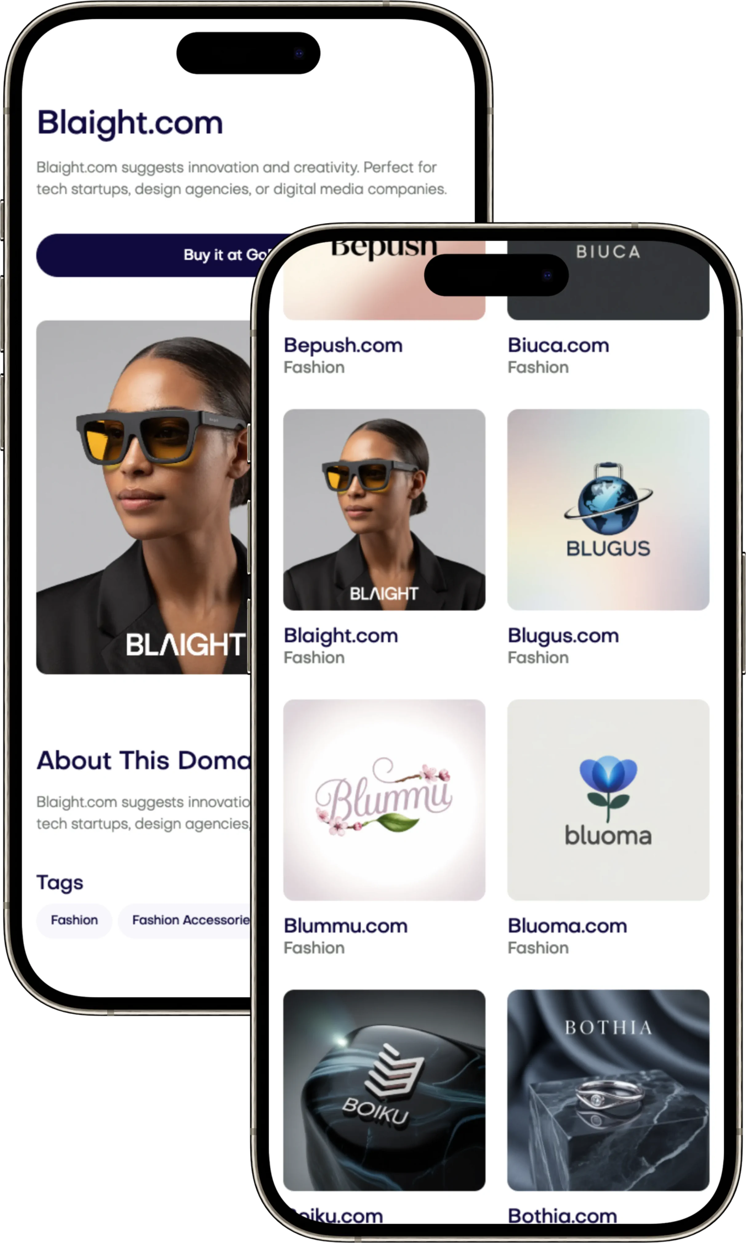
If you're ready to start or revamp your platform with a strong, trustworthy name, check out Brandtune.com. They offer excellent, brandable domain names to kickstart your venture with confidence.
Why Brand Trust and Safety Define Modern Dating Platforms
Your brand grows when people feel safe and respected. Treat safety as more than just a checkbox. In crowded markets, having trust and safety as a key part of your brand stands out. It shows you care and are reliable for both your business and users.
Positioning safety as an emotional brand promise
Start with a promise that values time, identity, and wellbeing. View safety as a sign of care, respect, and freedom: “We protect your choices and your peace of mind.” Bumble leads with a women-first approach. This shows how values shape app safety and user experience.
Bring that promise to life every day. Use signs in the app that make users feel safe. Show how you value safety in profiles, chats, and help articles.
Signaling trust through design, language, and support
Design with trust in mind: use verification badges and clear report buttons. Easy-to-read CTAs and colors build trust and make the app safer.
Keep your language simple: “Only your matches can message you.” Be clear about how you use data and match users. Offer help through various channels, with clear answers and safety tips.
Make a library of trust signals: badges, warnings, and tips. Keep a friendly, clear tone in all support channels.
Aligning moderation and community standards with brand values
Make rules that match your brand's values. Use AI and human checks to find bad content. Apps like Hinge and Bumble update users on safety; do this to stay trusted.
Set up fast, fair systems for handling reports. Track how users feel about safety. Use what you learn to make your app safer and keep promises.
Here's what to do: write a Safety Manifesto, teach moderators about fairness, and update your trust library often. These steps make safety a core part of your brand, building trust and safety all around.
Core Identity: Purpose, Values, and Personality
Your dating brand starts with a clear goal. This guides every decision: Help people find healthy relationships with respect. Keep it clear and useful. This should lead all parts of your work.
What you say should match what you do. Use facts and people's feedback to improve. Every change is a chance to build trust.
Crafting a purpose that champions meaningful connections
Make your aim something users can feel: safe chats, honest profiles. Look at Hinge's goal. Match it to what your users want. This focus helps your team make the right choices.
Show your promise with real features: we filter out lazy messages; we promote deep questions; we gently remind users to respond. All these prove your goal is real.
Defining values that guide both product and community
Choose values that shape your actions and attitudes. Respect means clear, consensual interaction. Authenticity brings real pictures and in-depth questions. Safety includes teaching users and fighting fraud.
Inclusivity is about offering choices and understanding different cultures. Being open to feedback improves safety. Connect values to features for a unified experience.
Choosing a brand personality that resonates with target users
Pick a personality that feels right at every step. Think of a creative teacher: inventive, caring, and based on facts. Choose warm over cold, clear over fancy. Be empowering, with a bit of fun.
Describe your voice clearly, use a catchy phrase, and show how features prove your values. A team keeps everyone on the same page. This makes sure your app stays true to its goals, from the first click to the first date.
Audience Segmentation and Behavioral Insights
Your brand shines when you understand and respect what people want. First, do lots of audience research for dating apps. Then, make what you learn simple for users to understand and use. Use what you know about behavior to shape design, writing, and help. This way, every time someone uses your platform, they feel it's right for them and easy to use.
Mapping user motivations: serious relationships vs. casual discovery
Begin by grouping users based on their real goals. Identify four main types: those looking for serious relationships, casual dating, new friends or shared interests, and local meetups. For instance, Hinge caters to those wanting something long-term. Tinder covers everything from casual to serious with the help of filters. Bumble branches out into making friends and business networking to keep different needs separate.
On user profiles, make their intentions clear but allow changes. Use straightforward prompts and sorting rules to reflect user choices. For those serious about commitment, offer "Dealbreakers"; for explorers, suggest "Discoveries this week". These hints build trust and lead to better matches.
Designing sub-brands or modes for diverse intentions
Deciding between sub-brands and intent modes depends on what's clearer or easier to manage. Sub-brands have their own look and language but share the same main brand. Bumble's BFF mode is a good example. This method fosters close-knit communities but might make marketing trickier.
Intent modes are simpler options within the app, marked by easy visual signs. They help keep things streamlined but might confuse users if not clearly explained. To avoid confusion, make sure labels, colors, and icons are clear within the first few uses.
Leveraging personas and voice-of-customer data
To create personas for a dating app, mix different research methods. Include interviews, diary studies, and data on how people behave. Look into how much safety concerns them, how much hassle they'll tolerate, and how they like to communicate. Use this info to improve how people start on the app, how they see potential matches, and how they interact.
Keep a constant flow of feedback from users. Use surveys in the app, analyze reviews, watch social media, and look at support tickets. Then, make updates based on what people say they want. For example, if users ask for more reporting options, add them. Showing you listen and make changes boosts trust in your product.
Measure success by looking at different results. Check how happy people are with their matches, how often they report problems, if they leave because they didn't find what they wanted, and if they have good conversations within a day of matching. Use these insights to get better at grouping users by their goals, adjusting how you let people show what they want, and understanding behavior without making things too complex.
Visual Language that Sparks Connection
Your brand's look should make folks feel safe and recognized right away. It's key to build trust through clear signs, smooth movements, and a respectful tone. Use UI trust patterns that make actions clear, lessen risk, and ask for consent nicely.
Color psychology for warmth, safety, and inclusivity
Use warm colors like coral, peach, and soft red to create a sense of connection. Choose teal, navy, or green for things like verification and success. This approach uses color psychology similar to dating apps to mix feelings and control.
Make sure your design is easy for everyone to use by meeting WCAG standards. Test your colors with different people. Use consistent colors so users don't get confused and feel in charge.
Typography and iconography that feel approachable
Pick fonts like Inter, SF Pro, or Roboto that feel friendly. Make sure text is easy to read with good spacing. Stick to a few font options to keep things simple and recognizable.
Design icons with soft edges and consistent lines. Use symbols we all know: a shield for safety, a hand wave for hello, and a flag for alerts. Add clear labels and hints to icons for easy understanding.
Imagery guidelines that reflect real, diverse users
Show pictures of real people of all ages, backgrounds, shapes, abilities, and LGBTQ+ identities. Use natural light and real settings instead of fake stock photos. Focus on safe, public places and daytime settings for comfort.
For likes and matches, use smooth animations and gentle feedback. Stay away from flashy effects that remind people of games. Keep a Figma library with rules and examples. This helps your design stay user-friendly as it grows.
Dating Platforms Branding Principles
Start with safety, then grow. Put safety rules in the start, help, and report steps before making growth plans. Measure trust as important as getting and keeping users. Create a brand that’s all about consent and ethical growth from the beginning.
Clear intentions mean less confusion. Users can share if they want something serious, casual, or just friends. Let them change their mind freely. Use filters to make sure everyone's on the same page. Keep choices simple and easy to change.
Choose realness over looks. Encourage video or voice intros and respect privacy in verification. Lessen the importance of easy likes and spam. Cheer on users who put effort into their profiles, beyond just looks.
Accept everyone from the start. Provide lots of options for gender and orientation, and accessible features. Include things like screen reader support and captioned videos. Make sure these options are easy to find.
Honesty leads to trust. Talk simply about how matches are made and let users adjust settings like seeing newer profiles. Explain why users match and how to tweak these reasons. Be clear on how data shapes results.
Guide behavior with examples, not just rules. Offer example messages and hints for kind communication. Promote good actions in the app itself. Offer kind corrections before problems grow.
Respect privacy in personalization. Keep sensitive info private. Allow detailed privacy choices and clear info on data storage. Make consent-based choices simple in line with your brand.
Keep the same style everywhere. Make sure ads, app descriptions, messages, and notifications all sound and look the same. A united style and tone build trust.
Test safely. Check how changes affect user safety and stop any that cause harm. Learn from tests to make safety a priority in updates.
Work together for care. Have a shared guide for product, design, marketing, and help teams. Set up regular checks and plans to focus on ethical growth, guided by the principles for dating platform brands.
Tone of Voice and Messaging Pillars
Your brand tone of voice should be warm, clear, empowering, and responsible. These pillars keep your product, marketing, and support in sync. They also let your business easily adjust across different channels. Use UX writing for dating apps to help users make good choices. This builds their confidence and keeps them safe without losing the fun.
Balancing playful energy with responsible guidance
Celebrate with light, positive words like: “New match—nice work.” Keep the mood lively for milestones and first chats. Use serious language for consent, reporting, and privacy. Users need to know safety is important.
Make fun moments lead to clear actions. Be factual and act-focused when trust matters. Here, your messaging pillars become very important. Be warm when making connections; be serious when setting limits.
Microcopy that reduces anxiety and increases clarity
Use microcopy to ease worries and show control. Say “You can change this anytime.” Tell them “Only mutual matches can message.” Be straightforward in consent-focused spots. Say “Ask before sharing personal contact info.” And “Report behavior that feels off.”
Make empty states educational, not punishing. Show examples of good conversation starters. In errors, blame the system, not the user. Offer a clear way to fix it with one main action.
Story frameworks for campaigns and in-app moments
Storytelling can highlight your features. Use Problem → Insight → Action → Outcome. This shows how intent filters result in better chats. Use Before/After stories to move from swipe fatigue to meaningful talks.
Show off real safety wins and inclusivity in your community. Keep your language consistent across the board. With focused UX writing for dating apps, your messaging stays strong. And your brand’s voice stays unique.
Onboarding and First Impressions as Brand Moments
Your brand's first taps show its true colors. Create an onboarding experience that's warm and human. It should set clear goals and keep people moving forward. Use short steps and visible progress. Always save work, so nothing is lost.
Friction-aware flows that feel human and respectful
Plan each step carefully. Start with phone or email, then move to a simple profile. Help users choose their goals, verify their identity, and learn about safety quickly. Add a progress bar and a way to come back to where they left off. Let people skip things that aren't super important. Make sure the must-dos are quick and clear.
Make the welcome screen meaningful. Tell users why they're there and what you stand for right away. Offer examples, quick tips, and friendly messages when things go wrong. Make sure it's easy for everyone to click and type.
Profile creation that champions authenticity
Encourage profiles that show the real person. Offer questions that bring out their values and sense of humor. Give them easy choices and the chance to share more about themselves. Ask for a clear photo of their face, skip the group pictures, and let them introduce themselves with audio or video that has captions.
Help with image editing by suggesting alt text and simple crop and light tools. As users fill in their profiles, show them small signs of trust. Explain how being thorough can lead to better connections and more answers.
Safety cues embedded early without fear tactics
Start safe with quick checks via selfie or video. Give clear instructions and protect their privacy. Keep the tone calm and kind. Let users know about safety tools early on, so they feel prepared.
At first, suggest meeting in public places and starting with in-app chats. Advise them to stop if they feel uneasy. Keep safety tips short and helpful. Then, smoothly guide them back to exploring.
Look at the right stats: how many get started, first replies, finish verifying, and report early. Change your messages and prompts to keep people engaged while lowering drop-offs.
Community Building and Social Proof
Your brand grows when members lift each other up. Create a strong community strategy. This turns everyday moments into trusted signals. Mix user-generated content with social proof. This way, people see real results and feel safe to join in.
Showcasing success stories and user-led content
Show real relationships, not just numbers. Follow Hinge's example with diverse success stories. Use reels, blog spotlights, and in-app cards. Lift up user content that shows respect and thoughtfulness. Work with creators who promote healthy dating and safety. Reward profiles that show what you stand for.
Incentivizing positive behavior and reporting
Nudge better choices with rewards. Give kudos for full profiles and nice messages. Boost verified users and those who report issues quickly. Thank those who flag harm. Tell them what you did about it. This builds trust and keeps people coming back.
Designing rituals that foster belonging
Make rituals that create a sense of belonging. Use theme prompts weekly. Host events to spotlight great first messages. Celebrate match anniversaries with praise. Look at engagement, referrals, and ritual participation. See what lowers bad behavior. Then, update your community strategy to grow what works.
Differentiation and Positioning in a Crowded Market
Your dating platform stands out when users quickly see what makes you special. Ground your brand's promise, then back it up with your product and rules. Positioning is all about creating a category: you set the standards, build expectations, and prove it's real.
Finding a distinctive promise and proof points
Pick a clear promise that impacts users from the start. For respect-first matching: include consent features, AI that stops aggressive texts, and easy block/report options. For depth over swipes: offer limited choices daily, in-depth questions, and voice intros to slow down browsing. For safer discovery: ensure profiles are verified first, remind of public meeting spots, and promise quick moderating.
Show evidence at every step. Advertisements should display real chats, not just pretty faces. Landing pages detail safety tools and clear intents with straightforward stats. App listings should emphasize user verification and community guidelines with user reviews. Price alignment with values means promoting verified users, rewarding polite messaging, and limiting spam. This sharpens your unique approach and builds trust.
Niche focus vs. mass appeal: brand architecture choices
Choose a structure that matches your growth aims. A single brand that offers different modes works for scaling and exploring diverse interests within one platform. Users can look for serious, casual, or friendship connections without switching apps. Clear categorizations and rules help manage expectations.
If catering to unique groups, having multiple brands under one roof works well. Customize standards, look, and moderation for each audience. Still, keep a unified design and management to make the collection feel together. This setup aids in growing while keeping things clear.
Competitive content gaps you can own
Always analyze competitors to find opportunities. Be the leader in teaching about positive signs, setting boundaries, and planning safe dates. Offer unique content like audio or video prompts over simple swipe actions. Provide tailored content and moderators for groups not well-represented elsewhere.
Turn these opportunities into consistent tools. Create guides for crafting your first message. Include safety checklists in the app for before meetups. Keep improving through category design trials. When your content tackles real issues, it solidifies your brand's stance and adds value uniquely yours.
Measuring Brand Health and Iterating Safely
Your brand gets stronger when it's built on trust and safety. Keep an eye on your brand's health every week. Track how people see your brand from start to finish. This means checking if they know your brand, if they consider using it after seeing an ad, and if they trust it. You can use things like surveys, how often people recommend your brand, and how they feel about it after using your service.
Make sure your brand is trustworthy by keeping track of key safety measures. Watch how many people complete safety checks, how long it takes to handle reports, and how often problems happen. Aim to make your platform safer by lowering repeat offenses and making sure your safety systems work right. Also, look at how people interact with each other on your platform to see if changes are helping.
Keep your community safe when trying new things. Stop any test that might make people feel less safe. Use careful testing methods to avoid affecting other users. Share regular updates about safety and what's new with your product. Make sure users know how their feedback helps improve things. Also, have a safety and ethics check for new features and teach your team about treating users fairly.
Here's what to do next: Make a dashboard that shows how safe and trustworthy your brand is. Set goals for safety and trust every three months. Talk about your progress with others and your users. When your brand grows, pick a name that shows it's trustworthy from the start. You can find good names at Brandtune.com.
People come for matches but stay for the trust your platform provides. This guide gives you the tools to build your brand on safety and connection as its foundation. View branding as a system that shows your values, from profile setups to how you handle reports.
Top brands in the market set great examples. Bumble focuses on safety with photo verifications and helpful tips in the app. Hinge tells users it's "designed to be deleted," showing their goal is real relationships. Tinder made the swipe famous and improved safety with user verifications. They all show safety and trust are key to the user experience.
Combine human-centered design with built-in safety for your brand strategy. Aim for clear, warm communication while promoting responsible behavior and effortless interactions. This makes your dating app more appealing, keeps users around longer, and makes your brand stand out.
You'll learn how to create a strong brand identity and speak to your audience's needs and preferences. We'll cover everything from visuals and words to welcoming new users and keeping track of what's working. The goal is a brand that grows and remains welcoming and safe for everyone.
If you're ready to start or revamp your platform with a strong, trustworthy name, check out Brandtune.com. They offer excellent, brandable domain names to kickstart your venture with confidence.
Why Brand Trust and Safety Define Modern Dating Platforms
Your brand grows when people feel safe and respected. Treat safety as more than just a checkbox. In crowded markets, having trust and safety as a key part of your brand stands out. It shows you care and are reliable for both your business and users.
Positioning safety as an emotional brand promise
Start with a promise that values time, identity, and wellbeing. View safety as a sign of care, respect, and freedom: “We protect your choices and your peace of mind.” Bumble leads with a women-first approach. This shows how values shape app safety and user experience.
Bring that promise to life every day. Use signs in the app that make users feel safe. Show how you value safety in profiles, chats, and help articles.
Signaling trust through design, language, and support
Design with trust in mind: use verification badges and clear report buttons. Easy-to-read CTAs and colors build trust and make the app safer.
Keep your language simple: “Only your matches can message you.” Be clear about how you use data and match users. Offer help through various channels, with clear answers and safety tips.
Make a library of trust signals: badges, warnings, and tips. Keep a friendly, clear tone in all support channels.
Aligning moderation and community standards with brand values
Make rules that match your brand's values. Use AI and human checks to find bad content. Apps like Hinge and Bumble update users on safety; do this to stay trusted.
Set up fast, fair systems for handling reports. Track how users feel about safety. Use what you learn to make your app safer and keep promises.
Here's what to do: write a Safety Manifesto, teach moderators about fairness, and update your trust library often. These steps make safety a core part of your brand, building trust and safety all around.
Core Identity: Purpose, Values, and Personality
Your dating brand starts with a clear goal. This guides every decision: Help people find healthy relationships with respect. Keep it clear and useful. This should lead all parts of your work.
What you say should match what you do. Use facts and people's feedback to improve. Every change is a chance to build trust.
Crafting a purpose that champions meaningful connections
Make your aim something users can feel: safe chats, honest profiles. Look at Hinge's goal. Match it to what your users want. This focus helps your team make the right choices.
Show your promise with real features: we filter out lazy messages; we promote deep questions; we gently remind users to respond. All these prove your goal is real.
Defining values that guide both product and community
Choose values that shape your actions and attitudes. Respect means clear, consensual interaction. Authenticity brings real pictures and in-depth questions. Safety includes teaching users and fighting fraud.
Inclusivity is about offering choices and understanding different cultures. Being open to feedback improves safety. Connect values to features for a unified experience.
Choosing a brand personality that resonates with target users
Pick a personality that feels right at every step. Think of a creative teacher: inventive, caring, and based on facts. Choose warm over cold, clear over fancy. Be empowering, with a bit of fun.
Describe your voice clearly, use a catchy phrase, and show how features prove your values. A team keeps everyone on the same page. This makes sure your app stays true to its goals, from the first click to the first date.
Audience Segmentation and Behavioral Insights
Your brand shines when you understand and respect what people want. First, do lots of audience research for dating apps. Then, make what you learn simple for users to understand and use. Use what you know about behavior to shape design, writing, and help. This way, every time someone uses your platform, they feel it's right for them and easy to use.
Mapping user motivations: serious relationships vs. casual discovery
Begin by grouping users based on their real goals. Identify four main types: those looking for serious relationships, casual dating, new friends or shared interests, and local meetups. For instance, Hinge caters to those wanting something long-term. Tinder covers everything from casual to serious with the help of filters. Bumble branches out into making friends and business networking to keep different needs separate.
On user profiles, make their intentions clear but allow changes. Use straightforward prompts and sorting rules to reflect user choices. For those serious about commitment, offer "Dealbreakers"; for explorers, suggest "Discoveries this week". These hints build trust and lead to better matches.
Designing sub-brands or modes for diverse intentions
Deciding between sub-brands and intent modes depends on what's clearer or easier to manage. Sub-brands have their own look and language but share the same main brand. Bumble's BFF mode is a good example. This method fosters close-knit communities but might make marketing trickier.
Intent modes are simpler options within the app, marked by easy visual signs. They help keep things streamlined but might confuse users if not clearly explained. To avoid confusion, make sure labels, colors, and icons are clear within the first few uses.
Leveraging personas and voice-of-customer data
To create personas for a dating app, mix different research methods. Include interviews, diary studies, and data on how people behave. Look into how much safety concerns them, how much hassle they'll tolerate, and how they like to communicate. Use this info to improve how people start on the app, how they see potential matches, and how they interact.
Keep a constant flow of feedback from users. Use surveys in the app, analyze reviews, watch social media, and look at support tickets. Then, make updates based on what people say they want. For example, if users ask for more reporting options, add them. Showing you listen and make changes boosts trust in your product.
Measure success by looking at different results. Check how happy people are with their matches, how often they report problems, if they leave because they didn't find what they wanted, and if they have good conversations within a day of matching. Use these insights to get better at grouping users by their goals, adjusting how you let people show what they want, and understanding behavior without making things too complex.
Visual Language that Sparks Connection
Your brand's look should make folks feel safe and recognized right away. It's key to build trust through clear signs, smooth movements, and a respectful tone. Use UI trust patterns that make actions clear, lessen risk, and ask for consent nicely.
Color psychology for warmth, safety, and inclusivity
Use warm colors like coral, peach, and soft red to create a sense of connection. Choose teal, navy, or green for things like verification and success. This approach uses color psychology similar to dating apps to mix feelings and control.
Make sure your design is easy for everyone to use by meeting WCAG standards. Test your colors with different people. Use consistent colors so users don't get confused and feel in charge.
Typography and iconography that feel approachable
Pick fonts like Inter, SF Pro, or Roboto that feel friendly. Make sure text is easy to read with good spacing. Stick to a few font options to keep things simple and recognizable.
Design icons with soft edges and consistent lines. Use symbols we all know: a shield for safety, a hand wave for hello, and a flag for alerts. Add clear labels and hints to icons for easy understanding.
Imagery guidelines that reflect real, diverse users
Show pictures of real people of all ages, backgrounds, shapes, abilities, and LGBTQ+ identities. Use natural light and real settings instead of fake stock photos. Focus on safe, public places and daytime settings for comfort.
For likes and matches, use smooth animations and gentle feedback. Stay away from flashy effects that remind people of games. Keep a Figma library with rules and examples. This helps your design stay user-friendly as it grows.
Dating Platforms Branding Principles
Start with safety, then grow. Put safety rules in the start, help, and report steps before making growth plans. Measure trust as important as getting and keeping users. Create a brand that’s all about consent and ethical growth from the beginning.
Clear intentions mean less confusion. Users can share if they want something serious, casual, or just friends. Let them change their mind freely. Use filters to make sure everyone's on the same page. Keep choices simple and easy to change.
Choose realness over looks. Encourage video or voice intros and respect privacy in verification. Lessen the importance of easy likes and spam. Cheer on users who put effort into their profiles, beyond just looks.
Accept everyone from the start. Provide lots of options for gender and orientation, and accessible features. Include things like screen reader support and captioned videos. Make sure these options are easy to find.
Honesty leads to trust. Talk simply about how matches are made and let users adjust settings like seeing newer profiles. Explain why users match and how to tweak these reasons. Be clear on how data shapes results.
Guide behavior with examples, not just rules. Offer example messages and hints for kind communication. Promote good actions in the app itself. Offer kind corrections before problems grow.
Respect privacy in personalization. Keep sensitive info private. Allow detailed privacy choices and clear info on data storage. Make consent-based choices simple in line with your brand.
Keep the same style everywhere. Make sure ads, app descriptions, messages, and notifications all sound and look the same. A united style and tone build trust.
Test safely. Check how changes affect user safety and stop any that cause harm. Learn from tests to make safety a priority in updates.
Work together for care. Have a shared guide for product, design, marketing, and help teams. Set up regular checks and plans to focus on ethical growth, guided by the principles for dating platform brands.
Tone of Voice and Messaging Pillars
Your brand tone of voice should be warm, clear, empowering, and responsible. These pillars keep your product, marketing, and support in sync. They also let your business easily adjust across different channels. Use UX writing for dating apps to help users make good choices. This builds their confidence and keeps them safe without losing the fun.
Balancing playful energy with responsible guidance
Celebrate with light, positive words like: “New match—nice work.” Keep the mood lively for milestones and first chats. Use serious language for consent, reporting, and privacy. Users need to know safety is important.
Make fun moments lead to clear actions. Be factual and act-focused when trust matters. Here, your messaging pillars become very important. Be warm when making connections; be serious when setting limits.
Microcopy that reduces anxiety and increases clarity
Use microcopy to ease worries and show control. Say “You can change this anytime.” Tell them “Only mutual matches can message.” Be straightforward in consent-focused spots. Say “Ask before sharing personal contact info.” And “Report behavior that feels off.”
Make empty states educational, not punishing. Show examples of good conversation starters. In errors, blame the system, not the user. Offer a clear way to fix it with one main action.
Story frameworks for campaigns and in-app moments
Storytelling can highlight your features. Use Problem → Insight → Action → Outcome. This shows how intent filters result in better chats. Use Before/After stories to move from swipe fatigue to meaningful talks.
Show off real safety wins and inclusivity in your community. Keep your language consistent across the board. With focused UX writing for dating apps, your messaging stays strong. And your brand’s voice stays unique.
Onboarding and First Impressions as Brand Moments
Your brand's first taps show its true colors. Create an onboarding experience that's warm and human. It should set clear goals and keep people moving forward. Use short steps and visible progress. Always save work, so nothing is lost.
Friction-aware flows that feel human and respectful
Plan each step carefully. Start with phone or email, then move to a simple profile. Help users choose their goals, verify their identity, and learn about safety quickly. Add a progress bar and a way to come back to where they left off. Let people skip things that aren't super important. Make sure the must-dos are quick and clear.
Make the welcome screen meaningful. Tell users why they're there and what you stand for right away. Offer examples, quick tips, and friendly messages when things go wrong. Make sure it's easy for everyone to click and type.
Profile creation that champions authenticity
Encourage profiles that show the real person. Offer questions that bring out their values and sense of humor. Give them easy choices and the chance to share more about themselves. Ask for a clear photo of their face, skip the group pictures, and let them introduce themselves with audio or video that has captions.
Help with image editing by suggesting alt text and simple crop and light tools. As users fill in their profiles, show them small signs of trust. Explain how being thorough can lead to better connections and more answers.
Safety cues embedded early without fear tactics
Start safe with quick checks via selfie or video. Give clear instructions and protect their privacy. Keep the tone calm and kind. Let users know about safety tools early on, so they feel prepared.
At first, suggest meeting in public places and starting with in-app chats. Advise them to stop if they feel uneasy. Keep safety tips short and helpful. Then, smoothly guide them back to exploring.
Look at the right stats: how many get started, first replies, finish verifying, and report early. Change your messages and prompts to keep people engaged while lowering drop-offs.
Community Building and Social Proof
Your brand grows when members lift each other up. Create a strong community strategy. This turns everyday moments into trusted signals. Mix user-generated content with social proof. This way, people see real results and feel safe to join in.
Showcasing success stories and user-led content
Show real relationships, not just numbers. Follow Hinge's example with diverse success stories. Use reels, blog spotlights, and in-app cards. Lift up user content that shows respect and thoughtfulness. Work with creators who promote healthy dating and safety. Reward profiles that show what you stand for.
Incentivizing positive behavior and reporting
Nudge better choices with rewards. Give kudos for full profiles and nice messages. Boost verified users and those who report issues quickly. Thank those who flag harm. Tell them what you did about it. This builds trust and keeps people coming back.
Designing rituals that foster belonging
Make rituals that create a sense of belonging. Use theme prompts weekly. Host events to spotlight great first messages. Celebrate match anniversaries with praise. Look at engagement, referrals, and ritual participation. See what lowers bad behavior. Then, update your community strategy to grow what works.
Differentiation and Positioning in a Crowded Market
Your dating platform stands out when users quickly see what makes you special. Ground your brand's promise, then back it up with your product and rules. Positioning is all about creating a category: you set the standards, build expectations, and prove it's real.
Finding a distinctive promise and proof points
Pick a clear promise that impacts users from the start. For respect-first matching: include consent features, AI that stops aggressive texts, and easy block/report options. For depth over swipes: offer limited choices daily, in-depth questions, and voice intros to slow down browsing. For safer discovery: ensure profiles are verified first, remind of public meeting spots, and promise quick moderating.
Show evidence at every step. Advertisements should display real chats, not just pretty faces. Landing pages detail safety tools and clear intents with straightforward stats. App listings should emphasize user verification and community guidelines with user reviews. Price alignment with values means promoting verified users, rewarding polite messaging, and limiting spam. This sharpens your unique approach and builds trust.
Niche focus vs. mass appeal: brand architecture choices
Choose a structure that matches your growth aims. A single brand that offers different modes works for scaling and exploring diverse interests within one platform. Users can look for serious, casual, or friendship connections without switching apps. Clear categorizations and rules help manage expectations.
If catering to unique groups, having multiple brands under one roof works well. Customize standards, look, and moderation for each audience. Still, keep a unified design and management to make the collection feel together. This setup aids in growing while keeping things clear.
Competitive content gaps you can own
Always analyze competitors to find opportunities. Be the leader in teaching about positive signs, setting boundaries, and planning safe dates. Offer unique content like audio or video prompts over simple swipe actions. Provide tailored content and moderators for groups not well-represented elsewhere.
Turn these opportunities into consistent tools. Create guides for crafting your first message. Include safety checklists in the app for before meetups. Keep improving through category design trials. When your content tackles real issues, it solidifies your brand's stance and adds value uniquely yours.
Measuring Brand Health and Iterating Safely
Your brand gets stronger when it's built on trust and safety. Keep an eye on your brand's health every week. Track how people see your brand from start to finish. This means checking if they know your brand, if they consider using it after seeing an ad, and if they trust it. You can use things like surveys, how often people recommend your brand, and how they feel about it after using your service.
Make sure your brand is trustworthy by keeping track of key safety measures. Watch how many people complete safety checks, how long it takes to handle reports, and how often problems happen. Aim to make your platform safer by lowering repeat offenses and making sure your safety systems work right. Also, look at how people interact with each other on your platform to see if changes are helping.
Keep your community safe when trying new things. Stop any test that might make people feel less safe. Use careful testing methods to avoid affecting other users. Share regular updates about safety and what's new with your product. Make sure users know how their feedback helps improve things. Also, have a safety and ethics check for new features and teach your team about treating users fairly.
Here's what to do next: Make a dashboard that shows how safe and trustworthy your brand is. Set goals for safety and trust every three months. Talk about your progress with others and your users. When your brand grows, pick a name that shows it's trustworthy from the start. You can find good names at Brandtune.com.
Tags
Start Building Your Brand with Brandtune
Browse All Domains