Design Systems for Brands: Scale Design Consistently
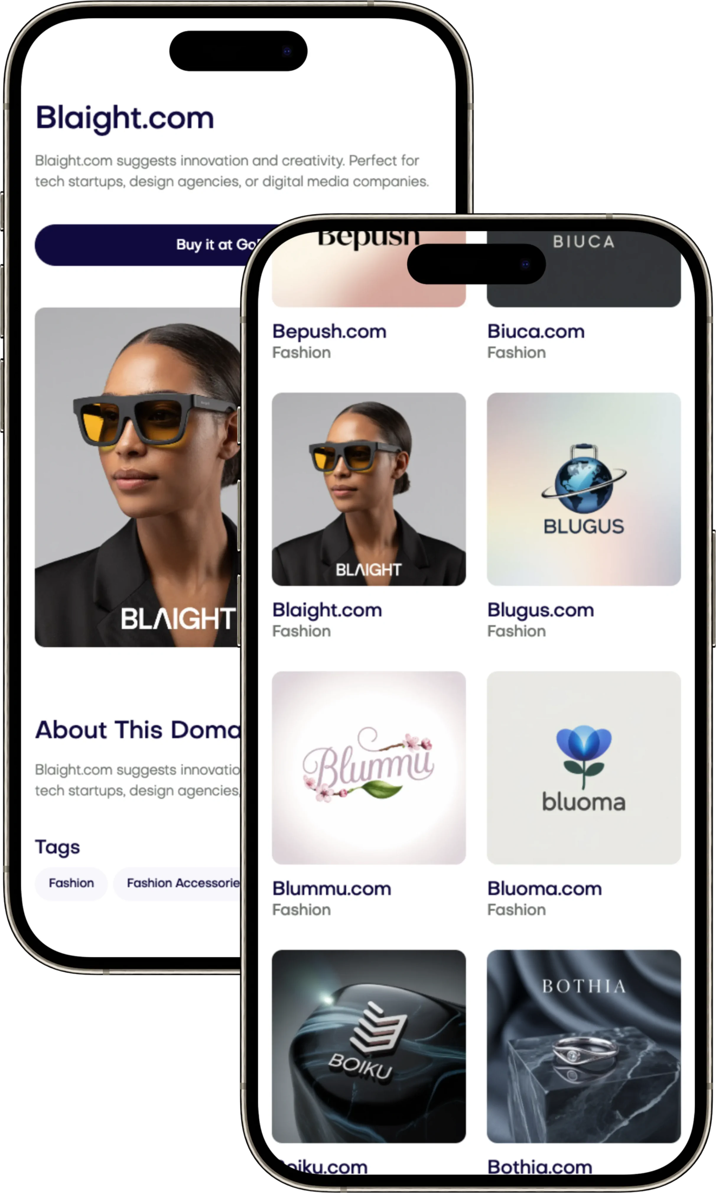
Unlock the full potential of your brand with scalable Design Systems for Brands. Streamline your visual identity at Brandtune.com.

You want your brand to stay the same at a fast pace. A modern brand design system makes sure of that. It gives you one place for all your brand's visuals, messages, and how it feels to use, everywhere.
This works by setting core principles, who owns what, tracking success, and always improving.
Your design system stands on four main things: foundations, tokens, components, and rules. Foundations cover colors, fonts, space, layout, and how things move. Tokens turn these choices into a format that works everywhere. Components are UI and marketing things you can use again and again.
Having strong rules and guidelines keeps everyone on the same track as your brand grows.
Big names like Shopify Polaris and IBM Carbon show this method works. They make things faster, better, and help people remember your brand. Use Figma for building and Storybook to link design to code.
This also fits into your CI/CD process. It makes managing designs and code automatic. Keep an eye on important metrics such as how quick you get to market, consistency, and if your UX is pulling its weight.
You want everything you send out to match your brand, without the need for too many do-overs. This all leads to real results for your business.
Want a brand identity that can grow and last? Start by picking the right name. Check out Brandtune.com for top domain names.
What a Modern Design System Includes for Cohesive Brand Identity
Businesses grow faster when decisions are easy. Align your brand's core to help designers and engineers. This creates a shared language. It reduces wasted effort and keeps everything looking like it should.
Foundations: Color, Typography, Spacing, and Grid
Start with a color system that's easy to read on all platforms. Include a variety of colors. Remember to consider different modes like light and dark.
Use a scale to pick your typeface sizes for headings and other text. This helps make sure your text is easy to read on any device. Don't forget to pick a backup font!
Make spacing regular with 4px or 8px steps. Use a grid that changes with screen size. This helps everything look right no matter where it's shown.
Components and Patterns for Reusable UI
Build reusable pieces like buttons and charts. These should explain how they work. Knowing their limits is key for a good user experience.
Keep track of how UI elements should work together. Having clear examples helps everyone. It also makes updating things less risky.
Tokens to Encode Decisions for Scale
Turn decisions into design tokens like color or spacing. Keep them in a format that works everywhere. This way, updates are easy and nothing breaks.
Connect everything with tokens to avoid mess-ups. This keeps designs and code matching. It stops things from getting confusing as your project grows.
Documentation and Governance for Consistency
Keep your design system up to date online. Use tools that help share guidelines and examples. This includes accessibility tips and how to use code.
Make rules for adding to the brand. Having a team responsible ensures quality stays high. This helps keep your design system moving forward smoothly.
Design Systems For Brands
Your brand is everywhere: websites, apps, social media, emails, videos, boxes, and stores. Design Systems For Brands align these areas. They create a unified brand identity with common rules. This way, every piece looks like it belongs together. Teams work faster, have clearer handoffs, and make fewer changes.
Think of your brand and product as one. Share tokens and components for a consistent visual language. This unity between marketing and product design systems drives consistency. It helps your brand grow without losing its identity.
Look at successful examples like Spotify’s Encore and Airbnb’s Design Language System. They use shared libraries for a smooth alignment of marketing and product experiences. A disciplined brand identity system with a modular approach lets teams deliver with precision.
Create a page for your brand's DNA: its purpose, values, tone, and look. Turn these into solid rules and show examples. Include motion rules, grid use, and voice next to UI components for guiding decisions. This helps your brand stay consistent but flexible across different platforms.
Use Figma for managing logos, illustrations, photos, and UI within a single control system. Offer downloadable materials for your partners to ensure consistency. With Design Systems For Brands, you'll see your strategies become real and stay on-brand every day.
Benefits of Scalable Design Systems for Marketing and Product Teams
Your business moves quicker and clearer when teams use shared standards. A well-developed system brings design and code together. This increases speed in marketing while ensuring high quality. You can move swiftly without compromising on craftsmanship.
Speed to Market with Reusable Assets
Reusing components speeds up processes. Teams make pages and features using established parts, not starting anew. The GOV.UK Design System and IBM Carbon show a 30–60% reduction in creating new designs.
Marketing can run more tests and variants in a single week compared to a month earlier. Product teams are more confident with updates. This is because reusable assets clear up confusion and shorten learning curves.
Consistent Experience Across Channels
Being consistent makes a bigger impact. Customers enjoy a seamless experience from ads to apps with familiar looks and actions. This smooth journey boosts conversion and keeps users coming back.
Shared elements ensure that text, motion, and interface remain consistent. Every interaction leads more smoothly to the next, making experiences across channels clearer.
Reduced Design and Engineering Debt
Standardizing reduces both design and engineering efforts. Fewer custom pieces mean less unique styling, tidier APIs, and easier quality checks.
Prebuilt features for accessibility and adaptability cut down on errors and extra work. Teams focus more on delivering value instead of fixing problems.
Stronger Brand Recognition and Recall
Consistent visuals and motion aid brand recognition. Regular encounters with coordinated colors, types, and patterns improve recall. This was seen with Atlassian and Salesforce after adopting these systems.
Clear rules aid every release in telling your brand’s story. Recognizable details enhance trust while keeping your marketing on track.
Foundational Elements: Brand Tokens That Power Scale
Your design system grows with data-made decisions. Start with data like a JSON schema or Tokens Studio for Figma. This way, everything from Figma can go straight to coding. Pack all this for the web, iOS, and Android to speed up and unify delivery.
Defining Color, Type, and Motion as Tokens
Start with colors: primary, secondary, surface, and text. Add spacing and shapes so everything fits together, no matter where it goes. Think of fonts as key pieces. Choose type details carefully so your words always look good.
Motion adds life and helps people remember your brand. Set up rules for how things move, watch the speed, and make sure it all works on phones. Stick to tips from Apple and Google to do it right.
Semantic vs. Hard-Coded Tokens
Use flexible tokens for things like button colors or link texts. This way, changing a color is easy, without messing with the code. Save fixed tokens for specific needs, and use shortcuts to show connections.
Follow best practices with design tokens everywhere. Check colors, test often, and keep track of changes to avoid surprises. This keeps things working well as your design grows.
Naming Conventions That Aid Cross-Team Adoption
Use clear names for tokens, like color.brand.primary.default. Add details like light or dark mode to help teams worldwide. This makes it easier for everyone to work together from the start.
Choose names that make sense and match your project's style. With consistent language for design and code, working together gets easier and mistakes happen less.
Component Libraries that Bridge Design and Code
Your component library connects your brand’s vision with the final product. Think of it as a product itself. It needs a clear purpose, strong rules, and tools that help your team every day. Make decisions that help your work grow smoothly.
Choosing a Tech Stack for UI Components
Choose technology that fits your team and platform. React components with TypeScript offer strict typing and a wide range of tools. Web Components work with many frameworks, perfect for diverse products. Vue or Svelte are good if you already use them.
Use Storybook to develop alone. It lets you document actions, use visual tests, and understand properties. Aim for small, clean build results. Choose simple HTML and CSS for easy updates later on.
Mapping Figma Components to Code
Keep a one-to-one match between Figma designs and code. Use the same names and options. Write down details about slots, tokens, and how things work. Be clear about different states like when something is clicked or loading.
Make the transfer automated if you can. Use design tokens for sizes and colors to make changes easier. Check everything in Storybook before finishing to ensure it matches the design perfectly.
Accessibility and Responsiveness baked into Components
Think about inclusivity from the start. Use straightforward HTML, add ARIA as needed, and hit accessibility goals. Make sure keyboard use and focus work well everywhere. Test with tools like axe-core and VoiceOver.
Design with responsiveness in mind. Use changing type sizes, media queries, and CSS layouts. Set smart breakpoints and sizing for touch. Create adaptable layouts without extra effort.
Versioning Strategies for Safe Iteration
Use a central repo like Nx or Turborepo and a registry such as npm. Have a clear system for versions, updates, and ending support. Provide tools to help with big updates.
Keep quality high with CI checks: code standards, testing, and accessibility in Storybook. Watch how people use your components to know what to do next. Regular, small updates reduce problems.
Design Ops: Governance Models that Keep Systems Healthy
Your design system gets better when roles are clear. The governance should be easy to follow. Have design ops that grow with your business. You need to know who owns what, have a clear workflow, and set up a design council. This keeps everyone working together. It helps make quick, quality decisions.
Roles and Responsibilities across Teams
Put together a main team of design, engineering, content, and accessibility experts. Include a product manager to oversee the plan. Have domain stewards for areas like marketing and data. They spot problems early and meet needs.
Make sure every role knows their job: handling requests, sorting them, delivering, and offering help. Use dashboards to monitor how well things are adopted. This helps the team spot issues and fix them.
Contribution Models: Centralized, Federated, or Hybrid
Pick a governance model that fits your size. With centralized, the main team does everything. Federated lets different teams add features. Most choose hybrid: the main team handles basics and quality, while others add to it. This is done through a set workflow.
Make contributing easy but safe. Use templates and checks. Make sure things meet standards before adding them. Give training and support to prevent errors and build confidence.
Review Rituals, SLAs, and Change Management
Have weekly and monthly meetings to look at designs and code. Bring together stakeholders to agree on priorities. Set clear times for fixing bugs and adding new features, depending on how big the task is.
Use tools that help manage changes as you grow. Have a process for adding new parts, making big decisions, and keeping documents up-to-date. Link reviews to checks and share updates to help teams work fast and sure.
Workflow Integration: From Brief to Build
Your business can move faster when everything works together. Make a clear plan from the start to the finish. This way, teams can work with sureness and keep the quality up. By using simple steps and quick checks, you can cut down on having to do things over. This also helps keep things moving forward.
Design Tokens in CI/CD Pipelines
Make design part of your daily CI/CD process. Keep your design tokens in Git. When you make changes, turn them into ready-to-use packages. This can be for CSS, JavaScript, iOS, and Android. Then, update your apps without worry by publishing these packages.
When you make a request, check the components and how the design looks. Use Storybook with these checks to spot any issues early. This method keeps your design up-to-date and lowers the risk across all products.
Automation for Asset Generation and Handoff
Use an automated system to manage your files. Turn icons and images into optimized SVGs. Then, make your images ready for all screen sizes. Also, make sure they load quickly by compressing them.
Make it easy to move designs into code and documents. Connect Figma to your code. Use Storybook to bring in components. Tools like Zeplin and Specify make sure engineers have what they need. This helps get campaigns out there without waiting.
Tools and Plugins that Improve Adoption
Give your team the best tools to bring ideas to life. Use Plugins in Figma for this. They can help with design tokens, consistent content, color checks, and fixing components before they're passed on.
Use Slack, a changelog bot, and Jira to keep everyone updated. When something changes, everyone knows right away. This keeps your project healthy with clear steps and habits everyone follows.
Measurement: KPIs to Prove the Value of Your Design System
A design system should make its own costs back. You should track solid KPIs to prove it's worth it. These help guide where you invest money and keep teams focused. Start by seeing where you stood before using it. Then, check every quarter to spot changes in how fast you deliver, the work's quality, and how well it fits your brand.
Time Saved and Velocity Metrics
See how long it takes to go from an idea to a finished product. Keep track of how many screens or pages you complete in each sprint. Also, note how often you use already made parts in your designs in Figma and your code. Moving faster means things are working smoother and with less passing around of work.
Find out how much time you save for design and coding by not making everything from scratch. Connect these savings to specific design features. This shows how using things again makes work faster.
Defect Reduction and Quality Indicators
Keep an eye on how many mistakes you find each time you release something. Also, check how often things go wrong in what you've made. Look for problems with making your site usable for everyone using tools like Axe and Lighthouse. Notice if things stay the same visually after you update parts of your design.
Seeing fewer mistakes and not having to fix things as often means you’re doing a better job. It shows that using the same parts helps keep a high quality.
Brand Consistency Scores and UX Outcomes
Check how well your different projects follow your design rules. Use special scanning tools for CSS and DOM, then compare that with what you expect. Work out a score for how consistent your brand looks across web, app, email, and ads. Look for places where it's not being used well.
Connect how well your design system is used with how easy it is for users. Look at how successfully users complete tasks, how long they take, and how many mistakes they make. Also, see how users feel about it through NPS and other standard tests. This shows if making things consistent is making a better experience.
For leadership, sum up the benefits every three months: better sales where designs are consistent, faster product launches, and less doing things over. Use these results to choose what to work on next and keep showing how the design system pays off.
Scaling Across Brands, Sub-Brands, and Campaigns
Plan for growth using a design system that focuses on core elements. Set a sturdy foundation with rules for spacing, radius, and grids. Add layers of theme for colors, text, and motion to make updates easy.
Create unique looks for sub-brands with preset themes. These help set the mood and style of pictures and movements. This way, switching styles is easy but the basic elements remain the same. Brands can customize specifics, like colors, for different areas quickly.
Make use of tools like Figma for previewing different themes easily. Change settings in code to switch styles without hassle. This helps launch new campaigns or updates swiftly, keeping things fresh.
When designing for brand flexibility, limit customization to avoid chaos. Use design rules to keep the layout and ease of use in check. But, let brands show their personality through colors, fonts, and icons. Provide clear guides on what can be tweaked and what stays.
Have a team in place to make sure all themes look good together. If brands come together or change, guide them smoothly through the process. This ensures a consistent and strong design across all your brands as they grow.
Getting Started: Roadmap, Resourcing, and Rollout
Start with a small pilot program. Choose important areas like the homepage, signup, or checkout. Create a simple MVP with key elements and clear, short guides. Make a design system plan for 90 days with goals: checking what you have, setting up rules, creating components, adding them to your workflow, making guides, and training teams. Keep the project small to quickly show its benefit and help plan a bigger rollout.
Make a plan for the people and tools you need. Put together a team with different skills: a product manager, a design leader, a UI engineer, an accessibility expert, and a writer. Plan a budget for tools and a website for your guides, like Zeroheight or an in-house one. This planning should match your rollout plan, ensuring everything is ready when you need to grow.
Introduce the system step by step: start with the pilot, then move to more teams, and finally, spread it across the company. Help teams adjust with training, guides, and examples of real projects. Keep track of important measures like time saved, fewer errors, and better brand unity. Share successes to keep getting support. Adjust your plan as more teams use the system, replace old elements, and add new designs.
End with a strong action plan: show who you are, speed up work, and make your position in the market stronger. Support your start or update with a catchy name that helps you grow. You can find great domain names at Brandtune.com.
Tags
Start Building Your Brand with Brandtune
Browse All Domains