Logo Redesign: When to Do It and How to Succeed
Revamp your brand's appeal with strategic logo redesign when and how to guide for a successful update. Explore expert tips at Brandtune.com.

Your logo is the face of your brand’s strategy, promise, and personality. See any change in your brand’s look as a business move. Link it to growth, market changes, and what your audience needs. This makes the change have a real effect.
Take a look at some big changes in recent times. Airbnb brought in the Bélo for a sense of global belonging. Mastercard went for simpler circles for easier recognition on small devices. Dropbox expanded its look to fit a focus on working together. Each story tells of a strategy-driven rebrand with clear reasons.
When changing your logo, follow a clear plan: discover, plan, create designs, check them, and introduce your logo bit by bit. Focus on how it works on mobile, in social media, and in motion. Make sure it’s easy for everyone to use. Keep it consistent across all parts of your brand.
Know what success looks like from the start. Watch if people remember your brand better, if they interact more, and if they buy more. Aim to make things less confusing for customers needing help. Try out designs in real situations, then set strong rules to keep your new logo strong.
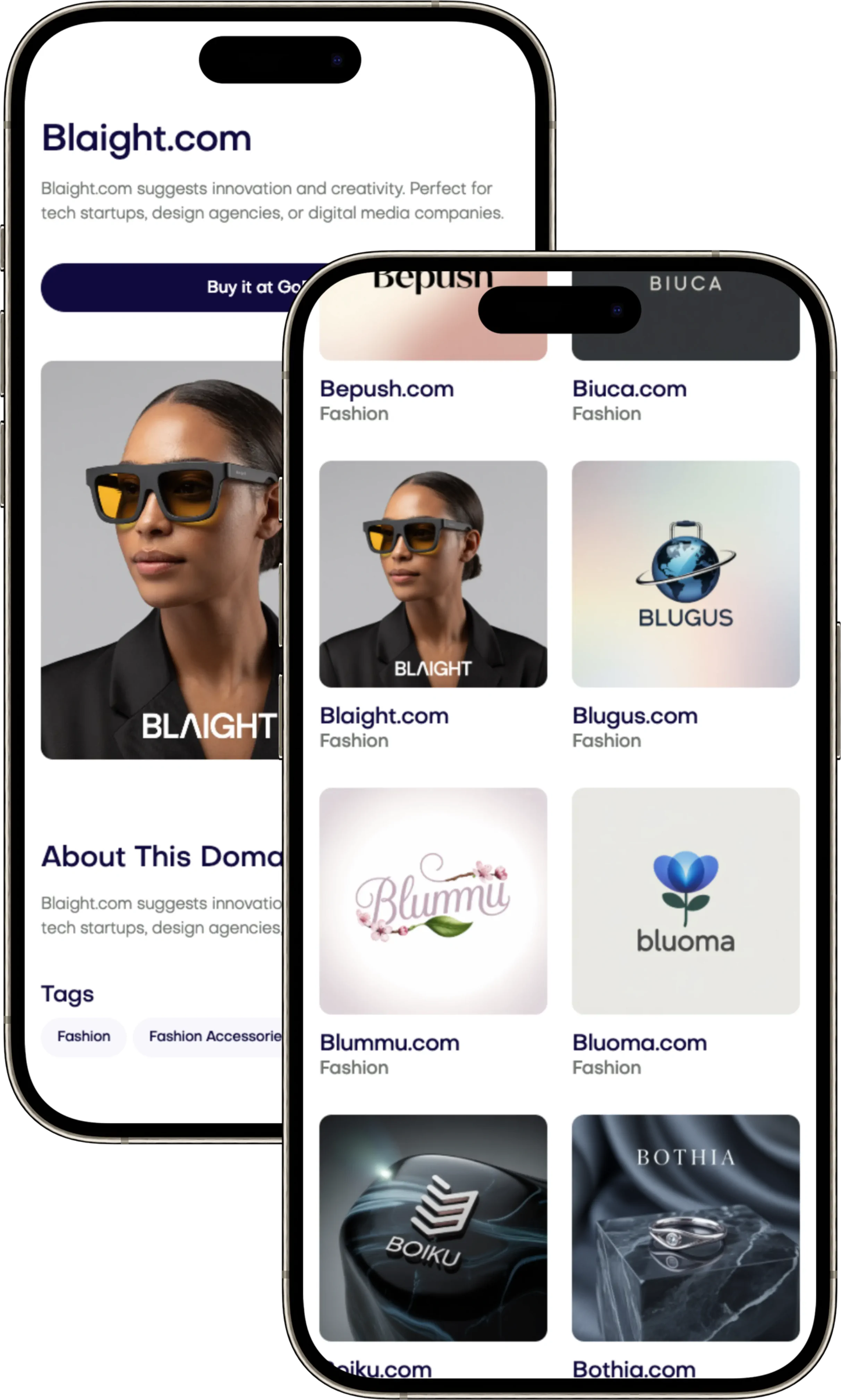
This piece is your guide to refreshing your logo. It explains the best timing, how to make decisions carefully, and what to check after you’ve made changes. When you’re ready to add new names, structures, or digital parts to your brand, you can find great domain names at Brandtune.com.
What Is a Logo Redesign and How It Differs from a Refresh
Your brand grows, so your logo must too. Choosing between a logo refresh or redesign shapes your business's image. It helps keep your identity strong, protected, and moving forward.
Defining a full redesign vs. a light refresh
A full redesign changes major things: symbols, names, fonts, and colors. It might change the logo’s style or how it’s used online. Google’s new font made it easier to read on all devices. Kia’s new logo shows innovation and modern thinking big time.
A small update doesn’t change your logo’s main look but improves it. Little changes in design like spacing and colors can make a big difference. Spotify’s small changes kept its identity but made it work better.
Common goals: clarity, distinctiveness, and relevance
Whether updating or totally changing your logo, the goals are the same. Your logo should be clear, unique, and meet customers' needs today. Make it simple and adaptable to different settings.
These aims help make tough decisions easier. They guide a strategy for staying true to your brand while growing.
Visual identity elements impacted beyond the logo
A big change often affects your whole brand style, like fonts, colors, and pictures. You'll need to think about how your logo looks in different sizes and places.
Get ready for a smooth switch by updating all your materials. This includes digital ads, app icons, and more. This makes sure your brand looks consistent and distinct everywhere.
Signals Your Logo Is Holding Your Brand Back
Your logo should grab attention on its own. If it looks less appealing than others in app stores or on social media, you're losing a big opportunity. These signs can help you decide if it's time for a new logo. They also help to keep your brand's momentum going.
Outdated aesthetics and design trends
Old-fashioned designs like skeuomorphic effects, busy gradients, and detailed linework can make your logo look dated. See how your logo compares to brands like Airbnb, Spotify, or Dropbox. If yours seems too complicated, it might not stand out enough.
Being modern doesn’t mean following every trend. Strive for a design with clean shapes, balanced colors, and simple details. This way, your logo will feel timeless and stand out from others.
Legibility and scalability issues across devices
It’s crucial for logos to be clear, even when small. Test yours at tiny sizes, in dark mode, and on simple screens. If details get lost, your logo isn't clear enough.
Look at how it works as a favicon, on smartwatches, or in small notifications. A good logo should be clear and recognizable everywhere. It should work well, even in animation.
Inconsistency across channels and touchpoints
Using the wrong colors or odd shapes can confuse people. Check your logo on your website, apps, and elsewhere. If it looks different in places, it can puzzle both your team and customers.
Having clear guidelines helps maintain quality and saves money. If inconsistencies remain, it might be time for a new logo or a strict review of your current one.
Confusion with competitors or category clichés
If your logo looks too much like others-for example, using leaves for "eco"-you lose uniqueness. Being too similar to others can weaken your brand's memory in people's minds.
Take a close look at what symbols are common in your field. If your logo shares too many elements with others, think about updating it. This will help your brand stand out more clearly.
Brand Strategy Foundations Before Any Visual Change
Start with clarity. Know who you help, what issue you fix, and how you stand out. Make sure your brand matches what you offer now, not before. Make your value clear and ensure every visual choice tells the same story.
Revisiting positioning and value proposition
Check your market place and what you offer. If you have new services or prices, make sure they fit into your story. Show how your value appears in features and benefits. Use real examples to test it, like customer support talks.
Audience research and perception mapping
Learn about your audience through talks and surveys. Use perception mapping to see how customers view you. Find any gaps between what you promise and what customers see. Focus on important customer segments and needs to decide your tone.
Tone of voice and personality alignment
Choose a brand personality that helps you win: be strong yet kind, creative yet reliable, simple yet friendly. Turn these traits into design rules and examples. Ensure your language and design match your chosen voice.
Defining success metrics for the redesign
Decide on brand goals before creating your logo. Watch how well people remember your brand and how unique it seems. Keep an eye on key measures like ad clicks, website visits, and social media feelings. If you're rebranding, make sure your goals reflect your brand's position, audience knowledge, and value so everyone knows what success looks like.
Logo Redesign When And How
Your brand grows with your business. Always time your rebrand well, using clear signals, not guesses. Aligning this process with your growth makes your brand stronger. It's all about knowing your brand and having everyone agree on the direction.
When to redesign: milestones, mergers, pivots, and performance plateaus
Change when big things happen, like adding new products or new leaders. Or maybe after joining with another company. Changing your business direction or entering new markets tells people you're moving forward. If people stop noticing your brand or buying, a redesign might help.
Look out for outside signs too. Bad vibes, similar logos, or poor online results mean it might be time to change. Think of this as a clear guide to when and how to redesign your logo, not just following the latest trend.
How to approach: phased discovery, concepting, and validation
Begin by really understanding your brand. Audit it, see what the competition is doing, and check your visual impact. Use workshops to understand your brand's truths, risks, and chances. This helps create a clear plan.
Design in simple steps, keeping things black and white at first. Then, test with users, check if it's easy for everyone to see, and make sure it will work in production. Keep improving your design, making sure it works well everywhere.
Resource planning: budget, timeline, and stakeholder roles
Decide who is in charge and who makes decisions to avoid confusion. A small group can make quick decisions while keeping everyone on the same page. This helps everyone know what to do and when to do it.
Make a budget that includes everything from planning to launching your new logo. Figure out a timeline that allows for testing. Team up with the right experts early on. This way, you can redesign your logo well, without wasting time or money.
Competitive and Category Analysis to Inform Direction
Begin by examining your competitors closely to understand your market. Notice common themes like colors and symbols that others use often. For instance, financial services prefer blue while eco-friendly brands choose green.
Tech companies go for simple logos. By noting these trends, you'll know what to avoid. This helps you create something unique.
Create a framework to compare your logo with others. Think about what makes yours different or similar. Look for unclaimed areas that your brand can dominate. Check out how Slack updated its logo for better visibility.
Let this inspire you to make designs that stand out.
See how you stack up against the best. Test how memorable and liked your logo is. Does it work well on different platforms? Use these insights to refine your creative brief.
Your final goal? To stand out with a logo that’s both different and fitting.
Design Principles for a High-Performing Logo
Clear design principles guide strong identities. Aim for simplicity in logos for motion, print, and online use. Build a logo system that works from billboards to app icons. Make sure your logo is memorable and strengthens your brand, avoiding fleeting trends.
Simplicity, memorability, and distinctiveness
Choose clarity with clean lines, smart use of space, and minimal detail. A single, solid idea is key. Your logo should remain unique in black and white and when tiny. This makes logos quick to load and easy to recognize at any size.
Typography choices and custom letterforms
Pick fonts with clear heights, open shapes, and good screen appearance. Custom fonts, like Airbnb’s “a” or Pinterest’s “P,” make your brand stand out. Adjust spacing and shape so your logo looks great everywhere, even on small or packed screens.
Color strategy for accessibility and emotion
Use colors that everyone can see well, including in light, dark, or gray settings. Choose colors that match your brand's feel-like trust, energy, or calm. Have color versions for different needs, like full color or high-contrast for difficult conditions.
Icon systems, monograms, and wordmarks
Choose between a wordmark or symbol based on what you need, like an app icon. For small icons, ensure your symbol is clear at 16px. Create a set of logos that look good everywhere. Add small motions to help people recognize your logo easily.
Following these principles helps create a logo that's easy to remember and works everywhere. It's all about a logo that people won’t forget, using custom fonts and the right colors. Decide carefully between using a wordmark or symbol, making sure your logo adjusts well for all uses.
Testing and Validation Before You Commit
Lowering risk comes from using real feedback, not guesses. Create a clear plan for logo testing. Combine data, insights, and design checks. Work quickly, use steady standards, and set clear rules for checking your brand on different platforms.
A/B testing in realistic contexts
Do A/B tests of your logo where people really see it: on social media ads, emails, and websites. Look at click rates, time spent on the site, and how well they remember your brand. Blind the tests to avoid bias and sort results by key groups. This helps you understand what your main customers prefer.
Test your logo like it's in the real world. See how it looks with different colors and on various sites. Change the designs often to keep the test fair. Make sure to keep your ad spend the same so you know the results are about the logo, not the money spent.
User interviews and preference testing
Use data and talking to users to know why they choose what they do. Hold short talks, sort cards for choices and reasons, and do first-impression tests. Check if people remember your brand and see if it matches what you want it to be like being new, upscale, or friendly.
Ask current and potential customers to join in. Look for when they get mixed up or how they feel about your brand. Write down their exact words that explain why certain designs make them trust your brand more.
Performance checks: visibility at small sizes and motion
Make sure your logo can be seen clearly at tiny sizes on all types of screens. Check how smooth lines look and that it fits perfectly in pixels. Change your logo into SVG, PNG, and PDF and see if the colors stay the same on various devices and printers. You should also look at how well it can be seen by everyone, including those who are color-blind, and see how it looks with different design themes.
Also, see how your logo does when it moves, at different speeds. Check that it can be read easily when it loops, shows up, and during small animations. Make sure details and spacing stay clear when your logo gets bigger, moves, or gets squeezed, like in social media stories and ads.
Implementation Roadmap Across All Touchpoints
Begin by setting up a clear plan focused on your team: training, tools, and goals alignment. Start with internal prep, then launch softly in a few areas, before the big public start. Focus first on high-profile spots like your website, app, and social media profiles. Also, integrate new brand changes in ad campaigns to boost recognition.
Prepare for updates across all platforms by refreshing design systems and templates. This includes redoing presentation decks, emails, and adverts to fit the new style. Then, plan to produce key visual elements in short, focused bursts.
Launch a central system to keep all important brand files. This system should have clear file names and use dates. It will help quickly share files while keeping their quality high.
Work closely with your printing and supply partners and online channels. Make sure they know about your new brand requirements. For online changes, make sure old web pages redirect correctly. For physical items, manage stock carefully to avoid waste as you introduce the new brand.
Roll out changes based on their importance, starting with what customers see first. Keep track of any problems in a shared place and solve them quickly. Make sure all teams work closely together to keep the launch smooth and united.
After launching, check every part of your project to ensure consistency. Secure the final brand elements and guide future projects. Keep working with your suppliers to manage future needs without hassle.
Building Comprehensive Brand Guidelines
Create a single source everyone can use. Your guidelines will show how to use the logo right. It will cover the clear space, and how big the logo should be to look good. It will say what to do and what not to do. This keeps your brand looking the same everywhere.
Clear space, minimum size, and misuse examples
Talk about what you must not change. Explain how to set clear space for readability. Say how small logos can be in print and on screens to keep them clear. Show wrong logo uses with pictures. This includes not adding shadows or changing colors. Also, give rules for working with other brands.
Color, type, and imagery specifications
Giving exact colors is a must. This means Pantone, CMYK, RGB, and HEX for all color levels. You also need the right contrast for people to see well. Explain your fonts and when to use them, including online. Tell how photos and drawings should look to match your style.
Templates for digital, print, packaging, and signage
Give templates for your team to use right away. This includes things for social media, ads, emails, and more. Talk about packaging and signs too. This helps everything look the same. Tell where to find everything online. This keeps your brand details the same no matter where they are used.
Change Management and Launch Communications
Your brand change effort wins when folks get the why, the what, and the how. Make a clear plan with owners, timelines, and steps to check. Use rebrand talks to link strategy and action so your team and customers sync up.
Internal alignment: training and toolkits
Begin with a rollout that boosts team confidence. Have live sessions to share the decision, research, and everyday work shifts. Aim for simplicity and clarity.
Give your teams toolkits: master logo files, templates, and guides on what to do or not. Assign brand guides in key areas to lead and ensure consistency.
Have short training and available hours for questions. Show examples of right use. Connect training to clear targets: how assets are used, presentation checks, and support requests.
External rollout strategy: teasers, storytelling, and rationale
Plan a staged launch that ties with product news or big campaigns. Share a simple post and a brief video to explain the changes. Use stories that connect your goals to the new look.
Launch teasers together on all channels. Update your website, social images, and profiles at once. Make sure PR, notes to investors, partner materials, and sales tools speak with one voice.
Show customers clear reasons and gains. Point out how things are clearer, easier to use, and better. Keep your message bold, friendly, and short.
Monitoring sentiment and responding to feedback
Start watching reactions from the beginning. Check social media, replies, and surveys. Look at trends in visits, interactions, searches about your brand, and confused ticket increases.
Have answers ready that understand concerns and explain why again. Share what you've learned and any small changes you've made. Only tweak based on real proof, and record reasons for later.
Keep sharing updates. Tell teams and stakeholders about progress, improve training with new questions, and stay open to feedback to keep moving forward.
Measuring Impact and Optimizing Post-Launch
Start by setting up a clear way to measure success. Get some initial data before your launch. Then, check on progress after 30, 60, and 90 days. Keep checking every three months. Look closely at important numbers like brand recall and how often people search for your brand. Check how your brand is doing across different channels to see if your logo and messages are hitting the mark.
Make sure you're really seeing the effect of your redesign. Keep things fair by accounting for ads, sales, and seasonal changes. Try using matched-market tests to really understand changes in how people see your brand. And if your logo is part of your app or website, watch how it affects user actions and questions. This helps you see if the new design is making things easier for users.
Use what you learn to make your brand even better. Fine-tune the colors and sizes to make everything easy to read and use. Keep updating your rules as new challenges pop up. Work on making things better step by step, with a good plan for checking in on progress. Once everything is running smoothly, think about adding new names or digital parts to your brand. You can find great options for names at Brandtune.com.
Make smart choices about what to keep, fix, or stop using based on what works. Over time, you'll see your brand grow stronger and your logo will make a bigger impact. This is how your design efforts add real value to your brand at every step of the way.
Your logo is the face of your brand’s strategy, promise, and personality. See any change in your brand’s look as a business move. Link it to growth, market changes, and what your audience needs. This makes the change have a real effect.
Take a look at some big changes in recent times. Airbnb brought in the Bélo for a sense of global belonging. Mastercard went for simpler circles for easier recognition on small devices. Dropbox expanded its look to fit a focus on working together. Each story tells of a strategy-driven rebrand with clear reasons.
When changing your logo, follow a clear plan: discover, plan, create designs, check them, and introduce your logo bit by bit. Focus on how it works on mobile, in social media, and in motion. Make sure it’s easy for everyone to use. Keep it consistent across all parts of your brand.
Know what success looks like from the start. Watch if people remember your brand better, if they interact more, and if they buy more. Aim to make things less confusing for customers needing help. Try out designs in real situations, then set strong rules to keep your new logo strong.
This piece is your guide to refreshing your logo. It explains the best timing, how to make decisions carefully, and what to check after you’ve made changes. When you’re ready to add new names, structures, or digital parts to your brand, you can find great domain names at Brandtune.com.
What Is a Logo Redesign and How It Differs from a Refresh
Your brand grows, so your logo must too. Choosing between a logo refresh or redesign shapes your business's image. It helps keep your identity strong, protected, and moving forward.
Defining a full redesign vs. a light refresh
A full redesign changes major things: symbols, names, fonts, and colors. It might change the logo’s style or how it’s used online. Google’s new font made it easier to read on all devices. Kia’s new logo shows innovation and modern thinking big time.
A small update doesn’t change your logo’s main look but improves it. Little changes in design like spacing and colors can make a big difference. Spotify’s small changes kept its identity but made it work better.
Common goals: clarity, distinctiveness, and relevance
Whether updating or totally changing your logo, the goals are the same. Your logo should be clear, unique, and meet customers' needs today. Make it simple and adaptable to different settings.
These aims help make tough decisions easier. They guide a strategy for staying true to your brand while growing.
Visual identity elements impacted beyond the logo
A big change often affects your whole brand style, like fonts, colors, and pictures. You'll need to think about how your logo looks in different sizes and places.
Get ready for a smooth switch by updating all your materials. This includes digital ads, app icons, and more. This makes sure your brand looks consistent and distinct everywhere.
Signals Your Logo Is Holding Your Brand Back
Your logo should grab attention on its own. If it looks less appealing than others in app stores or on social media, you're losing a big opportunity. These signs can help you decide if it's time for a new logo. They also help to keep your brand's momentum going.
Outdated aesthetics and design trends
Old-fashioned designs like skeuomorphic effects, busy gradients, and detailed linework can make your logo look dated. See how your logo compares to brands like Airbnb, Spotify, or Dropbox. If yours seems too complicated, it might not stand out enough.
Being modern doesn’t mean following every trend. Strive for a design with clean shapes, balanced colors, and simple details. This way, your logo will feel timeless and stand out from others.
Legibility and scalability issues across devices
It’s crucial for logos to be clear, even when small. Test yours at tiny sizes, in dark mode, and on simple screens. If details get lost, your logo isn't clear enough.
Look at how it works as a favicon, on smartwatches, or in small notifications. A good logo should be clear and recognizable everywhere. It should work well, even in animation.
Inconsistency across channels and touchpoints
Using the wrong colors or odd shapes can confuse people. Check your logo on your website, apps, and elsewhere. If it looks different in places, it can puzzle both your team and customers.
Having clear guidelines helps maintain quality and saves money. If inconsistencies remain, it might be time for a new logo or a strict review of your current one.
Confusion with competitors or category clichés
If your logo looks too much like others-for example, using leaves for "eco"-you lose uniqueness. Being too similar to others can weaken your brand's memory in people's minds.
Take a close look at what symbols are common in your field. If your logo shares too many elements with others, think about updating it. This will help your brand stand out more clearly.
Brand Strategy Foundations Before Any Visual Change
Start with clarity. Know who you help, what issue you fix, and how you stand out. Make sure your brand matches what you offer now, not before. Make your value clear and ensure every visual choice tells the same story.
Revisiting positioning and value proposition
Check your market place and what you offer. If you have new services or prices, make sure they fit into your story. Show how your value appears in features and benefits. Use real examples to test it, like customer support talks.
Audience research and perception mapping
Learn about your audience through talks and surveys. Use perception mapping to see how customers view you. Find any gaps between what you promise and what customers see. Focus on important customer segments and needs to decide your tone.
Tone of voice and personality alignment
Choose a brand personality that helps you win: be strong yet kind, creative yet reliable, simple yet friendly. Turn these traits into design rules and examples. Ensure your language and design match your chosen voice.
Defining success metrics for the redesign
Decide on brand goals before creating your logo. Watch how well people remember your brand and how unique it seems. Keep an eye on key measures like ad clicks, website visits, and social media feelings. If you're rebranding, make sure your goals reflect your brand's position, audience knowledge, and value so everyone knows what success looks like.
Logo Redesign When And How
Your brand grows with your business. Always time your rebrand well, using clear signals, not guesses. Aligning this process with your growth makes your brand stronger. It's all about knowing your brand and having everyone agree on the direction.
When to redesign: milestones, mergers, pivots, and performance plateaus
Change when big things happen, like adding new products or new leaders. Or maybe after joining with another company. Changing your business direction or entering new markets tells people you're moving forward. If people stop noticing your brand or buying, a redesign might help.
Look out for outside signs too. Bad vibes, similar logos, or poor online results mean it might be time to change. Think of this as a clear guide to when and how to redesign your logo, not just following the latest trend.
How to approach: phased discovery, concepting, and validation
Begin by really understanding your brand. Audit it, see what the competition is doing, and check your visual impact. Use workshops to understand your brand's truths, risks, and chances. This helps create a clear plan.
Design in simple steps, keeping things black and white at first. Then, test with users, check if it's easy for everyone to see, and make sure it will work in production. Keep improving your design, making sure it works well everywhere.
Resource planning: budget, timeline, and stakeholder roles
Decide who is in charge and who makes decisions to avoid confusion. A small group can make quick decisions while keeping everyone on the same page. This helps everyone know what to do and when to do it.
Make a budget that includes everything from planning to launching your new logo. Figure out a timeline that allows for testing. Team up with the right experts early on. This way, you can redesign your logo well, without wasting time or money.
Competitive and Category Analysis to Inform Direction
Begin by examining your competitors closely to understand your market. Notice common themes like colors and symbols that others use often. For instance, financial services prefer blue while eco-friendly brands choose green.
Tech companies go for simple logos. By noting these trends, you'll know what to avoid. This helps you create something unique.
Create a framework to compare your logo with others. Think about what makes yours different or similar. Look for unclaimed areas that your brand can dominate. Check out how Slack updated its logo for better visibility.
Let this inspire you to make designs that stand out.
See how you stack up against the best. Test how memorable and liked your logo is. Does it work well on different platforms? Use these insights to refine your creative brief.
Your final goal? To stand out with a logo that’s both different and fitting.
Design Principles for a High-Performing Logo
Clear design principles guide strong identities. Aim for simplicity in logos for motion, print, and online use. Build a logo system that works from billboards to app icons. Make sure your logo is memorable and strengthens your brand, avoiding fleeting trends.
Simplicity, memorability, and distinctiveness
Choose clarity with clean lines, smart use of space, and minimal detail. A single, solid idea is key. Your logo should remain unique in black and white and when tiny. This makes logos quick to load and easy to recognize at any size.
Typography choices and custom letterforms
Pick fonts with clear heights, open shapes, and good screen appearance. Custom fonts, like Airbnb’s “a” or Pinterest’s “P,” make your brand stand out. Adjust spacing and shape so your logo looks great everywhere, even on small or packed screens.
Color strategy for accessibility and emotion
Use colors that everyone can see well, including in light, dark, or gray settings. Choose colors that match your brand's feel-like trust, energy, or calm. Have color versions for different needs, like full color or high-contrast for difficult conditions.
Icon systems, monograms, and wordmarks
Choose between a wordmark or symbol based on what you need, like an app icon. For small icons, ensure your symbol is clear at 16px. Create a set of logos that look good everywhere. Add small motions to help people recognize your logo easily.
Following these principles helps create a logo that's easy to remember and works everywhere. It's all about a logo that people won’t forget, using custom fonts and the right colors. Decide carefully between using a wordmark or symbol, making sure your logo adjusts well for all uses.
Testing and Validation Before You Commit
Lowering risk comes from using real feedback, not guesses. Create a clear plan for logo testing. Combine data, insights, and design checks. Work quickly, use steady standards, and set clear rules for checking your brand on different platforms.
A/B testing in realistic contexts
Do A/B tests of your logo where people really see it: on social media ads, emails, and websites. Look at click rates, time spent on the site, and how well they remember your brand. Blind the tests to avoid bias and sort results by key groups. This helps you understand what your main customers prefer.
Test your logo like it's in the real world. See how it looks with different colors and on various sites. Change the designs often to keep the test fair. Make sure to keep your ad spend the same so you know the results are about the logo, not the money spent.
User interviews and preference testing
Use data and talking to users to know why they choose what they do. Hold short talks, sort cards for choices and reasons, and do first-impression tests. Check if people remember your brand and see if it matches what you want it to be like being new, upscale, or friendly.
Ask current and potential customers to join in. Look for when they get mixed up or how they feel about your brand. Write down their exact words that explain why certain designs make them trust your brand more.
Performance checks: visibility at small sizes and motion
Make sure your logo can be seen clearly at tiny sizes on all types of screens. Check how smooth lines look and that it fits perfectly in pixels. Change your logo into SVG, PNG, and PDF and see if the colors stay the same on various devices and printers. You should also look at how well it can be seen by everyone, including those who are color-blind, and see how it looks with different design themes.
Also, see how your logo does when it moves, at different speeds. Check that it can be read easily when it loops, shows up, and during small animations. Make sure details and spacing stay clear when your logo gets bigger, moves, or gets squeezed, like in social media stories and ads.
Implementation Roadmap Across All Touchpoints
Begin by setting up a clear plan focused on your team: training, tools, and goals alignment. Start with internal prep, then launch softly in a few areas, before the big public start. Focus first on high-profile spots like your website, app, and social media profiles. Also, integrate new brand changes in ad campaigns to boost recognition.
Prepare for updates across all platforms by refreshing design systems and templates. This includes redoing presentation decks, emails, and adverts to fit the new style. Then, plan to produce key visual elements in short, focused bursts.
Launch a central system to keep all important brand files. This system should have clear file names and use dates. It will help quickly share files while keeping their quality high.
Work closely with your printing and supply partners and online channels. Make sure they know about your new brand requirements. For online changes, make sure old web pages redirect correctly. For physical items, manage stock carefully to avoid waste as you introduce the new brand.
Roll out changes based on their importance, starting with what customers see first. Keep track of any problems in a shared place and solve them quickly. Make sure all teams work closely together to keep the launch smooth and united.
After launching, check every part of your project to ensure consistency. Secure the final brand elements and guide future projects. Keep working with your suppliers to manage future needs without hassle.
Building Comprehensive Brand Guidelines
Create a single source everyone can use. Your guidelines will show how to use the logo right. It will cover the clear space, and how big the logo should be to look good. It will say what to do and what not to do. This keeps your brand looking the same everywhere.
Clear space, minimum size, and misuse examples
Talk about what you must not change. Explain how to set clear space for readability. Say how small logos can be in print and on screens to keep them clear. Show wrong logo uses with pictures. This includes not adding shadows or changing colors. Also, give rules for working with other brands.
Color, type, and imagery specifications
Giving exact colors is a must. This means Pantone, CMYK, RGB, and HEX for all color levels. You also need the right contrast for people to see well. Explain your fonts and when to use them, including online. Tell how photos and drawings should look to match your style.
Templates for digital, print, packaging, and signage
Give templates for your team to use right away. This includes things for social media, ads, emails, and more. Talk about packaging and signs too. This helps everything look the same. Tell where to find everything online. This keeps your brand details the same no matter where they are used.
Change Management and Launch Communications
Your brand change effort wins when folks get the why, the what, and the how. Make a clear plan with owners, timelines, and steps to check. Use rebrand talks to link strategy and action so your team and customers sync up.
Internal alignment: training and toolkits
Begin with a rollout that boosts team confidence. Have live sessions to share the decision, research, and everyday work shifts. Aim for simplicity and clarity.
Give your teams toolkits: master logo files, templates, and guides on what to do or not. Assign brand guides in key areas to lead and ensure consistency.
Have short training and available hours for questions. Show examples of right use. Connect training to clear targets: how assets are used, presentation checks, and support requests.
External rollout strategy: teasers, storytelling, and rationale
Plan a staged launch that ties with product news or big campaigns. Share a simple post and a brief video to explain the changes. Use stories that connect your goals to the new look.
Launch teasers together on all channels. Update your website, social images, and profiles at once. Make sure PR, notes to investors, partner materials, and sales tools speak with one voice.
Show customers clear reasons and gains. Point out how things are clearer, easier to use, and better. Keep your message bold, friendly, and short.
Monitoring sentiment and responding to feedback
Start watching reactions from the beginning. Check social media, replies, and surveys. Look at trends in visits, interactions, searches about your brand, and confused ticket increases.
Have answers ready that understand concerns and explain why again. Share what you've learned and any small changes you've made. Only tweak based on real proof, and record reasons for later.
Keep sharing updates. Tell teams and stakeholders about progress, improve training with new questions, and stay open to feedback to keep moving forward.
Measuring Impact and Optimizing Post-Launch
Start by setting up a clear way to measure success. Get some initial data before your launch. Then, check on progress after 30, 60, and 90 days. Keep checking every three months. Look closely at important numbers like brand recall and how often people search for your brand. Check how your brand is doing across different channels to see if your logo and messages are hitting the mark.
Make sure you're really seeing the effect of your redesign. Keep things fair by accounting for ads, sales, and seasonal changes. Try using matched-market tests to really understand changes in how people see your brand. And if your logo is part of your app or website, watch how it affects user actions and questions. This helps you see if the new design is making things easier for users.
Use what you learn to make your brand even better. Fine-tune the colors and sizes to make everything easy to read and use. Keep updating your rules as new challenges pop up. Work on making things better step by step, with a good plan for checking in on progress. Once everything is running smoothly, think about adding new names or digital parts to your brand. You can find great options for names at Brandtune.com.
Make smart choices about what to keep, fix, or stop using based on what works. Over time, you'll see your brand grow stronger and your logo will make a bigger impact. This is how your design efforts add real value to your brand at every step of the way.
Tags
Start Building Your Brand with Brandtune
Browse All Domains