Types of Logos: Wordmarks, Emblems and More
Explore the diverse world of logo design with our guide on Types Of Logos, from wordmarks to emblems. Find your perfect brand identity at Brandtune.com.

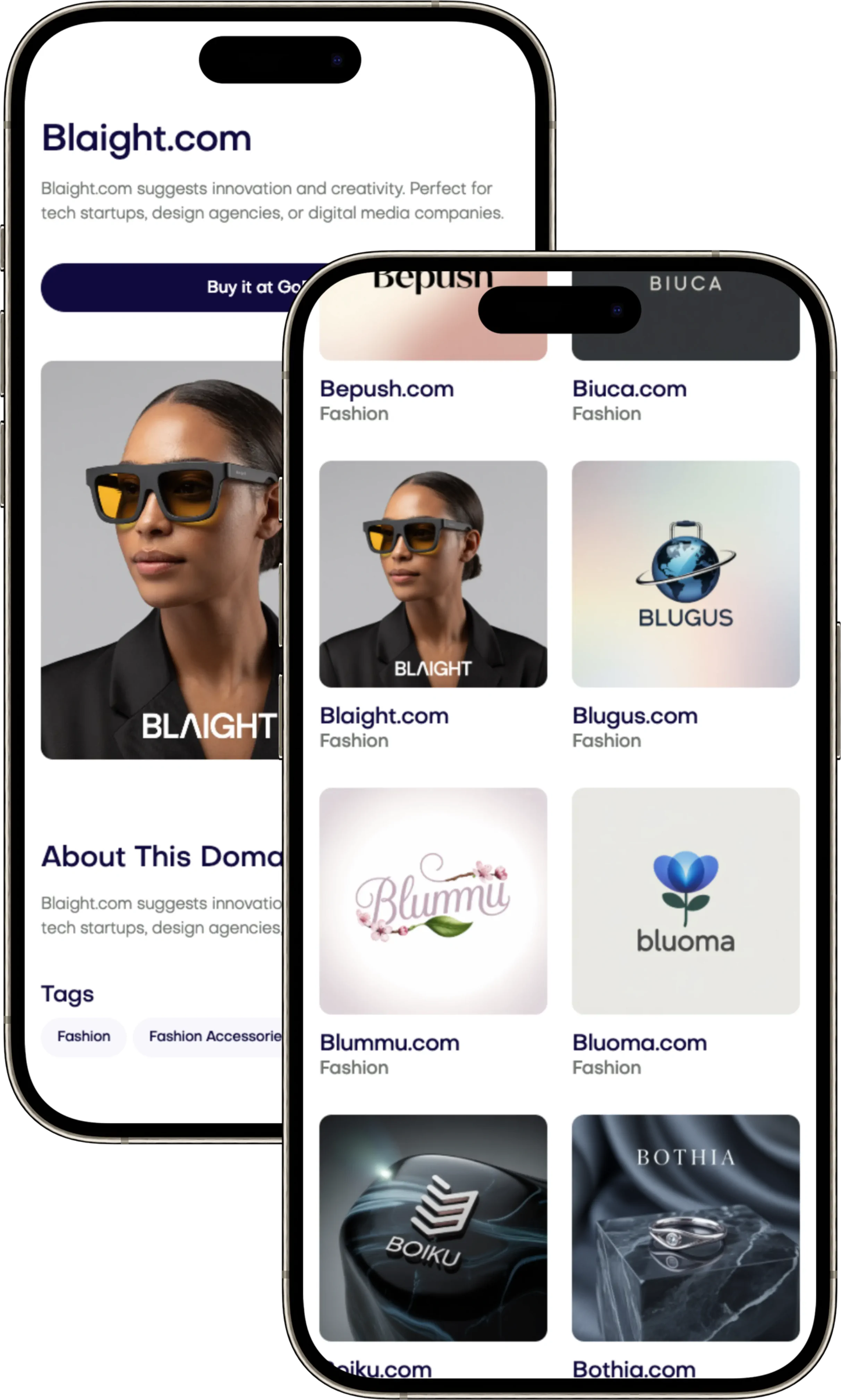
Choosing a logo is key to your brand's identity. This guide helps pick the right one. It explains how logos boost recognition and tell your brand's story.
We look at different logos you'll see a lot. Like Google’s wordmark and IBM’s lettermark. There’s also Starbucks’ emblem, Apple’s pictorial mark, and Nike’s abstract swoosh. Plus, Lacoste’s combination mark and Michelin’s mascot.
We give smart tips on logo design and branding. Learn the impact of typography, color, and symbols. Know the best choices for websites, social media, and more. This helps pick between simple or complex designs.
Picking a logo that matches your goals is important. Match it with a strong brand name and secure a good domain. Brandtune.com has premium domain names.
What Is a Logo and Why It Matters for Brand Identity
Your logo is like your brand's front door. It's a quick way to show what your brand is about. It stands for being seen, known, and remembered. A good logo makes people recognize your brand faster and sets your brand's overall vibe.
Core functions of a logo in brand recognition
A logo makes your business stand out instantly. It sets you apart when there's lots of information. It ensures your brand looks the same everywhere. Shapes, fonts, and colors like Nike’s Swoosh make your brand easy to remember.
Keeping a consistent look helps people recognize your brand. This includes using the same colors and designs on everything. This approach makes your brand more memorable and makes choices easier for customers.
How logos communicate positioning and personality
Your logo's design tells a story. A sharp, modern shape might mean your brand is all about the future. A classic font, like The New York Times, shows seriousness. A fun character, like the Michelin Man, means friendliness.
Your logo should match your brand's vibe. Choose fonts and colors that fit what you want your brand to say. Your logo should help your brand stand out in a good way.
When to refresh or redesign a logo
Think about changing your logo if it’s hard to read or looks old. Also, if your business changes a lot, it might be time for a new logo. Changes can include new products or entering new markets.
If people already know your brand, be careful with changes. Try to update your logo without losing its familiar look. Make sure to explain your new logo clearly and introduce it slowly to keep people's trust.
Wordmarks: When Typography Speaks for Your Brand
A wordmark logo makes your name stand out. With the right look, your message is clear even without a symbol. It ensures people remember your brand on any platform.
Defining features of a strong wordmark
Your brand name turns remarkable with custom typography. It may include unique touches like special ligatures and unique shapes. Brands like Google, Coca-Cola, and Canon show how unique forms aid memory.
Getting the details right is key. Proper spacing makes the logo look unified. Fixes at certain points ensure it looks good in any size.
Choosing typefaces, spacing, and kerning for clarity
Choose a typeface that fits your brand’s image. Serifs give a traditional vibe, while geometric sans look modern. Scripts can feel luxurious but must be used carefully.
Adjust kerning for letters that pair oddly. Make sure your logo is easy to read everywhere. Always check how it looks on mobile and as a favicon too.
Pros, cons, and best-fit use cases
Advantages include quick recognition and easy use. Typographic logos scale well for any need. But, they can be hard to display in small spaces and may lack visual depth.
They work best for digital-first companies and those with short names. Enhance uniqueness with special typography. A complete set should include variations for all uses, all perfectly adjusted.
Lettermarks: Monograms That Make a Memorable Mark
A lettermark logo turns long names into swift cues. It focuses on brand initials. This helps quick recall in small spaces and fast feeds. Think of IBM, HBO, CNN, and H&M: they're clear, compact, and made for logo simplicity and small-size readability.
When abbreviations outshine full brand names
Use initials if your name is long or hard to say. Abbreviations catch the eye where speed is key: like app icons and social avatars. Over time, these initials become the first thing customers notice.
Famous examples include IBM for International Business Machines. HBO stands for Home Box Office, and CNN is Cable News Network. These are quick to read and recognize without any clutter.
Balancing simplicity with distinctiveness
Start with simplicity in your logo. Then, add unique features. You might use custom letters or shapes. Think of FedEx’s arrow and apply such smart ideas.
Avoid plain looks. Use special cuts or angles. Make sure your logo is clear at first glance. Aim for a design that's easy to identify quickly.
Design tips for legibility at small sizes
Make sure your logo is easy to read when small. Simplify lines and ensure good contrast. Avoid tiny serifs and complex designs that get lost when small. Space letters so they’re clear on all screens.
Create versions for different uses. Have stacked, horizontal, and simple initial logos. Test them on both dark and light backgrounds. This makes your monogram logo clear everywhere, from apps to billboards.
Logotypes vs. Logomarks: Understanding the Difference
Think of logotypes and logomarks as tools that shape your business image. A logotype uses text only, like Google's name or IBM's initials. A logomark, however, focuses on symbols, such as the Apple icon or the Adidas stripes. This divides logos into text-based or symbol-based types.
Choosing depends on your name. A short and catchy name does well with logotypes for memory. But for small screens or worldwide appeal, logomarks are key. Apple mainly uses its symbol. Google uses its name in a colorful style. Adidas uses both its name and stripes, showing flexibility.
Think ahead to your brand's growth. Many brands start with both text and symbol, but may later use just one. Create a clear system: start with a main logo, then have versions with just text or symbol, and tiny ones for web use. Make rules for how your logo looks everywhere, to keep it consistent and clear.
Include these rules in your brand guidelines. List all parts of your logo, say how to use them, and where. Deciding between text or symbol logos depends on where they're used. Signage might use text, while apps prefer symbols. Testing your logo in different situations ensures it's always clear and united.
Emblems: Seals, Badges, and Crests with Classic Impact
An emblem logo blends presence and poise. It combines type and images into a single unit. This unit acts as a seal of trust. Examples include Starbucks’ seal, Harley-Davidson’s shield, and Porsche’s shield. Each signals quality, authority, and a rich history.
How emblems integrate text inside a symbol
Begin with a shape, like a circle or shield. Put the brand name on top. Then, add a description or category below. You might add a founding date or location. This makes the logo compact and easy to understand. It also keeps the vintage feel without being too busy.
Use clear silhouettes and space things out well. Make the letter shapes wider and the overall look tight. Don’t use fancy details. Light decorations help the message stand clear on any backdrop or size.
Historical associations and modern adaptations
Emblems are tied to groups like teams and guilds. They’re great for cars, sports, schools, and craft drinks. To update them, make the edges simpler and the designs less complicated. Use minimal decoration and strong shapes. This keeps emblems clear on screens but still connected to their roots.
Create a set for different uses: a full emblem for packaging, a basic version for online, and a simple letter for tiny spaces. All versions should remind people of the original emblem. This helps them recognize the brand everywhere.
Scalability, detail, and printing considerations
Think about how it will be made from the start. Thin lines might blur on clothes or small tags; fades might not print right. Choose a minimum size, make lines thicker if needed, and check how it looks on different materials. These steps make sure the logo is always clear.
Design in vector for clean edges. Pick solid colors so the retro feel stays the same everywhere. Offer a high-contrast, one-color option for stamps or metallic prints. This ensures the emblem stays bold in any use.
Pictorial Marks: Symbols That Tell a Visual Story
A strong pictorial mark turns one image into a clear promise. Consider the apple of Apple, Twitter's bird, or Shell's shell. Your brand symbol should quickly show its meaning and support your story at every step.
Choosing imagery with clear, universal meaning
Pick a symbol logo that speaks without needing words. Choose simple shapes and bold outlines that are quick to recognize. Tie the image to your brand's roots or values: its source, what it offers, or what it achieves. Avoid clichés by exploring widely used icons and selecting unique metaphors that match your brand’s unique stance.
Ensure the design is durable. Keep it simple with fewer anchor points. Skip thin lines that disappear when small. If the logo hints at deeper meaning, use negative space or scale, not added details.
Icon simplicity versus brand differentiation
Start with simplicity, then make it special. Look at Target's bullseye to see how simplicity aids memory. Stand out with unique shapes, cuts, or patterns. Make sure your mark is easy to recognize, even when moving or seen quickly.
Develop a full system: primary, monochrome, duotone, and flat-color versions. Pick colors that match your brand goals, not just what's popular. Ensure your symbol is clear even in black and white.
Cross-channel performance and accessibility
Test your logo as a favicon, on apps, packaging, ads, and products. Make sure it's noticeable from close-up and far away. Create logos that are easy to see, with high contrast and simple shapes, for all screen types and materials.
Always include alt text for digital formats and check its visibility on different backgrounds. Produce clean, sharp versions for all sizes. A well-used symbol logo becomes a key asset for your brand.
Abstract Marks: Shape-Driven Logos for Unique Brands
Abstract marks make shapes full of meaning. An abstract logo shows what your business is about without being obvious. The Nike swoosh shows speed and success. Pepsi’s globe stands for balance in motion. Mitsubishi’s three diamonds show strength and exactness. These are perfect for brands that want to be known worldwide without language getting in the way.
Begin with a plan: pick traits like quickness, togetherness, or steadiness. Turn these into shapes. Angles mean precision. Curves make things seem friendly. Symmetry shows balance and trust. Your logo should be simple. It should have balance and use space wisely. Even small changes can make your logo feel different.
Color is key. Create a palette that works in many ways but stays recognizable. Make sure your logo looks good everywhere. It should work on different backgrounds and sizes. If it loses detail when small, make it simpler or add contrast.
Using your logo a lot gives it meaning. Match it with a strong design style. Use patterns, motion graphics, and sounds that fit your logo. Keep your logo's look consistent. This helps people connect your logo with what you promise.
When launching, have rules to keep things creative yet controlled. Set sizes, colors, and how much space it needs. Give examples for web, apps, packages, and videos. These guidelines help your logo work everywhere, keeping your brand strong.
Combination Marks: Text and Symbol Working Together
A combination mark joins a logo and symbol for quick memory. It gives your brand flexibility. Use the complete logo at first, then just the symbol as it gets known. Examples include the Lacoste crocodile, Adidas's stripes, and Mastercard’s circles with their names.
Lockups, stacking, and responsive variations
Design logos for different spaces. A horizontal layout fits email headers. A vertical layout is good for profile pictures and icons. Logos that fit within borders are great for signs and uniforms.
Create logos that work everywhere: big, small, symbol-only, or text-only. Make sure they keep the same look, no matter the size. Have versions for different backgrounds ready.
Creating flexible systems for different contexts
Make a logo guide for partners and displays. Include space rules and color use. Add motion guidelines to keep your logo the same everywhere.
Remember both print and digital needs. Offer all necessary file types and layouts. This helps everyone use your brand correctly without confusion.
Avoiding visual clutter while keeping impact
Keep your logo simple: one symbol, one wordmark, and clean lines. Make everything clear and straightforward so it's easy to see. Avoid too many effects that can make it hard to read.
Check how your logo looks small or from far away. If it's not clear, simplify or adjust. This makes sure your logo is always easy to recognize and strong.
Mascot Logos: Character-Driven Branding
Mascot logos make your business memorable. Think of famous ones like Michelin's Bibendum or Planters' Mr. Peanut. They are friendly figures that create trust and help people remember you. With mascot branding, you can make joining your brand more fun. You can also add excitement to events and bring warmth to your products. This helps show off your brand's personality. It's also practical for your team and partners to use.
When mascots enhance approachability and fun
Mascots are great for many types of businesses. This includes food, sports, entertainment, education, and services. They make things seem easier and more fun. You can use them in various ways, like welcoming new users or celebrating achievements. This turns everyday tasks into fun moments that people love to talk about.
Illustration style, expressions, and brand voice
Your mascot's style should match your brand. You can use bold shapes for a tech look or textured drawings for a crafty feel. Define your colors, how thick lines should be, and how to use shadows. This will help your team use the mascot in different ways. Create different looks for your mascot for various situations. This helps you show your brand's personality without needing lots of words.
Adapting mascots for digital and print formats
For small displays, keep your mascot simple and focus on important features. Make a small version for use as a website icon. You should have different versions for print and digital screens. Make sure your mascot looks good in all situations. This includes different screen settings and for people with visual impairments. Test it in many ways to make sure it works everywhere.
Types Of Logos
Logos come in many forms. Wordmarks turn simple names into valuable assets, like Google and Coca-Cola do. Lettermarks abbreviate names for quick recall, such as IBM and HBO. Logos can be text or symbols forming a unified system. Emblems show off heritage. Pictorial marks tell stories easily. Abstract marks create unique symbols. Combination marks offer flexibility, while mascots add charm.
Begin with your brand strategy: what you stand for, who you want to reach, your promise, and your style. Look at what others do to stand out visually. Choose a logo that highlights your unique advantage. Your logo should be easy to recognize, work in different sizes, and be clear in any light.
A great logo is part of a bigger system. It works in various forms and sizes. Set rules for its colors, space around it, and where it sits. Check it in real-life places, like websites, apps, products, signs, and clothes. Your logo should make a strong impression every time it's seen.
Finish by picking a great name and web address that grow with your brand. Your visual look and name should be easy to remember and find online. When picking a logo, think ahead to logos that will grow with your business. For top-notch names and logos, Brandtune.com has what you need.
Tags
Start Building Your Brand with Brandtune
Browse All Domains