Visual Identity System: Build a Unified Look
Create a cohesive brand presence with a Visual Identity System. Elevate your branding strategy and secure your unique domain at Brandtune.com.

Your brand should look the same everywhere. A Visual Identity System sets rules for your brand's design. It includes your logo, colors, fonts, images, and more. The aim is to make your brand easy to recognize and keep everything consistent.
Creating a visual brand strategy makes things clear and quick. It helps your team work faster and make better choices. Your brand will have a unified look that helps share your message widely. This makes your brand easy to recognize everywhere.
Being consistent works wonders. Research by McKinsey shows that good design can increase sales by 10–20%. Brands like Apple and Nike are easy to remember because of their visuals. A well-planned system saves money and makes digital work easier.
Everything should be easy to find and use in one place. Tools like Figma or Adobe Creative Cloud help keep everyone on the same page. This helps your brand grow without losing your unique style. Make sure your online look is unique too. You can find special domain names at Brandtune.com.
What a Visual Identity System Is and Why It Matters
Your business needs a clear way to be seen. A visual identity system turns your brand plan into useful tools. These tools include rules, examples, and assets that keep everything in sync. With this guide, teams work faster, create better, and make your brand look purposeful.
Defining visual identity versus brand identity
Visual identity and brand identity are different but connected. Brand identity is about your mission, values, and how you speak. Visual identity brings these ideas to life through colors, logos, images, layouts, and more. It makes it easy for anyone creating content to do it right.
Using the same visual style in all projects makes your strategy real. This way, people quickly recognize your work everywhere.
How consistency boosts recognition and trust
Being consistent helps people remember and trust your brand. Seeing the same colors and logos over again makes your brand stick in their minds. Think of Coca-Cola’s red or Spotify’s green; these colors make brands stand out fast.
Keeping your design elements the same makes messages clearer. This makes your brand seem more reliable. Over time, your brand gets easier to remember and gains trust from shoppers.
The business case: clarity, cohesion, and memorability
Being clear and unified makes your brand stronger. It ties together ads, websites, and all you create, showing off your style. Being different but consistent makes your brand unforgettable, keeping it in customers' minds.
A solid visual identity system also makes work go quicker. Templates that can be used again save time and speed up bringing products to market. Track different types of brand awareness, how much you're searched for, and how well you stick to your brand plan to measure success.
Core Elements of a Cohesive Brand Look
Your visual identity should be a unified system. It's vital to align everything from your logo and colors to your motion design. This way, people can instantly recognize your business.
Logo structures and lockups
Set rules for using different logo versions. This includes their sizes and how they should look on various backgrounds. Also, create guidelines for using logos together to ensure they're clear.
Color palettes and usage ratios
Choose up to three main colors and add some for accents and notifications. Show how to use these colors and list their exact shades. Make sure your colors work both in print and online.
Typography systems and hierarchy
Pick fonts that show your brand’s style. Define their use across different content types. Make sure your text looks good everywhere by setting detailed guidelines.
Iconography and illustration styles
Stick to one style for your icons and illustrations. Set rules for their design and use. This keeps your visuals consistent and meaningful.
Photography direction and art style
Detail how photos should look and feel. Guide the choice of subjects and settings. Align photo styles with your brand for a unified look.
Motion and micro-interactions for digital
Create guidelines for animations that fit your brand. Specify how long they should last and how they should behave. Document interactive elements carefully to speak in your brand’s voice.
Visual Identity System
Start by building your visual identity in steps: first come principles, then design tokens, components, patterns, and templates. Principles guide the system, ensuring everything is clear and stands out. Tokens represent the basics like colors and fonts. Components, such as buttons, use these tokens.
Patterns and templates put everything together. They help in creating forms and web pages quickly. This method reduces mistakes and speeds up your work.
Design tokens should work everywhere and have meaningful names, like color.brand.primary. Use tools to keep tokens updated in your designs. Make sure to include designs for all users, adding light and dark modes.
When you update a token, everything adjusts without extra work. This keeps your designs consistent across all platforms.
Keep all your brand stuff in one spot with controls on who can use them. This includes logos, fonts, and videos. Add a starter kit with a brand guide and templates. This makes it easy for new people to work with your brand.
Work together with teams across your company to use the system. Give engineers a library that matches your design tools. This helps avoid mistakes and makes testing easier.
Check your system every quarter to keep it fresh. Update tokens, remove old items, and record changes. Keep a list of what people want added. Share updates on a website that's easy to use. This helps keep your brand strong and consistent everywhere.
Design Principles That Keep Your Identity Unified
Your visual identity shines when everything is well-thought-out. Base your design on principles that make your brand easy to recognize. Aim for choices that your team can use over and over. This ensures your brand looks the same everywhere, without losing its edge.
Simplicity, contrast, and legibility
Focus on the basics. Choose just a few fonts and colors to make your message clear. Use contrast to organize and make text easy to read in any light. Always check how your brand looks on small screens and different materials before deciding.
Write short and clear sentences. Leave plenty of white space around them. Make sure icons are easy to understand at 16–24 px. When unsure, choose simple shapes and clear lines. This helps your message stand out, no matter the situation.
Scalability across sizes and formats
Design to be flexible, from tiny icons to huge banners. Offer different logo versions for different sizes. Use vector files for the originals, and set limits for the smallest sizes for controls and icons. This keeps your branding consistent.
Explain how to crop images and adjust designs for different uses. This approach will help your brand stay flexible. It works for websites, mobile apps, packaging, and events without having to start from scratch.
Accessibility and color contrast standards
Follow accessibility rules to reach more people. Stick to WCAG rules for text contrast: 4.5:1 for regular text and 3:1 for big text and buttons. Also, make sure to include options for users who find animations challenging.
Provide guidelines for alternative text and use colors that everyone can see well. These steps make your brand more understandable and trustworthy, even for users with different needs.
Grid systems and spatial consistency
Use layout grids that adapt to any size. Start with a basic spacing unit-4 or 8 px. Align items using columns that fit different screens. Set rules for margins and alignment so everything snaps into place easily.
Stick to a baseline grid for arranging text across your designs. A steady rhythm makes your message clearer, strengthens your design, and helps turn principles into habits.
Building a Flexible Yet Consistent System
Your visual identity should bend without breaking. Build for speed and scale, yet keep a recognizable core. Use a modular design language to unlock brand flexibility while protecting the look and feel with clear design guardrails and practical brand consistency rules.
Creating a modular design language
Break the system into modules: color themes, component states, layout patterns, and content blocks. Define how each module plugs into the next so your team can adapt to new channels without reinventing the style.
Spell out assembly logic: which color themes pair with which typography roles, how spacing tokens feed layout patterns, and how content blocks stack on mobile. This structure boosts brand flexibility while keeping decisions fast and repeatable.
Defining do’s and don’ts for variations
Use variation guidelines that show real cases. Demonstrate correct logo clear space versus a compressed mark. Show acceptable color tints alongside off-brand hues. Present approved photo treatments next to filters that shift tone.
Detail icon usage: consistent stroke weights and sizes versus mismatched outlines. Include side-by-side visuals and code snippets for buttons, shadows, and motion easing. These brand consistency rules make decisions easy and remove guesswork.
Establishing guardrails for experimentation
Encourage pilots within design guardrails. Define what can vary-illustration subjects, photography scenarios, campaign accent colors-and what stays fixed-logo proportions, the core palette, and type roles. This balance keeps ideas fresh and familiar.
Set an approval lane for trials with clear criteria: audience fit, usability scores, production feasibility, and on-brand impact. Promote winning tests into the system and update the modular design language so future teams can build with confidence.
Brand Guidelines: The Playbook for Consistency
When everyone uses the same playbook, your business grows faster. Brand guidelines help turn creative ideas into routine work. They explain how to use your visual identity and how teams should apply it. Think of them as a dynamic system, supported by rules, managing tools, and regular updates. They are meant to be clear, actionable, and simple to use.
Essential sections to include
Begin with a short summary of your brand's purpose and position. Include a tone of voice section with examples from Apple, Nike, or Adobe to guide for clarity and effectiveness. Detail how to use logos, the needed whitespace, lockups, color schemes, how to set type, rules for images, designing icons, how to include movement, the layout, and how to make everything accessible.
Explain how to adapt these for websites, apps, social media, printed stuff, packaging, and presentations. Add checklists and guides for those not trained in design so they can do their tasks well. Keep all these guidelines in a manual that clearly explains dos and don'ts, supported by visuals showing right and wrong ways.
File management and asset delivery
Keep a central folder that has all vital logos, files, templates, and guides. Set up clear naming rules, file formats for print and digital, and details that explain ownership and rights. Use a system to manage versions. This stops confusion and ensures everyone uses the latest files.
Have a simple form for requesting new materials and outline how long requests will take. Make sure your system fits with how your team works creatively. Provide tools and templates for Figma, Adobe Creative Cloud, Google Slides, and PowerPoint. Include color guides to ensure consistent production.
Governance: who approves and updates
Name people in your brand or design team to oversee updates. Decide who gets to approve changes to logos, new colors, or templates. Use tools like Jira or Asana to track projects and share updates, so everyone knows what's new or different. This is key in managing your brand.
Review your guidelines every quarter and update your team through training and videos. Create an online place where everyone can find answers based on the brand manual. With defined roles, up-to-date control, and helpful support, your business will keep moving forward while keeping your brand safe.
Applying Your Identity Across Channels
Your brand's journey should be smooth from start to finish. Use cross-channel branding to guide each step and clarify your message. Keep rules simple for fast, guess-free application by teams.
Website, product UI, and mobile apps
Change your brand tokens into CSS variables or platform styles for a uniform look. Set guidelines for navigation, buttons, forms, and more so everything scales nicely. Don't forget responsive design, dark mode, and how to handle dates and money.
Write guides for onboarding, small text, and error messages in your brand's voice. Also, prepare app store assets and screenshots that show off your design. This ensures your brand stays consistent as your team adds new features.
Social media templates and content
Create editable social media templates for different types of content. Make sure everything looks consistent in terms of size, animation, and thumbnails. This helps videos look unified in feeds and grids.
Design a content plan that uses your brand colors just right. Have different sets ready for new launches and seasonal changes. This helps keep your branding steady across all channels.
Packaging and unboxing experiences
Detail packaging designs like materials and finishes to match your online look. Note color standards and eco-friendly options for your suppliers. Make sure everything inside the box fits your brand too.
Design an unboxing that feels like using your app. It strengthens your brand when moving from screen to product. It also makes the moment of opening special.
Presentations, documents, and sales collateral
Offer templates for slides, proposals, and reports that are easy to read. Use your colors and fonts in charts and infographics for easier scanning. Include branded email signatures and document covers too.
Share templates for sales materials that teams can quickly adjust. This helps keep your brand's look consistent. Digital and cross-channel branding support each other this way.
Measuring the Impact of Your Visual Identity
Start by building a clear way to track success. This helps your team see what methods are effective. Use both immediate and future signals to measure impact. For example, run different kinds of tests on your logo, colors, and font. Keep an eye on Net Promoter Score and changes in conversion rates after updates.
Also, look at how many people engage and talk about your brand online. And, use studies to see how well your marketing campaigns are doing. Check if your online interface is easy to use too. These steps give you real ways to measure and improve your brand.
It’s important to connect what you do with the results you get. Check how you use your logo and other brand elements on all platforms. You can use tools or do manual checks to make sure everything is consistent. Keep track of how well these elements meet your standards. Then, see how they relate to your brand's overall success.
When you find a connection between design quality and success, you know where to focus. This helps you know what to improve or where to invest more.
Make research a regular part of your process. Do surveys, listen to social media, and look at what people are searching for every quarter. Test out different designs within your brand guidelines. Use what you learn to keep your brand strong and consistent.
By doing this, your brand’s look and feel will get better and be easier to manage. This makes your brand stronger and more recognizable over time.
Rolling Out and Maintaining the System Over Time
Start your brand rollout in steps. First, show your team the vision and tools privately. Test it with a few teams, listen to feedback, and make it better. After, go for a full launch with a set date. Use a period where old and new materials are used together. This makes changing easier. Also, send out a launch kit. It should include a guidelines website, materials, templates, and messages for partners.
Training helps people adopt the brand. Run short workshops for marketing, product, and sales teams. Focus on how and when to use the brand. Offer quick videos, office hours, and support via Slack or Microsoft Teams. Praise teams that use the brand right. This encourages everyone. Also, have a group of brand champions. They can quickly answer questions and show how to do things right.
Start taking care of the system right away. Use a form to handle requests for changes. Choose what to update based on importance and how hard it is. Keep a log that everyone can see. It shows changes and reasons. Have a plan to stop using old materials on time. Check your strategy every year. This keeps your brand fresh and in line with your goals and market changes.
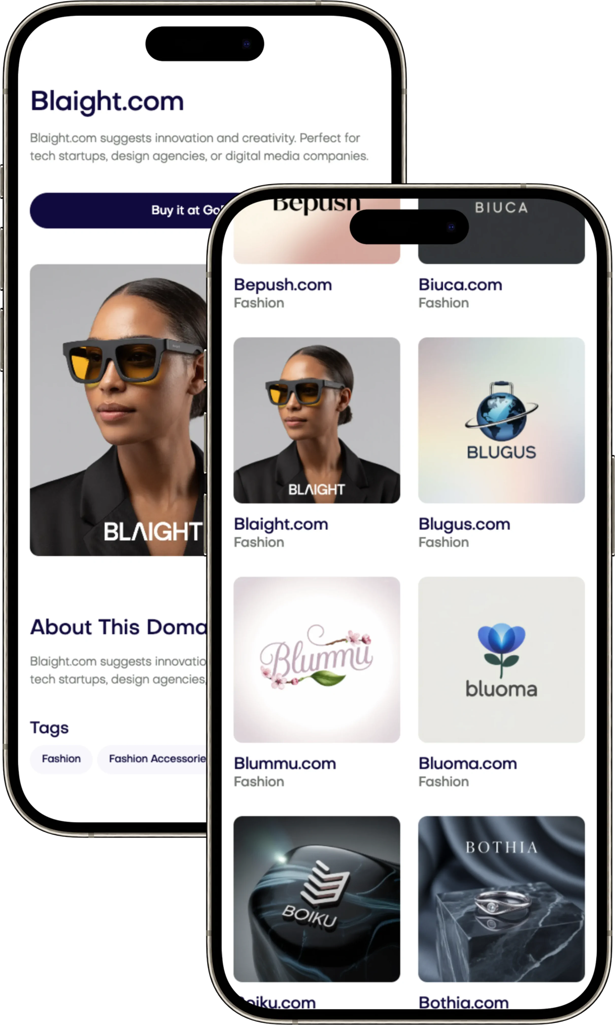
Follow a regular plan: plan, train, improve. A good rollout plan, strong training, and clear upkeep lead to lasting change and true brand use. Make your brand stand out with a special address. You can find great brand domains at Brandtune.com.
Your brand should look the same everywhere. A Visual Identity System sets rules for your brand's design. It includes your logo, colors, fonts, images, and more. The aim is to make your brand easy to recognize and keep everything consistent.
Creating a visual brand strategy makes things clear and quick. It helps your team work faster and make better choices. Your brand will have a unified look that helps share your message widely. This makes your brand easy to recognize everywhere.
Being consistent works wonders. Research by McKinsey shows that good design can increase sales by 10–20%. Brands like Apple and Nike are easy to remember because of their visuals. A well-planned system saves money and makes digital work easier.
Everything should be easy to find and use in one place. Tools like Figma or Adobe Creative Cloud help keep everyone on the same page. This helps your brand grow without losing your unique style. Make sure your online look is unique too. You can find special domain names at Brandtune.com.
What a Visual Identity System Is and Why It Matters
Your business needs a clear way to be seen. A visual identity system turns your brand plan into useful tools. These tools include rules, examples, and assets that keep everything in sync. With this guide, teams work faster, create better, and make your brand look purposeful.
Defining visual identity versus brand identity
Visual identity and brand identity are different but connected. Brand identity is about your mission, values, and how you speak. Visual identity brings these ideas to life through colors, logos, images, layouts, and more. It makes it easy for anyone creating content to do it right.
Using the same visual style in all projects makes your strategy real. This way, people quickly recognize your work everywhere.
How consistency boosts recognition and trust
Being consistent helps people remember and trust your brand. Seeing the same colors and logos over again makes your brand stick in their minds. Think of Coca-Cola’s red or Spotify’s green; these colors make brands stand out fast.
Keeping your design elements the same makes messages clearer. This makes your brand seem more reliable. Over time, your brand gets easier to remember and gains trust from shoppers.
The business case: clarity, cohesion, and memorability
Being clear and unified makes your brand stronger. It ties together ads, websites, and all you create, showing off your style. Being different but consistent makes your brand unforgettable, keeping it in customers' minds.
A solid visual identity system also makes work go quicker. Templates that can be used again save time and speed up bringing products to market. Track different types of brand awareness, how much you're searched for, and how well you stick to your brand plan to measure success.
Core Elements of a Cohesive Brand Look
Your visual identity should be a unified system. It's vital to align everything from your logo and colors to your motion design. This way, people can instantly recognize your business.
Logo structures and lockups
Set rules for using different logo versions. This includes their sizes and how they should look on various backgrounds. Also, create guidelines for using logos together to ensure they're clear.
Color palettes and usage ratios
Choose up to three main colors and add some for accents and notifications. Show how to use these colors and list their exact shades. Make sure your colors work both in print and online.
Typography systems and hierarchy
Pick fonts that show your brand’s style. Define their use across different content types. Make sure your text looks good everywhere by setting detailed guidelines.
Iconography and illustration styles
Stick to one style for your icons and illustrations. Set rules for their design and use. This keeps your visuals consistent and meaningful.
Photography direction and art style
Detail how photos should look and feel. Guide the choice of subjects and settings. Align photo styles with your brand for a unified look.
Motion and micro-interactions for digital
Create guidelines for animations that fit your brand. Specify how long they should last and how they should behave. Document interactive elements carefully to speak in your brand’s voice.
Visual Identity System
Start by building your visual identity in steps: first come principles, then design tokens, components, patterns, and templates. Principles guide the system, ensuring everything is clear and stands out. Tokens represent the basics like colors and fonts. Components, such as buttons, use these tokens.
Patterns and templates put everything together. They help in creating forms and web pages quickly. This method reduces mistakes and speeds up your work.
Design tokens should work everywhere and have meaningful names, like color.brand.primary. Use tools to keep tokens updated in your designs. Make sure to include designs for all users, adding light and dark modes.
When you update a token, everything adjusts without extra work. This keeps your designs consistent across all platforms.
Keep all your brand stuff in one spot with controls on who can use them. This includes logos, fonts, and videos. Add a starter kit with a brand guide and templates. This makes it easy for new people to work with your brand.
Work together with teams across your company to use the system. Give engineers a library that matches your design tools. This helps avoid mistakes and makes testing easier.
Check your system every quarter to keep it fresh. Update tokens, remove old items, and record changes. Keep a list of what people want added. Share updates on a website that's easy to use. This helps keep your brand strong and consistent everywhere.
Design Principles That Keep Your Identity Unified
Your visual identity shines when everything is well-thought-out. Base your design on principles that make your brand easy to recognize. Aim for choices that your team can use over and over. This ensures your brand looks the same everywhere, without losing its edge.
Simplicity, contrast, and legibility
Focus on the basics. Choose just a few fonts and colors to make your message clear. Use contrast to organize and make text easy to read in any light. Always check how your brand looks on small screens and different materials before deciding.
Write short and clear sentences. Leave plenty of white space around them. Make sure icons are easy to understand at 16–24 px. When unsure, choose simple shapes and clear lines. This helps your message stand out, no matter the situation.
Scalability across sizes and formats
Design to be flexible, from tiny icons to huge banners. Offer different logo versions for different sizes. Use vector files for the originals, and set limits for the smallest sizes for controls and icons. This keeps your branding consistent.
Explain how to crop images and adjust designs for different uses. This approach will help your brand stay flexible. It works for websites, mobile apps, packaging, and events without having to start from scratch.
Accessibility and color contrast standards
Follow accessibility rules to reach more people. Stick to WCAG rules for text contrast: 4.5:1 for regular text and 3:1 for big text and buttons. Also, make sure to include options for users who find animations challenging.
Provide guidelines for alternative text and use colors that everyone can see well. These steps make your brand more understandable and trustworthy, even for users with different needs.
Grid systems and spatial consistency
Use layout grids that adapt to any size. Start with a basic spacing unit-4 or 8 px. Align items using columns that fit different screens. Set rules for margins and alignment so everything snaps into place easily.
Stick to a baseline grid for arranging text across your designs. A steady rhythm makes your message clearer, strengthens your design, and helps turn principles into habits.
Building a Flexible Yet Consistent System
Your visual identity should bend without breaking. Build for speed and scale, yet keep a recognizable core. Use a modular design language to unlock brand flexibility while protecting the look and feel with clear design guardrails and practical brand consistency rules.
Creating a modular design language
Break the system into modules: color themes, component states, layout patterns, and content blocks. Define how each module plugs into the next so your team can adapt to new channels without reinventing the style.
Spell out assembly logic: which color themes pair with which typography roles, how spacing tokens feed layout patterns, and how content blocks stack on mobile. This structure boosts brand flexibility while keeping decisions fast and repeatable.
Defining do’s and don’ts for variations
Use variation guidelines that show real cases. Demonstrate correct logo clear space versus a compressed mark. Show acceptable color tints alongside off-brand hues. Present approved photo treatments next to filters that shift tone.
Detail icon usage: consistent stroke weights and sizes versus mismatched outlines. Include side-by-side visuals and code snippets for buttons, shadows, and motion easing. These brand consistency rules make decisions easy and remove guesswork.
Establishing guardrails for experimentation
Encourage pilots within design guardrails. Define what can vary-illustration subjects, photography scenarios, campaign accent colors-and what stays fixed-logo proportions, the core palette, and type roles. This balance keeps ideas fresh and familiar.
Set an approval lane for trials with clear criteria: audience fit, usability scores, production feasibility, and on-brand impact. Promote winning tests into the system and update the modular design language so future teams can build with confidence.
Brand Guidelines: The Playbook for Consistency
When everyone uses the same playbook, your business grows faster. Brand guidelines help turn creative ideas into routine work. They explain how to use your visual identity and how teams should apply it. Think of them as a dynamic system, supported by rules, managing tools, and regular updates. They are meant to be clear, actionable, and simple to use.
Essential sections to include
Begin with a short summary of your brand's purpose and position. Include a tone of voice section with examples from Apple, Nike, or Adobe to guide for clarity and effectiveness. Detail how to use logos, the needed whitespace, lockups, color schemes, how to set type, rules for images, designing icons, how to include movement, the layout, and how to make everything accessible.
Explain how to adapt these for websites, apps, social media, printed stuff, packaging, and presentations. Add checklists and guides for those not trained in design so they can do their tasks well. Keep all these guidelines in a manual that clearly explains dos and don'ts, supported by visuals showing right and wrong ways.
File management and asset delivery
Keep a central folder that has all vital logos, files, templates, and guides. Set up clear naming rules, file formats for print and digital, and details that explain ownership and rights. Use a system to manage versions. This stops confusion and ensures everyone uses the latest files.
Have a simple form for requesting new materials and outline how long requests will take. Make sure your system fits with how your team works creatively. Provide tools and templates for Figma, Adobe Creative Cloud, Google Slides, and PowerPoint. Include color guides to ensure consistent production.
Governance: who approves and updates
Name people in your brand or design team to oversee updates. Decide who gets to approve changes to logos, new colors, or templates. Use tools like Jira or Asana to track projects and share updates, so everyone knows what's new or different. This is key in managing your brand.
Review your guidelines every quarter and update your team through training and videos. Create an online place where everyone can find answers based on the brand manual. With defined roles, up-to-date control, and helpful support, your business will keep moving forward while keeping your brand safe.
Applying Your Identity Across Channels
Your brand's journey should be smooth from start to finish. Use cross-channel branding to guide each step and clarify your message. Keep rules simple for fast, guess-free application by teams.
Website, product UI, and mobile apps
Change your brand tokens into CSS variables or platform styles for a uniform look. Set guidelines for navigation, buttons, forms, and more so everything scales nicely. Don't forget responsive design, dark mode, and how to handle dates and money.
Write guides for onboarding, small text, and error messages in your brand's voice. Also, prepare app store assets and screenshots that show off your design. This ensures your brand stays consistent as your team adds new features.
Social media templates and content
Create editable social media templates for different types of content. Make sure everything looks consistent in terms of size, animation, and thumbnails. This helps videos look unified in feeds and grids.
Design a content plan that uses your brand colors just right. Have different sets ready for new launches and seasonal changes. This helps keep your branding steady across all channels.
Packaging and unboxing experiences
Detail packaging designs like materials and finishes to match your online look. Note color standards and eco-friendly options for your suppliers. Make sure everything inside the box fits your brand too.
Design an unboxing that feels like using your app. It strengthens your brand when moving from screen to product. It also makes the moment of opening special.
Presentations, documents, and sales collateral
Offer templates for slides, proposals, and reports that are easy to read. Use your colors and fonts in charts and infographics for easier scanning. Include branded email signatures and document covers too.
Share templates for sales materials that teams can quickly adjust. This helps keep your brand's look consistent. Digital and cross-channel branding support each other this way.
Measuring the Impact of Your Visual Identity
Start by building a clear way to track success. This helps your team see what methods are effective. Use both immediate and future signals to measure impact. For example, run different kinds of tests on your logo, colors, and font. Keep an eye on Net Promoter Score and changes in conversion rates after updates.
Also, look at how many people engage and talk about your brand online. And, use studies to see how well your marketing campaigns are doing. Check if your online interface is easy to use too. These steps give you real ways to measure and improve your brand.
It’s important to connect what you do with the results you get. Check how you use your logo and other brand elements on all platforms. You can use tools or do manual checks to make sure everything is consistent. Keep track of how well these elements meet your standards. Then, see how they relate to your brand's overall success.
When you find a connection between design quality and success, you know where to focus. This helps you know what to improve or where to invest more.
Make research a regular part of your process. Do surveys, listen to social media, and look at what people are searching for every quarter. Test out different designs within your brand guidelines. Use what you learn to keep your brand strong and consistent.
By doing this, your brand’s look and feel will get better and be easier to manage. This makes your brand stronger and more recognizable over time.
Rolling Out and Maintaining the System Over Time
Start your brand rollout in steps. First, show your team the vision and tools privately. Test it with a few teams, listen to feedback, and make it better. After, go for a full launch with a set date. Use a period where old and new materials are used together. This makes changing easier. Also, send out a launch kit. It should include a guidelines website, materials, templates, and messages for partners.
Training helps people adopt the brand. Run short workshops for marketing, product, and sales teams. Focus on how and when to use the brand. Offer quick videos, office hours, and support via Slack or Microsoft Teams. Praise teams that use the brand right. This encourages everyone. Also, have a group of brand champions. They can quickly answer questions and show how to do things right.
Start taking care of the system right away. Use a form to handle requests for changes. Choose what to update based on importance and how hard it is. Keep a log that everyone can see. It shows changes and reasons. Have a plan to stop using old materials on time. Check your strategy every year. This keeps your brand fresh and in line with your goals and market changes.
Follow a regular plan: plan, train, improve. A good rollout plan, strong training, and clear upkeep lead to lasting change and true brand use. Make your brand stand out with a special address. You can find great brand domains at Brandtune.com.
Tags
Start Building Your Brand with Brandtune
Browse All Domains