Typography · 5 min read
Brand fonts: how to choose and pair typefaces
Fonts do more of the brand's talking than most people expect. How to pick one or two that fit the brand, read well on a screen and stay out of trouble.
By the Brandtune studio · Last reviewed 2 Nov 2026
In short
- Pick fonts from the brand's tone, not from a list of favourites.
- Two typefaces are enough: one for headlines, one for text.
- Test on a phone and write the rules down.
Start from the tone
Before opening a font library, describe the brand in three words. Warm, precise, playful, calm. A typeface carries those words in its shapes: round or sharp, wide or narrow, heavy or light. Choose from the words, not from the fonts you happen to like.
Use two typefaces, rarely more
A display typeface gives headlines their character. A text typeface does the reading. Both can be two weights of the same family. A third typeface is a decision to defend, not a default.
Test readability where it matters
Set a real product name, a long paragraph and a button in each candidate and look at them on a phone. Check sizes: body text should be comfortable to read without zooming. Check numbers, since prices and sizes are everywhere on a store.
Check the practical side
Does the family have the weights you need? Does it cover the languages you sell in, with accents and symbols? Does it load quickly on a web page? These questions are cheaper to ask before the choice than after.
Pair by contrast
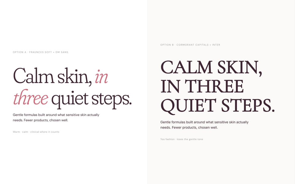
Pair a distinctive headline face with a quiet text face. Two typefaces that are almost alike look like a mistake. One expressive and one neutral looks designed.
Write the rules down
Put the sizes, weights and line spacing for headlines, text and labels in the brand guidelines, with an example page. Typography is the part of a brand that drifts fastest when nobody has written it down.