Store · 6 min read
Ecommerce homepage design: what to put on it and in what order
A store homepage has a few seconds to say what you sell, to whom and where to go next. A simple order of sections that does that job.
By the Brandtune studio · Last reviewed 2 Nov 2026
In short
- The first screen must say what you sell and for whom.
- Show products early, then reasons to trust you.
- Only show proof you really have.
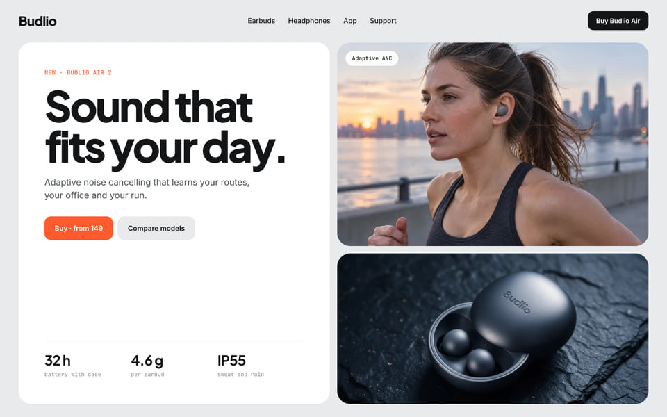
1. A first screen that explains itself
One headline that says what you sell and for whom, one button, and an image of the product in use. A visitor who cannot tell what the store sells in a few seconds will leave.
2. Products, not decoration
Right after the first screen, show the products people buy most, with clear names, an image and the thing that decides the purchase. Make the next step obvious: a product page, a collection or a quick add.
3. Ways into the catalogue
Not every visitor wants the bestsellers. Offer entry points by need, by category or by occasion, in the words your customers use.
4. Reasons to trust you
Delivery, returns, support and how the product is made, in short lines near the products. Show only what is true and what you can keep doing.
5. The brand story, briefly
Two or three sentences and an image. Enough to explain why the brand exists, with a link for those who want more.
6. Proof you really have
Reviews, press or a number of customers, only when they exist and can be checked. An empty section is better than an invented one.
Check it on a phone first
Most visits start on a phone. Open the page on one and ask whether the first screen, the first product and the menu work with one thumb. Fix that before polishing the desktop version. If the page needs more than that, read when to refresh or rebuild.